In 1890 the Milton Bradley Company published a historically significant manual on teaching color to children called Color in the School-room: A Manual for Teachers. It was exceedingly scientific for a textbook on kindergarten-level education, tackling topics like color blindness and having an entire chapter dedicated to “The Demand for a Definite Color Nomenclature.”
Somewhere early in chapter 4— “The Theory of Light and Color”—one can find the following passage: “It should be remembered that no substance is wholly transparent, and no material absolutely opaque.”

In design, we often refer to transparency and opacity as similar things. Opacity is measured by how much light passes through an object. Objects with lower opacity allow more light to pass through them, therefore becoming more “see-through.” The more solid an object is—the less light that can pass through it—translates to a higher opacity.
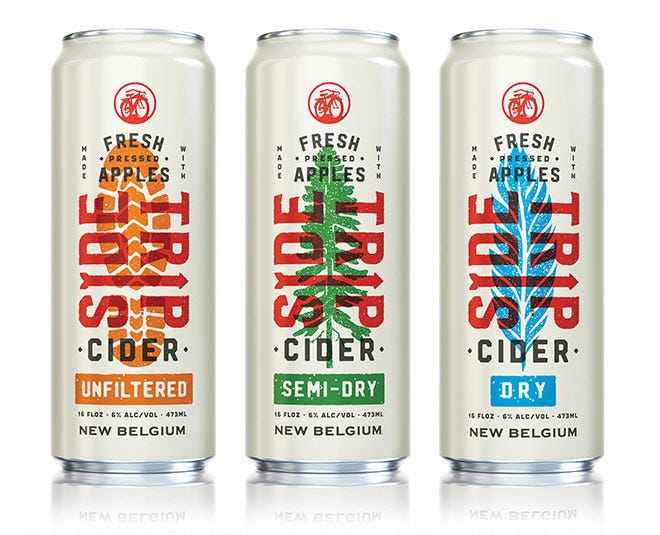 New Belgium Side Trip by Helms Workshop
To establish a direct connection: The level of opacity is directly related to how transparent an object is.
Designers often use opacity to create a sense of depth in design by translating the effects of physical transparency into layers of line, shape, image, texture, and color to achieve a graphic transparency, with the intended outcome of making two or more surfaces or objects simultaneously visible.
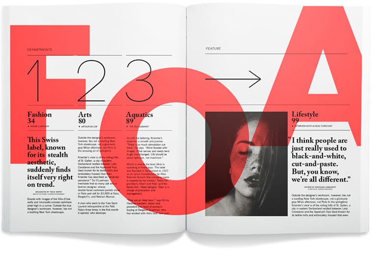 Photo by cosasvisuales on flickr
There are an indefinite number of reasons we design with transparency: To create visual interest, to contrast elements, to create depth. Let’s take a look at 8 reasons in action:
1. Blend color and image
Starting off with inspiration from Milton Bradley’s textbook: Experimenting with transparency channels is one of the easiest ways to introduce color into your imagery. Want to punch up a black and white photo? Add a color overlay. Need to standardize the visual branding of a product? Ditto.
Compared to solid backgrounds, transparent color overlays can look softer while also adding depth. In the below example, a red color overlay was added to a series of photos to retain the product’s (ESPN) branding colors, rather than let the teams’ brand colors compete for attention.
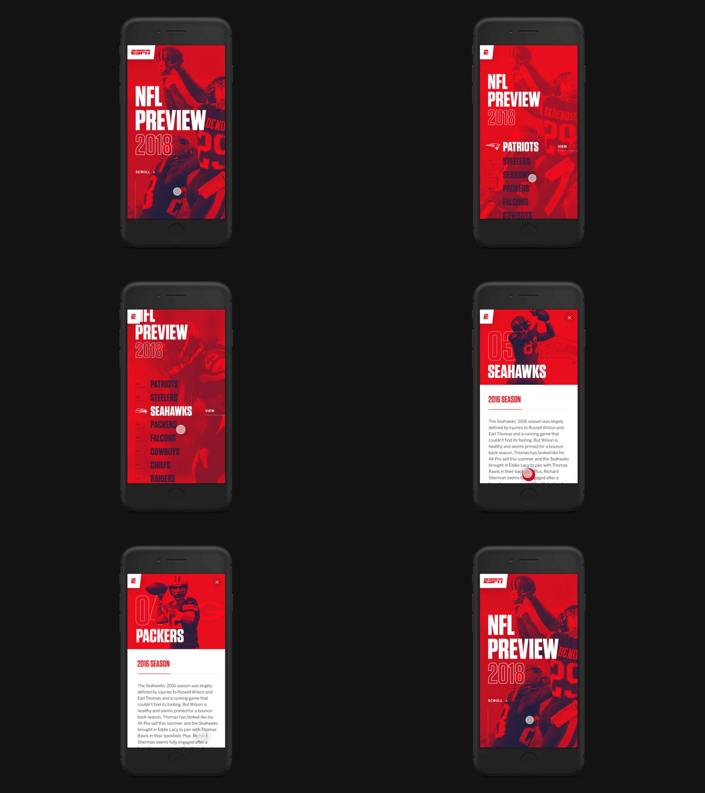 by Nathan Riley for green chameleon
2. Tell a story
Playing with color channels to produce monotone/duotone images, holograms, glitches, and image distortions was identified as a design trend for 2019, in addition to double exposures. Using transparency to overlay multiple exposures of the same subject allows designers to explore alternate expressions, build a multi-level story, and create movement.

Additionally, placing the subject facing right is a classic visual storytelling technique for creating forward movement.
3. Create depth
The obvious benefit to using multiple layers of transparency is to stack elements to create depth. Layering different colors, photos, and shapes not only creates interesting visual effects, but allows you to create a sense of foreground and background in an otherwise flat medium.

This sense of space is intensified when digital motion is involved, allowing designers to push and pull content in different directions from the viewer.
4. Define space
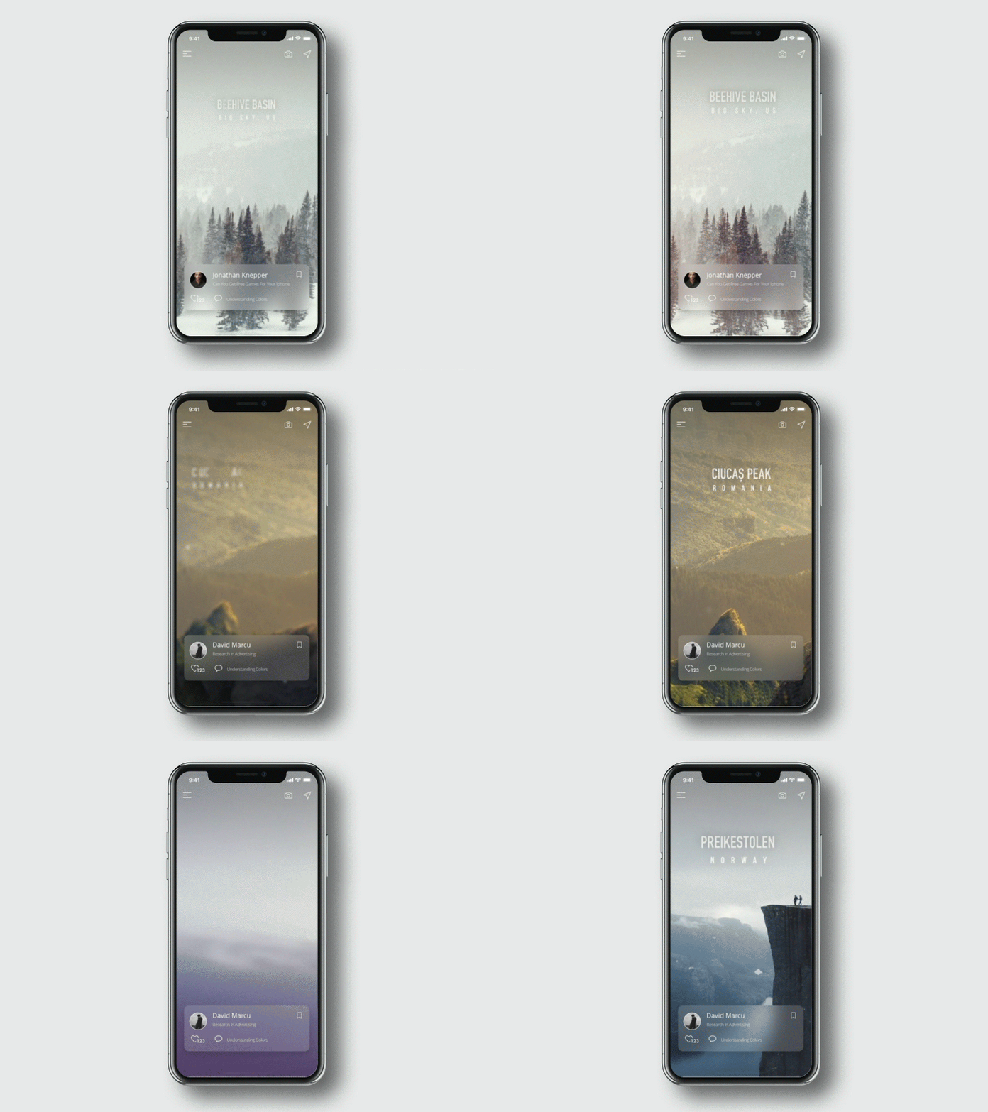
Sometimes, we only have so much space to work with. Transparency can be used to add additional layers to a design, create additional contrast between image and text, or both: Allowing multiple elements to occupy the same space through contrasting levels of opaqueness. Is your background or image too busy for text? Overlay a second, semi-transparent layer on top to create the contrast you need.

5. Communicate states
The more you can see through an element, the more its tangibility decreases. Pairing “barely-there” buttons, for example, with full opacity ones in a UI design can easily communicate the difference between on/off or selected/deselected states for a feature.
 by Oleg Frolov in Interaction design
With the rise of neuromorphic design trends to create clean, simple appearances in UI designs, adjusting transparency is a simple—and minimalist—way to communicate transitions.
6. Show off the goods
In consumer packaging design, utilizing materials with varying levels of opaqueness is a great way to showcase what’s inside the package, giving the product a chance to sell itself. What better way to align with FDA efforts for ingredient label transparency than providing “transparency” related to the package’s physical contents. This is a technique that’s also traditionally applied to print design. For example, layering transparent sheets of substrate to enhance the depth of a design and showcase content on the next page.
 Design by Freddy Taylor
7. Create a focal point
This is a pretty obvious—and likely most important—reason to utilize transparency (or any design principle, for that matter): To create a point of visual focus. Guide the viewer’s eye by creating cutouts or windows for them to look at/through, or use transparency to create contrast on an area of your design to draw attention to it. This is like adding a big pointing arrow that says, “Look at me! I’m important.”

8. Overprint text and image
This one’s my favorite, so I saved it for last. The ability to overprint colors on multiple passes is one of the most exciting features of the screen printing process that digital designers often utilize transparency to recreate.


The interplay of line, shape, color, and texture is really on exhibition in these examples, and the equal focus of image and text adds a depth that comes through in the instability of the background/foreground relationships.
So before you use transparency in a design project, consider why you are using it. And keep in mind that “no substance is wholly transparent, and no material absolutely opaque.”
Originally posted on Jon's Medium page.
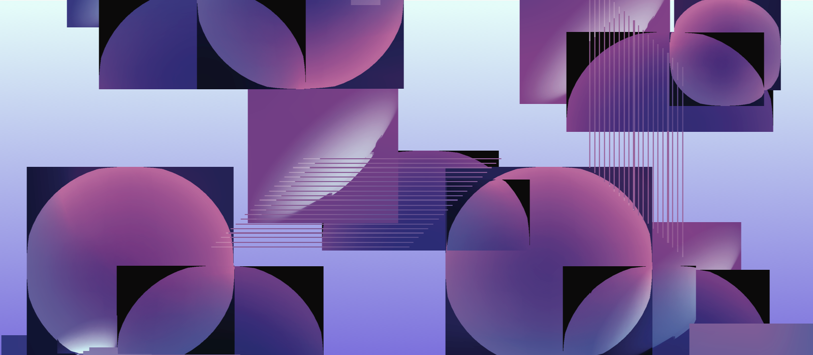
 by
by 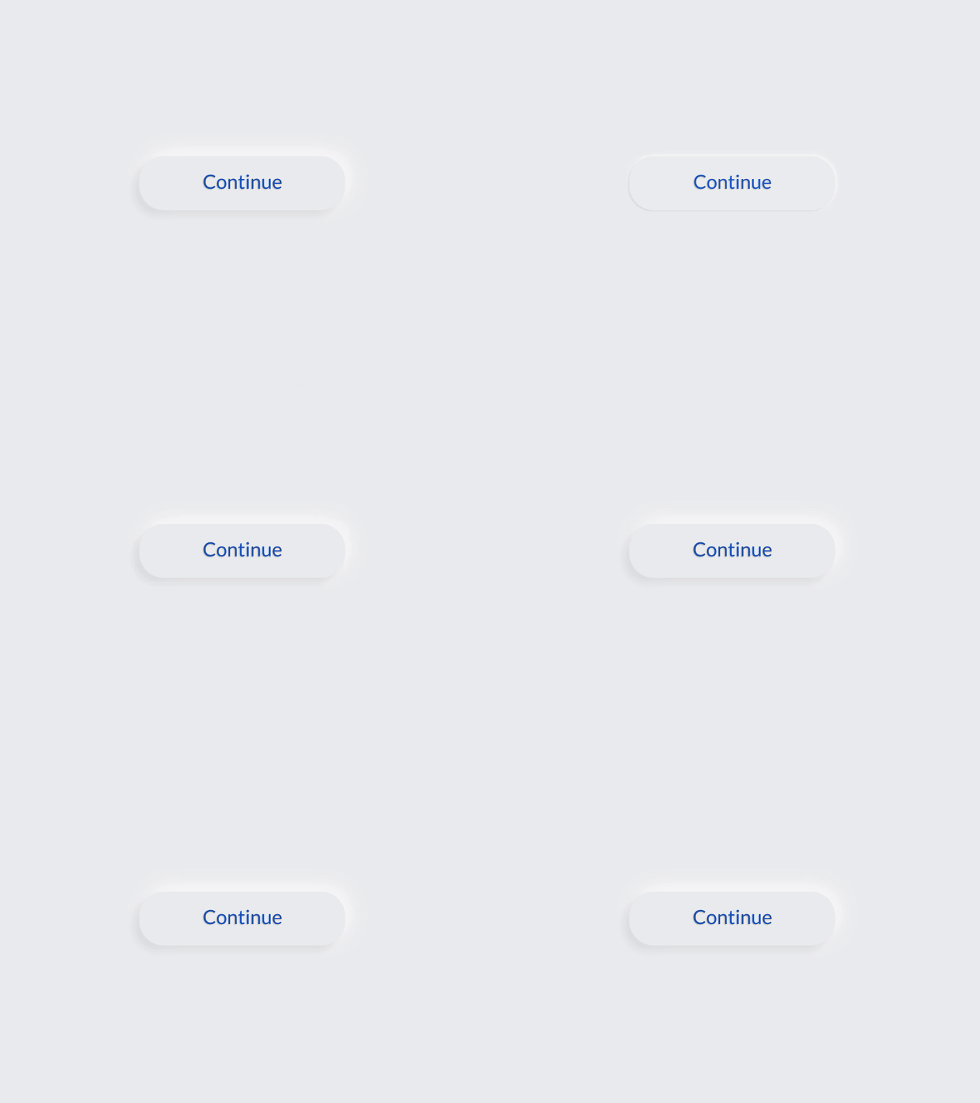 by
by