When designing your marketing materials and website, it can be easy to rest on your laurels. However, if you don’t keep up with market trends, your materials will quickly become dry and outdated. As we charge through 2021, it’s essential to consider what design trends are on the horizon and which are here to stay.
For the rest of 2021, we’re going to be relying on some old favorites like muted color palettes and minimalism. In your designs, create a user-centered experience that evokes a sense of calm and positivity. Below, we will break down the design trends that you need to keep up with this year.
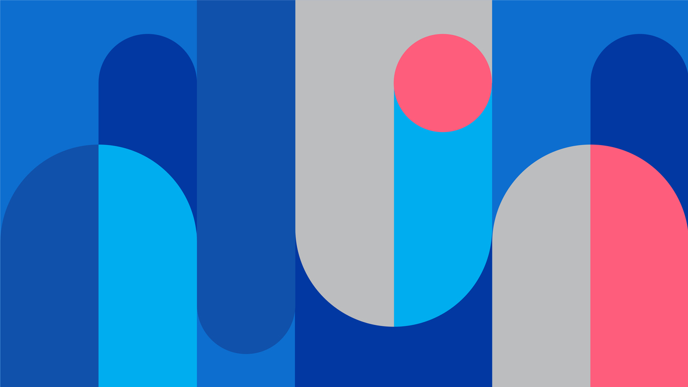
Muted Color Palettes
While this trend isn’t exactly new, it shows no sign of going out of style anytime soon. While we won’t see bold colors disappear entirely, this will be the preferred palette. These colors are peaceful and easy on the eye.
What are muted colors?
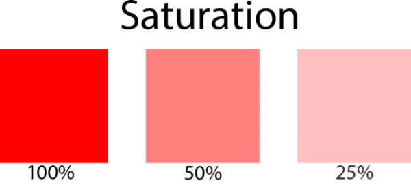
Muted colors have low saturation (i.e., chrome), which makes them appear subdued, dulled, or grayed. Color saturation refers to the intensity or brightness of a hue. The less saturated the color, the more muted it will appear.
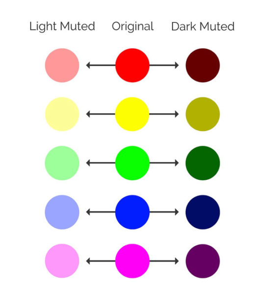
To achieve a muted color palette, you can take a vibrant color and infuse it with black, white, or a complementary color. Because you can go dark or light with muted colors, you still have a wide range of options for contrast and dynamic designs. In collaboration with a UX designer, you can decide on your color palette. You could even use your brand colors as a jumping-off point for your designs.
Why use muted colors?
Health and wellness have been at the forefront of people’s minds this past year. Muted color palettes will reflect this as organic and calming colors that can help engender a sense of calm.
If you do use a vivid color in your design palette, use it sparingly in combination with muted colors. This will help prevent colors from fighting for attention. Don’t feel like you have to use bold colors in your muted designs, however. You can make eye-catching designs using only a muted color pattern.
Geometric Shapes
As you’ll see, as we explore 2021 design trends, minimalism is key. Surprisingly, many brands have started using geometric shapes in their designs— no need for abstract or complicated designs in your visual communication strategies this year. Geometric shapes are great for designers because they are straightforward to create and easy to reproduce.
There are endless ways you can incorporate geometric shapes into your designs. A logo doesn’t have to be complex to tell a story. A well-crafted geometric logo summarizes a brand identity with a simple, easy-to-remember image.
Geometric shapes do not have to be confined to your logo.
They also look great in marketing materials and on your website. If you are setting up your website, you can use Wix or Squarespace to construct your brand. Their templates will inevitably include these geometric designs.
Here are some other ways and places to use geometric designs:
Web & Mobile Designs: Simple geometric designs can create a clean and modern aesthetic.
Graphic Illustrations: Geometric shapes can be stacked and arranged to create illustrations with depth and texture to level up your design skills.
Flat Icons & Illustrations
Along with geometric designs, flat icons will also dominate the design scene. This may be ideal for your UX design because it can be easily adapted across your digital communication strategy.
If you’re using designs across platforms, consider testing them out before integrating them into a campaign. To do this, construct a UX data dashboard for your design team. Icons can be a powerful tool for communication.
Like geometric shapes, this design can also include illustrations. This minimalistic design approach emphasizes usability and features clean, open, and crisp concepts.
Why use flat designs?
Flat icons can be easy to create and are instantly recognizable. Consider the apps on your phone or tablet. Do you look for the name of the app or recognize it based on its icon? Most likely, you look for the icon. Now you can use this flat icon across platforms and be instantly recognizable to all your users.
You can even use icons to differentiate between different types of media, like file types. This will increase the useability of your application or website. You can incorporate these icons across your UX design, whether on a website or your PaaS. What is PaaS (platform as a service)? It is a platform in which the hardware and software are provided by a third party.
Flat illustrations are also a great way to create a simple and practical design. They keep your website, social media, or marketing materials looking clean and modern while conveying a message.
Simple Data Visualizations
In keeping with the minimalistic theme, simple data visualizations will be at the forefront of effective design. When creating a visualization of a dataset, you want it to be comprehensive without any added context. You can use this trend in your external communications but also internally to add flair to your teleconferencing.
What is data visualization, and why is it important?
Data visualization is a graphical representation of data and information using visual elements. These graphic elements can include diagrams, graphs, and charts to provide an accessible way to understand data.
Humans have the remarkable ability to remember pictures. By placing data within a visual format, you make it stand out, and thereby it’s easy to absorb. To facilitate the greatest impact of an image, it needs to be simple. Make your message as simple and straightforward as possible.
If you have a digital workforce, you can use simple data visualizations to condense lengthy reports in the form of infographics. While employees should read all the reports they receive, you want to make sure they take in the most critical information from all the materials you give them. By creating charts and graphs, they can refer to complex information quickly and easily.
Retro Designs
While many decades will be referenced in design trends this year, the 1990s will steal the show. From graphic design to music, artists, and marketing professionals, everyone will draw inspiration from the 90s. It’s possible that the people driving these trends grew up in that decade and are now longing for a reminder of the comfort of childhood. UX design can enhance feelings of nostalgia to draw users in.
No matter your business or brand, you can find a retro design that fits your needs. Here are two different ways to incorporate the 90s in your designs.
Grunge
This design originates from punk, graffiti, and skateboarding culture. It includes less polished elements, like dirty backgrounds and distressed textures. The grunge look diverges from the minimalistic designs that are dominating the market this year.
Pop Culture
This is the genre of design that will come to mind when most people think of the 90s. The pop culture of the decade featured bold and pastel colors with abstract shapes and patterns. The design trend this year will feature some of the pop culture icons like the Spice Girls.
If you’re not sure which retro design will speak to your audience the most, consider using crowdsourced testing. This is the only way to know for certain what your users find the most nostalgic. You can also make assumptions based on the average age of your users. For example, if your demographic is typically 21-40, 90s designs may be the perfect fit.
Conclusion
Of course, this list doesn’t cover all the design trends beginning to gain momentum or are already a staple this year. For example, serif-type fonts have made a significant comeback recently. This design dates back to the 15th century and is still considered fashionable and reliable today.
When constructing your designs this year, don’t be afraid to mix and match. For example, if you are developing a way to market your new business VoIP capabilities, look at how you can use complementary designs. You may decide on a muted palette with a flat geometric design. It may include data visualization that shows how much easier it now is for customers to reach you.
The ability to get creative with your designs means you have almost limitless options. To help you navigate design choices, make sure to meet regularly with your team. Consider using a free online meeting platform to stay connected, even if you are working remotely. You can screen share to workshop ideas and even gain invaluable input from interdepartmental collaboration.
With design trends, some come and go while others are here to stay. Make sure you keep up with the latest trends to ensure your business stays modern and exciting to your audience.

