Whitespace (or “negative space”) is an empty space between and around elements of a page. Although many may consider it a waste of valuable screen estate, whitespace is an essential element in design:
“Whitespace is to be regarded as an active element, not a passive background” — Jan Tschichold
Today, I’ll cover how you can use whitespace in your designs to give it a clean, uncluttered feel.
Whitespace And Negative Space
The term “negative space” originates from traditional art where it used to capture the shape of the object more accurately. Actually, space doesn’t actually need to be colored white — any type of blank space that isn’t in competition with the focus content can be classed as “whitespace.” Since there’s no real connection to the actual color white the terms “whitespace” and “negative space” can be used interchangeable.

“Suprematist Composition: Airplane Flying” by Kasimir Malevich. “Negative space” is the space between elements in a composition.
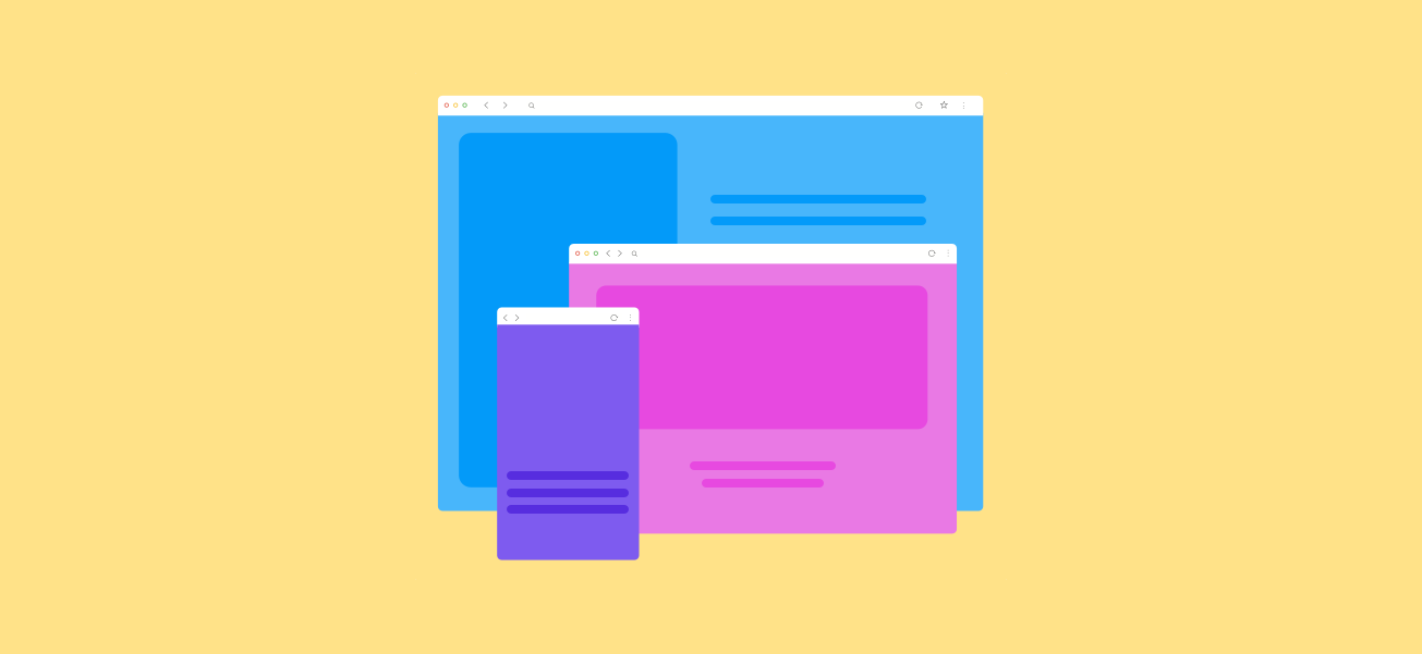
Whitespace In Graphical User Interfaces
Same as traditional art, objects in graphical user interfaces also require negative space — text, buttons, logos and other objects need room to breath. All good user interfaces incorporate proper whitespace values into all page elements from top to bottom. Elements of whitespace in GUI are:
- Margins, paddings and gutters
- Space around graphics and images
- Line-spacing and letter-spacing within text content, space between columns
The whitespace on a page can be every bit as important as the space occupied by UI elements because even empty space serves a purpose and supports the visual integrity of a layout. Whitespace serves 4 essential functions:
1. Improving Comprehension
Whitespace should make both scanning and reading content easier and more predictable.
Prioritize Legibility And Readability
Space between text is important because it helps to define the page content itself. You should optimize your content both for legibility (how well you can discern the letters and words) and readability (how well you can scan the content).
A lab research conducted by Wichita State University confirms that increasing whitespace actually improves reading comprehension, although it may decrease reading speed. As was pointed out by Dmitry Fadeyev:
"Properly using whitespace between paragraphs and in the left and right margins can increase comprehension up to 20%"
Two important things to keep in mind when optimizing your text content are paragraph margins and line spacing(the space between each line). Line spacing can drastically improve the legibility of a body of text. Generally, the larger the spacing, the better experience the user will have whilst reading, although too much can break the unity and make the design disconnected. Again, it’s just about finding the perfect balance.

Left: Everything is pretty cramped, lack of white space puts a strain on the reader’s eyes. Right: Good spacing aids readability. Image credit: Apple
2. Clarifying Relationships
The whole layout arises from the sum of its parts. Content relationships are defined by surrounding whitespace. The whitespace acts as a visual cue.
Group Related Elements Together
When observing how people organize visual information, Gestalt psychologists established the Law of Proximity, which states that objects near to each other appear similar.

The laws of Gestalt dictate that objects in close proximity will appear as one “unit” whereby the white space acts as a visual cue

Information is communicated far more clearly when labels are placed closer to the fields they relate to.
3. Attracting Attention
Many apps and websites suffer from cramming too many elements and information together without enough breathing room.

Cluttering your interface overloads your user with too much information. A cluttered page is unattractive and doesn’t make users want to read the content, especially when there’s no visual hierarchy.
If cluttering your interface overloads your user with too much information, then reducing the clutter will improve comprehension: by removing distractions, you force users to focus only on what’s immediately visible.
Lead Users Eye’s Towards Relevant Content
There’s a relationship between a distance and attention — larger distance forces attention. The lack of other elements will only make existing elements stand out more. Use whitespace to your advantage to draw wandering eyes onto certain page elements. Extra padding around a particular segment of content forces user’s attention onto that area because there’s nothing else on the screen to draw attention.
"The more whitespace around an object, the more the eye is drawn to it."

Mailchimp, as you can see, is a big advocate of white space in their designs. When quickly scanning your eyes Mailchimp’s homepage it’s quite obvious that the ‘Sign Up Free’ button draws your attention almost immediately.
Create Visual Hierarchy
When whitespace is used appropriately, it allows a page to create a general flow and balance, which in turn helps communicate the intent of the design.
"As designers, it’s our responsibility to create usable communication vehicles."
Whitespace can support the overall hierarchy. It produces either symmetry or asymmetry. Symmetry creates memory and harmony, while asymmetry draws attention. Asymmetry is great for bringing attention to a particular area on the page or a particular element in the page. When an element uses asymmetrical space, it stands out against other surrounding elements.

When an element uses asymmetrical space, it stands out against other surrounding elements.
4. Creating Feeling Of Luxury
Although whitespace is often considered a technique for improving user experience, it can also be used for purely aesthetic purposes. Designers use whitespace to create a feeling of elegance for upscale brands. Coupled with a sensitive use of typography and photography, generous whitespace is seen all over luxury markets. Whitespace can add a feeling of sophistication and luxury into a generic page by creating the feeling that the product is more important than the real estate it lives in.
"Let the products speak for themselves."
Conclusion
Whitespace isn’t an empty canvas, it’s a powerful design tool. Whitespace can be hard to master: the application of whitespace is both art and science. Truly understanding how much whitespace should be used to create a good layout requires practice. The more you design, the more you’ll learn.