

Cheatsheet summarizing my approach
I recently worked on defining the spacing system for Practice Fusion’s EHR (Electronic Health Record) product, to ensure improved readability and consistency across all pages. I came up with 3 spacing rules (hint: rule of 3 C’s) and 4 spacing values, which worked harmoniously well with the new typographic system.
The problem
"When positioning elements vertically, the designer has to make decisions that never should be left to chance or be random. Too often, designers rely on vertical increments made possible in Photoshop by holding shift and arrows keys: “I use 5 or 10px, it depends.” This approach is acceptable horizontally, as columns are multiples of 10, but it doesn’t conform to any typographic reality." - Robert Bringhurst (Author of “The Elements of Typographic Style”)
- We were using 5px, 10px, 15px, 20px margins / paddings for spacing in Practice Fusion’s EHR product. We were not following any strict guideline around when to use each of these spacing values.
- Margins / paddings are just one piece of the spacing puzzle. Line-heights of type add considerable space in the UI too. We had not established line-height values for any of our (old) type styles. So, the UI developers had to assume line-heights and supplement it with extra margin / padding values such that the overall space matched the design spec. Due to this approach, adhoc margin / padding values were getting added across product.
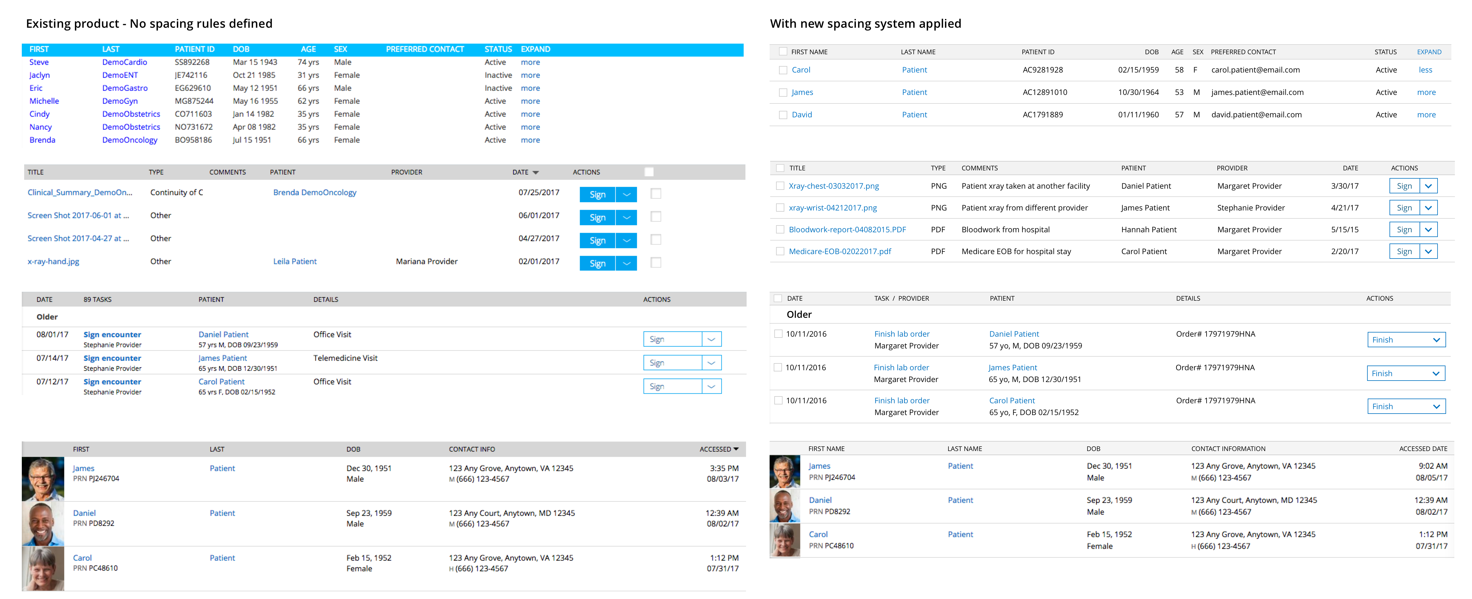
- Similar components and content looked quite different across product. That gave an overall inconsistent appearance to our EHR product and hampered a smooth reading experience due to data density issues.
The beginning
"Don’t compose without a scale. Type should actually be the scale that defines almost everything else." — Robert Bringhurst
Type (line-height) is the first piece of the spacing system puzzle.
Step 1: Determine body text line-height (& baseline grid that works)
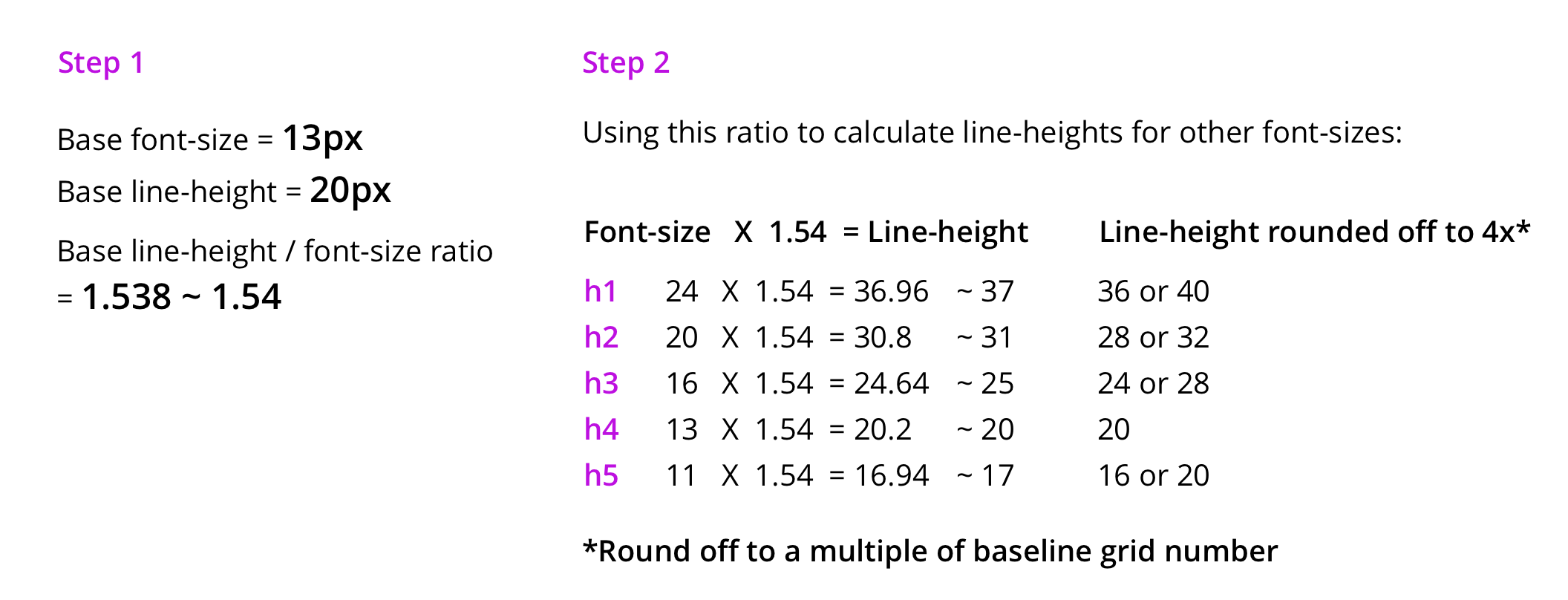
I started with a hypothesis that the very popular 8-point baseline grid (ie multiples / factors of 8 spacing) was going to work. So, in my experiments, I paired my base body font-size of 13px with line-heights which are multiples of 8 — 16px and then 24px to see if any of these values worked. Both of these values did not work — which meant that 8-point baseline grid was not going to work.
I then paired my base body font-size of 13px with even line-height values between 16px and 24px. At first, I paired it with 18px (a multiple of 6). If it had worked, it would have meant I was adopting a 6-point baseline grid aka multiples / factors of 6 spacing (aka spacing values like 2,3,6,12,18,24..). Then, I tried out 20px line-height. It worked perfectly well and that’s how it was clear to me that I was adopting the 4-point baseline grid aka multiples / factors of 4 spacing (aka spacing values like 2,4,8,12,16,20..).

Step 2: Hick’s law & geometric progression to determine spacing values
“As the number of choices increase, it becomes exponentially difficult to make a decision.” — Hick’s law
To come up with a predictable system that simplifies decision-making, keep number of values to the minimum required.
- Spacing values are factors or multiples of the baseline-grid number (4, as determined in step 1). So, my spacing values were going to be from this set (2,4,8,12,16,20,24,28,..).
- Typically up to 4–5 values seem to provide enough variance and still seem sufficient even for a complex enterprise product, but you can add more intervals if you really feel the need during explorations.
- I decided to select the first 4 values derived using geometric progression as it provides better visually perceptible intervals (excellent for showing hierarchy). So, my spacing values were going to be (2,4,8,16).
Refer to Nathan Curtis’s Spacing in Design systems post for his analysis about picking values.

How do I apply these spacing values in a predictable way? Rule of 3 Cs comes to your rescue.
I was heavily influenced by the spacing vocabulary like Insets, Stacks & Inline introduced in Nathan Curtis’s above post. I decided to build an additional layer of vocabulary on top of it, to make it easier for my team to understand the context of use for each. I broke down all spacing rules into 3 C’s: Containers, Content & Components.
- Rule for Containers uses the concept of Square Inset (uses 16px)
- Rule for Content uses the concept of Stack (Header stack uses 2px and leaf-node stack uses 0,4,8,16px depending on content type)
- Rule for Components use the concept of Inline (uses 8px for most cases, 4px for association relationships)
1st C: Rule for Containers
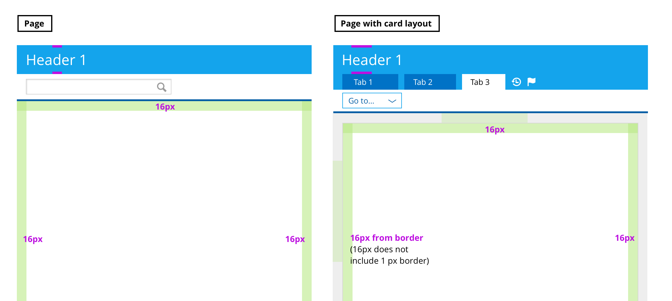
Containers are frames in your UI which hold content in them. Typically these are pages, cards, modals, panes, etc. Since containers are at the highest level in hierarchy, I made sure all containers got the highest spacing value (16px in my case) all around (also defined as “square inset” by Nathan). Tip: Never include border in any spacing calculations. (A good explanation is provided in Elliot Dahl’s 8-point grid: Borders and Layouts post.)

2nd C: Rules for Content
Content lives inside the container. Content contains:
- headers (h1,h2,h3,h4,h5)
- interspersed with data in the form of paragraphs, lists, forms, tables (which appear at the end of the header hierarchy, and hence referred as “leaf-node” going forward).
All this content is stacked vertically using margins. But the type line-height adds extra spacing to the specified margins too. Nathan mentions in his article about solving these collisions with line-height using a mixin. I could not figure out how to do that in a consistent way, so I created my own way of handling stacks by taking in account the line-heights as well as margin spacing simultaneously. Here is my process:
A) Solve header stack first
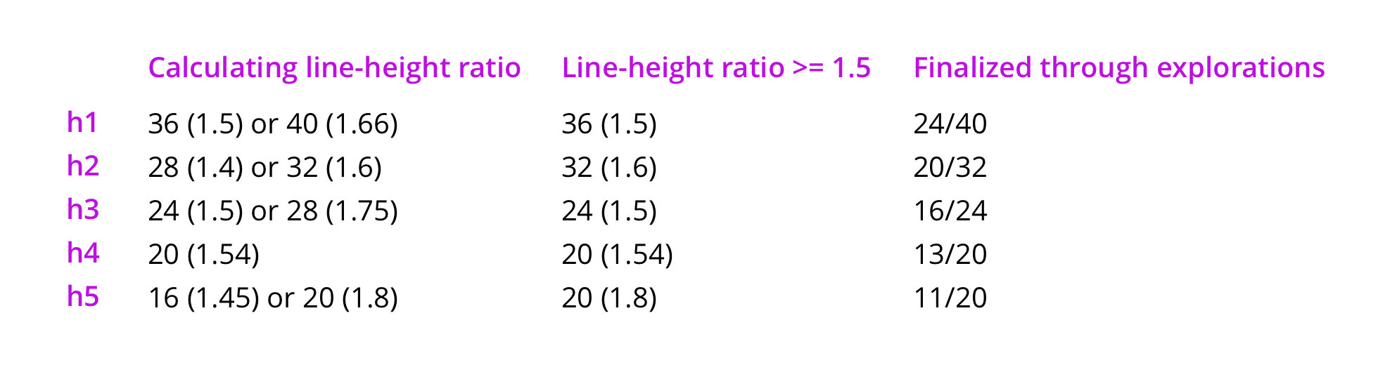
- As you can see in the image below, I started with 2 options for line-heights for headers. For more details on how I got to this, read my typography system post.
- To simplify decision-making between the 2 options for each line-height, I calculated line-height ratio for each and decided to work with line-heights equal to 1.5, or more than that. I was still on the fence about few options. But, after doing visual explorations and reviewing the outcome within design team, we got to a place of clarity about which line-height option to adopt.
Process of visual explorations
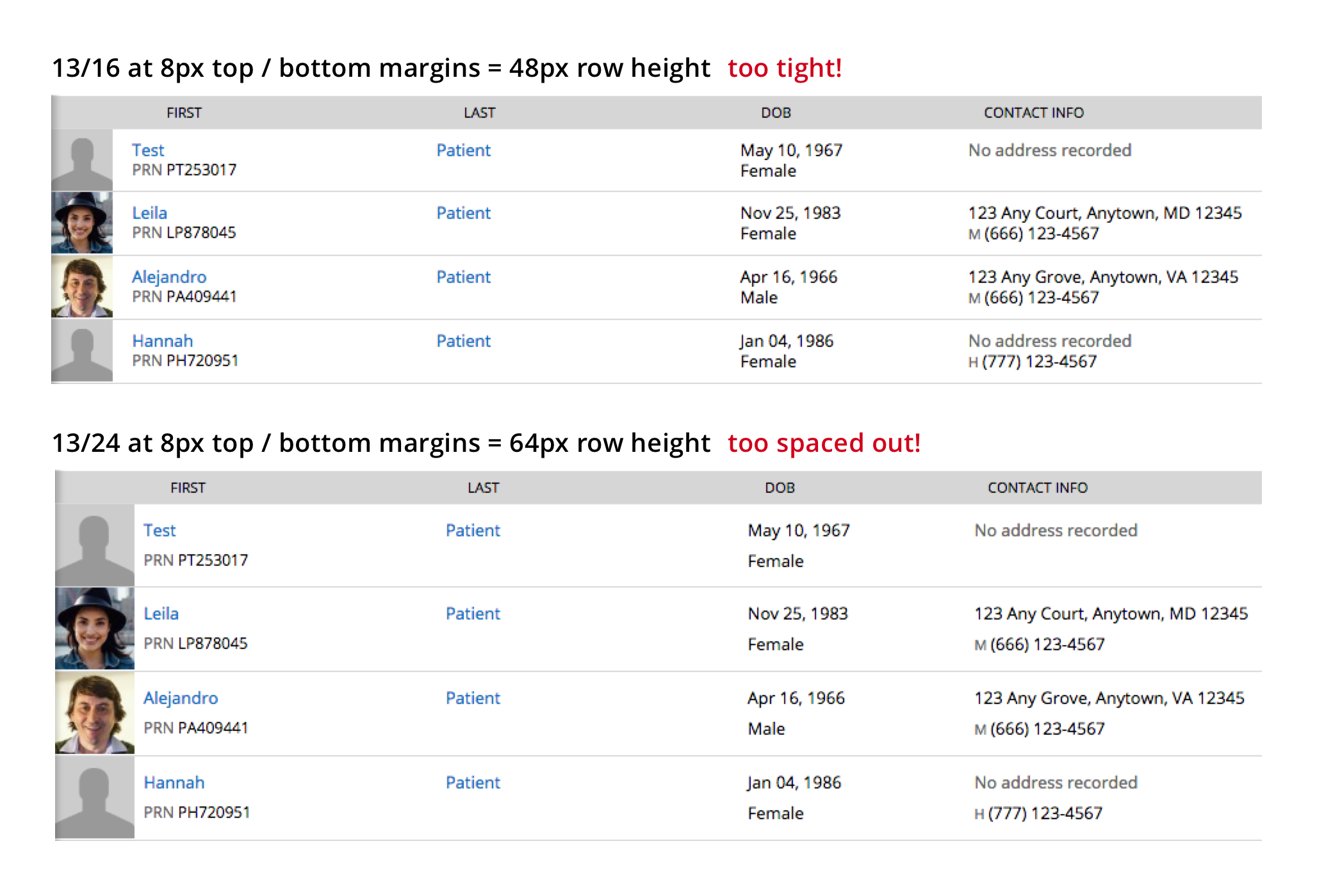
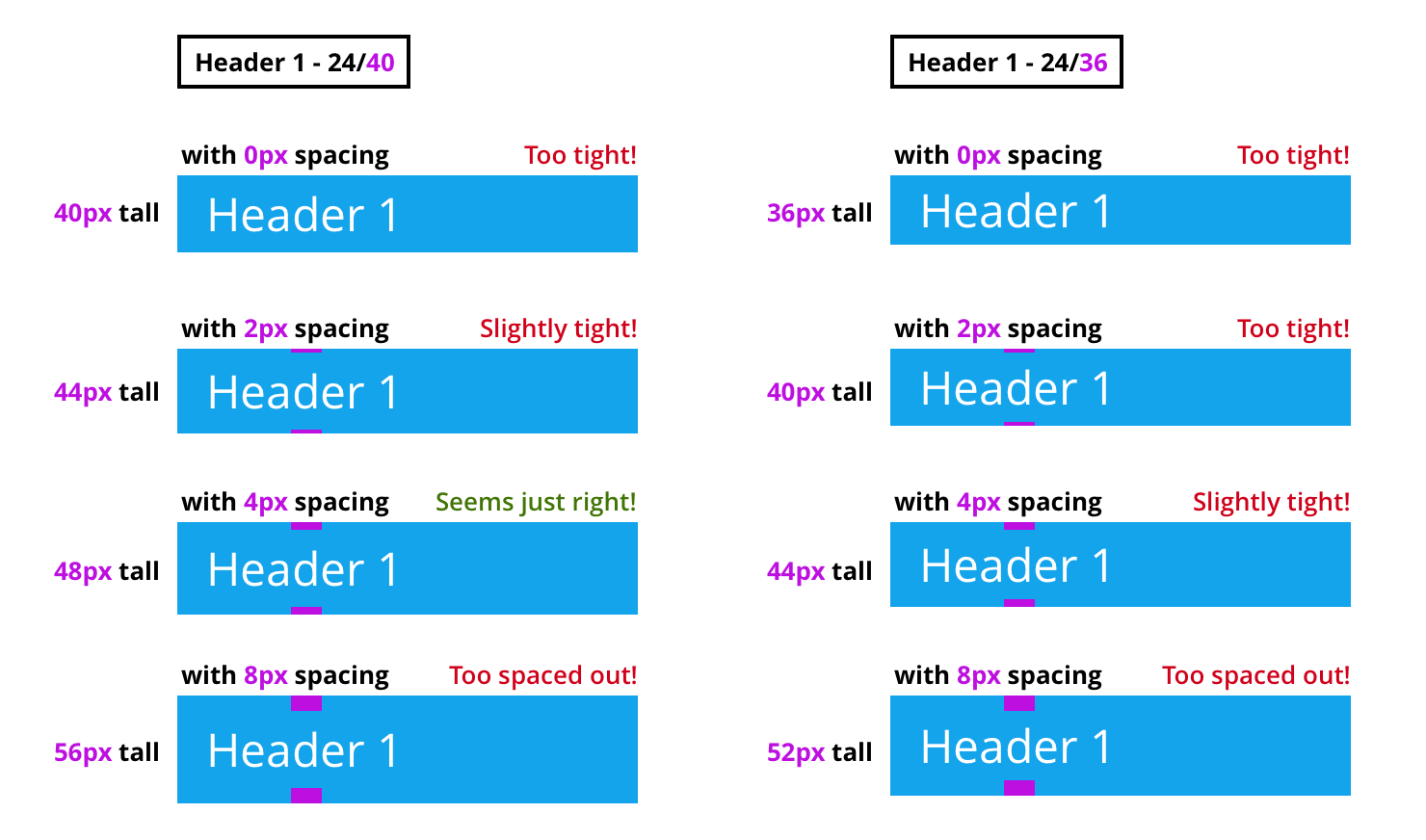
- I started with h1 at the top of the header stack and experimented with different spacing options starting with flush (0px), 2px, 4px, 8px. Most spacing options with line-height 36px felt tight, but 4px spacing with line-height 40px felt just right!
- I tackled h2 next. In our product, h2 happens to be the first header in the white page container. So by the rule for containers, the topmost h2 got 16px at the top. I decided to give 16px spacing (maximum allowed spacing) on top of all h2s because that value made parent section hierarchy super clear.

- Next, I experimented with spacing values of 0px, 2px, 4px and 8px between all headers (h2,h3,h4,h5) and leaf-nodes (lists, paragraphs, table, forms). Spacing outcomes of 2px and 4px felt close enough, but 2px margins felt slightly better as we reviewed the outcomes internally within design team. Try to stick with just 1 margin value as much as you can, as it simplifies design as well as development process.

Header & leaf node spacing experiments

Header stacks — spacing with 2px and 4px
B) Solve leaf-node stacks next
Practice Fusion’s EHR has 4 main types of leaf-nodes:
- Tables (almost 50% of the product)
- Lists (almost 30% of the product)
- Forms (probably 15% of the product)
- Paragraphs (probably 5% of the product)
I started addressing spacing for the simplest content type first?—?paragraph.
Spacing within each paragraph
This was the simplest?—?simply flush all lines of text in a paragraph such that there is 0px margin between 2 lines. Everything that did not look like a list (example, 2-line content in table row), got paragraph spacing too.

Typesetting paragraph in Sketch (Line height of 20px was derived by doing visual explorations and validated using the WCAG SC 1.4.8 which states “Line spacing (leading) is at least space-and-a-half within paragraphs” (20/13 = 1.538)
Spacing between 2 consecutive paragraphs
My first impulse was to use spacing equal to line-height = 20px. But then, I came across WCAG SC 1.4.8 which states — “Paragraph spacing is (at least) 1.5 times larger than the line spacing — by that we mean that the spacing from the top of the last line of 1 paragraph is 250% farther from the top of the first line of the next paragraph.*” Assuming that the % values are calculated with respect to the base font-size of 13px, I calculated that the actual spacing between 2 paragraphs should be about (ps — ls) = 13px, which will be defined in CSS using margin-bottom: 13px. Now, 13px is not one of the spacing values we determined in step 2. So, I chose the closest spacing value more than 13px i.e. 16px for my margin-bottom for paragraphs.
* I found these 2 guidelines not aligning in values, but very close enough. I interpreted the first line as ps = 1.5 x ls = 1.5 x 1.5 x 13px = 2.25 x 13px. The second line interpretation: ps = 2.5 x 13px. If any of you are interpreting these guidelines in a different way, do let me know in comments.

Interpreting the paragraph spacing clause in WCAG SC 1.4.8

Typesetting multiple paragraphs in Sketch
When in doubt about calculations, I always cross-check with visual explorations. 16px spacing between paragraphs worked best as compared to other possible values. (I thought that 12px spacing worked even better. But, I did not want to add an additional value to the spacing system just for this use case, as our EHR product does not have many paragraphs and hardly any consecutive paragraphs.)

Spacing within list items in a list
A list is a data structure made of multiple items of homogenous data. Since a list groups all these homogenous data items, it is important that the list items are not spaced apart like paragraphs (with 16px in between them), which typically hold heterogenous ideas. At the same time, the list items still need to be spaced apart a little bit — or they might end up looking like 1 paragraph. So, I experimented with spacing between 0px and 16px. I had just 3 values to experiment with — 2,4 and 8. Total 4px spacing between list items looked the best for hierarchy.

Spacing between 2 consecutive input fields with labels
Forms have consecutive input fields stacked one below the other.

Spacing between 2 consecutive input fields without labels
Not having labels is not a good practice for accessibility. Yet, in certain situations, it seems like it is best to not display labels in UI (but continue to declare labels in implementation to ensure accessibility and hide them out of viewport using huge margins). These scenarios are:
- When multiple input fields together imply 1 object (example, in Address section below, “Address” fieldset legend groups street address 1, street address 2, city, state, zip)
- When label is too obvious / repetitive to be spelled out (example, Search bar or Query builder)
In such situations, depending on whether you are using fieldset legend or not, different spacing works. Since fieldset legend groups fields to imply 1 object, it uses less spacing (8px). However, when you don’t want to logically group input fields as 1 object, more spacing helps (16px) — just like consecutive paragraph spacing.

Spacing inside tables
Tables are very useful for grouping data of similar type — just like lists. However, tables are used when data is much more dense and has many attributes. And so, spacing considerations for table are slightly more than list spacing. If the data is spaced too close, it can be difficult to read through an entire table row, without getting distracted by adjacent row data. By having 8px between table text and table row borders, we get a total of 16px spacing between text across 2 rows. This is again very similar to our consecutive paragraph spacing of 16px.

3rd C: Rule for Components
Components are buttons, input fields, icons, etc. These components are often placed next to each other horizontally (inline). Also all components were sized with dimensions as multiples of 4 (also of 8). So buttons and input fields had an internal space of height 24px (and together with 1px top and 1 px bottom border, the overall height was 26px). When individual components and type sit perfectly on baseline grid and is proportionately spaced, overall layout is perfectly aligned and harmonious.
Spacing 2 components
I used a simple rule of applying 8px for spacing between any 2 adjacent components most of the times. For a few cases, I decided to use 4px to show a tighter relationship between 2 components (Gestalt’s law of proximity).

Inline spacing of 8px (pink) and 4px (orange)
Spacing inside components
I used 8px consistently for any left / right paddings inside components.

Design Spacing inside components with icons
Once again — applying Gestalt’s law of proximity, I grouped icons inside a component, by spacing them 4px apart — instead of the usual 8px.

Spacing components from outside icons
If an icon is associated with a component, it is spaced at 4px from the component to show association relationship (Gestalt’s principle of proximity). However, if an icon is associated with a set of components, then it is spaced at 8px from the last component to clarify that it is not associated with just the last component, but the entire set.

In conclusion
By following this process:
- You will come up with a design spacing system with limited values and limited application rules (Hick’s law)— which are very easy and logical to remember (Gestalt’s principles of proximity).
- You will be using design spacing in your UI such that it respects information hierarchy and also adheres to accessibility guideline WCAG 1.4.8. This will allow people of different abilities to track and comprehend information more easily.
- I might sound like a broken record here, if you have read my typography system post. But, I will repeat it here — Design-dev handoffs will become faster as the developers will also know all the rules of application of design spacing system and be able to predict spacing in mocks delivered by designers.
- Designers may not need to redline everything. Developers will not need to spend time in inspecting mocks in other tools like Zeplin.
What’s next?
I will be diving into designing accessible color system next. Stay tuned (by following me)!
You can also follow me on Twitter. Thank you for taking the time to read this far!
Useful articles for reference:
Though there are plenty of articles touching on why white space is important in design, I did not find a lot of resources explaining a systematic practical approach to handle design spacing.
- https://medium.com/eightshapes-llc/space-in-design-systems-188bcbae0d62
- https://builttoadapt.io/8-point-grid-borders-and-layouts-e91eb97f5091
This article was originally published on Priyanka's Medium page.
