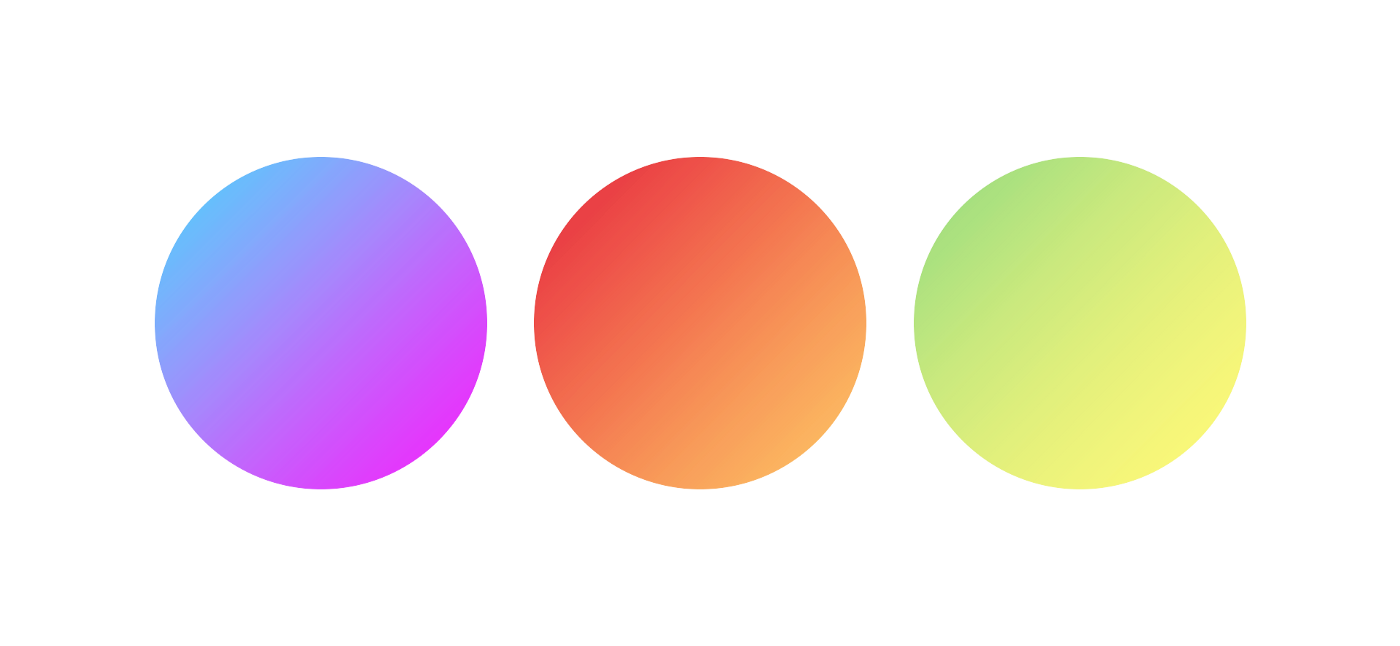
Colors are one of the most important and powerful elements in design. Since design is an evolution, our perception of colors (and the ways we use them) is ever-changing.
I’ve noticed that there is a new and fresh trend in design that involves a prominent use of gradients in UI, branding, illustration, typography and more. It seems like we got bored of all the existing colors in the world, so we started to create new ways to use them.
A gradient is created by using two or more different colors to paint one element< while gradually fading between them. Gradients let designers create something that feels like a new color. A tone which didn’t exist before, something that looks unique, modern and refreshing.
Is this going to be the new way we use colors? Are flat colors old-fashioned now? Only time could tell because anything new these days is considered a “trend”. We all know that most of the trends change over the years, and lots of them will become old-fashioned themselves. And then Instagram might change their logo again. ?
Why are gradients so trendy?
1. Gradients are memorable
Gradients are something we don’t see a lot, our eyes catch them as something new, and being memorable is exactly what you want for your design or brand identity. We remember these unusual visuals much better because we aren’t used to see them yet. We are surrounded by a very limited amount of usual and flat colors, we all know them since we were babies and we recognize them in an instant.
Our language to describe colors is limited to a specific perception structure. So if suddenly we see something which we can’t name as “blue” or “purple”, we remember it. We remember it like we remember the first time we traveled to a new place or the first time we tasted something new.
2. Gradients are unique
Let’s be honest, there are not enough different colors in the world in order to let brands create their unique identity. I think there are around 20 common colors we can actually name and recognize, while on the other hand there are hundreds of thousands of brands trying to create their own unique identity. You can’t choose blue because Facebook already did, so you try a different blue and you realize that Twitter took it. Not enough colors for everyone?
That’s where gradients change the game. Designers can fade multiple different colors and the use of gradients actually adds a lot of more options to the amount of “tones” available. The amount of brands that use a “Blurple” (a gradient between blue and purple) is really small, so that gives brands the opportunity to obtain a unique color identity.
3. Gradients feel realistic
I’ve noticed that in the real world, where a circle doesn’t exists but a ball does, we see way more gradients than flat colors. Every lemon has its shady half which is more brown or green. Same in flowers, the sky, different materials, and more. They are all painted with gradients. Maybe it might be more natural and logic for our eyes to see gradients also on our screens.
4. Gradients are just more colorful and playful
People love colors. We are attracted to colors by our nature since we were on the hunt for fruits and flowers for too many years. Eventually those natural things were designed by nature itself to be as colorful as possible in order to attract us and other animals. So this is another winning point for gradients, since they basically got the potential to be more colorful, playful and attractive than a flat color.


