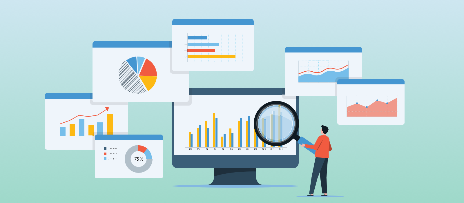
At New York Public Radio (NYPR), we have a variety of brands and digital products such as WNYC, WQXR, WNYC Studios, etc. This year, our digital team is updating the experiences of our brands with a more consistent UX to better serve our diverse audiences. In order to do that, we are looking at the data to understand how our users interact with our digital products today.
Why make a UX data dashboard for designers?
It is important to look at how your digital experiences perform to identify patterns and trends. This is not meant to take away from the value of generative user research which is valuable if you want to understand your user’s journey and identify those underserved user needs. With data, we can get a sense of what users are actually doing and how they use our digital products. Keeping track of these behaviors and patterns and how they evolve over time can help inform new ideas for user research.
“To design an easy-to-use interface, pay attention to what users do, not what they say.”
~ Jakob Nielsen
For our team, designing for multiple brands within a large media company can be challenging when data and insights on user behaviors can easily be siloed amongst individual teams rather than shared broadly. Additionally, having a four person design team means that we need to be able to draw relevant insights in a way that enables quick decision making.
As a design team, we strive to be human-centered and data-driven. As much as we love spending our hours mining Google Analytics for information, we need a better way of keeping track of how users are finding us and interacting with our experiences. Having something tailored to our team’s data needs would save us time, confusion, and maybe a few tears. Also, it would provide us with visuals using the latest data for any spur-of-the-moment proposals or presentations. Luckily, most of our team has prior experience with data dashboards. For these reasons and with the help of my prior experience, I created a UX Data Dashboard and took an iterative approach to this process.
Process for making the data dashboard
Surprisingly, there are not many articles around creating a data dashboard for Design and UX teams. Below is the process I followed for the creation of the dashboard.
- Define: What are the goals, objectives, and data points that the team wants to track? What questions typically come up when you start a new design project? This will help you think about what data you need and how to format it so that you can quickly extract these insights. This is also a great way to make sure you are incorporating your team in the process and starting to get feedback on the final output. Keep in mind, you might not answer all the questions in the first design of your ux data dashboard and that is okay!
- Research: Once you have questions that you want to answer, figure out where and how you can access the data you need. For this, I collaborated with our data team, engineering team, and product managers. In some cases, I reframed our original questions as we discovered gaps in the available data.
- Select a Medium: Determine the best medium for creating a UX data Dashboard. There is no right answer here, but it is important to think about what will work best for your team. You do not want to create more manual work in the future so find something that will automatically update and be ready to use when it is needed. We use Google Data Studio because it seamlessly pulls from Google Analytics (GA) and our data warehouse. We also add links to our qualitative studies for quick reference.
- Explore and Experiment: Take time to experiment with the data and see what you can do with it. We have multiple properties that we track via GA and we need a way to holistically view performance. After a few tries, I was able to get a view of how the number of sessions varies overtime for 5 different brands.
- User Testing: After creating your first “design” of the dashboard, do a quick user test. See how quickly your teammates can extract insights from the data and ask if there is any additional data that is needed for better context. Some of my teammates pointed out redundant information or gave me tips on how to better structure or visualize the information to support our team’s needs.
- Validate your data: Collaborate with other teams such as engineering or data & research to make sure you know exactly what your data is telling you and that it is the right information. For example, thanks to our engineering lead, I learned that ‘Search Queries’ in GA are actually just what users search within our sites. To get the search terms that bring people to our sites, I had to access Google Console data. From our data team, I now know that it is better to look at some of our data by ‘sessions’ rather than ‘pageviews’ due to how each one is counted in GA.
- Share it out!: Make sure you give your team an onboarding to the final design and make it easily accessible.
Our result from this process:
Many of the questions from the first step made it clear that our team wants a quicker way to compare data across different brands. While GA provides a lot of data for each of our properties, it is difficult to do comparisons between two or more.
To address this need, the first page on the dashboard is an overview of key data points across our 9 unique digital properties. At first glance, we can quickly see and compare the following:
- Session durations
- Bounce rates
- Top search terms
- Popular days/times
- Traffic sources
- And more
Following the overview page, there are additional pages for each brand. For brands that have mobile apps, I merged that information onto one page. For each brand page, the information is the same as above, as well as:
- Pages per session
- Number of page views by new and returning users
- Top articles
- Landing pages
- Exit pages
- Devices
- User demographics
This is just the start and we are continuing to iterate on the content and structure of the dashboard based on the team’s needs.
Some things to consider:
- Build upon what exists and works for your team: We already have a repository where different teams are documenting any new surveys and qualitative studies. Rather than reinventing this, we incorporate links to the repository into our dashboard.
- Start with an MVP = Minimum Viable Product: An MVP is the lowest effort product you can build that can deliver the most amount of value. Of all the questions and data points identified by the team, which ones are the most needed and easy to answer? This helps ensure you do not put in too much work to then have to completely rearrange the dashboard.
- Keep it Agile: Do not try to make it perfect the first time and keep it agile by iterating as you get feedback. We made an MVP and will see how this works for a few months. As we go along, we will keep track of what works and what needs improvement. I have already made a few updates in the past month based on requests from the team!
- Beware of research paralysis: It is easy to get hung up on the data and spend a lot of time making it “perfect”. There are many ways to look at the data and many edge cases to consider. At some point, you need to start with just enough to provide value and add as you go.
Hopefully, this helps your team get started on a UX Dashboard. We are constantly iterating on ours and it has been really helpful for our Design team thus far. Happy dashboarding!
Originally written for Air Break, from the Digital Team @ New York Public Radio and posted on Daniela's Medium page.


