It’s often said that actions speak louder than words, and while goal-based and qualitative user tests are a key part of the design journey, sometimes the most informative test of all, is to watch a user interact organically with your design.
Instead of taking notes or trying to manually spot the insights, heatmaps record what the user does in a highly visual way - collecting interaction data on where your users roam around and what they try to do when in a user test.
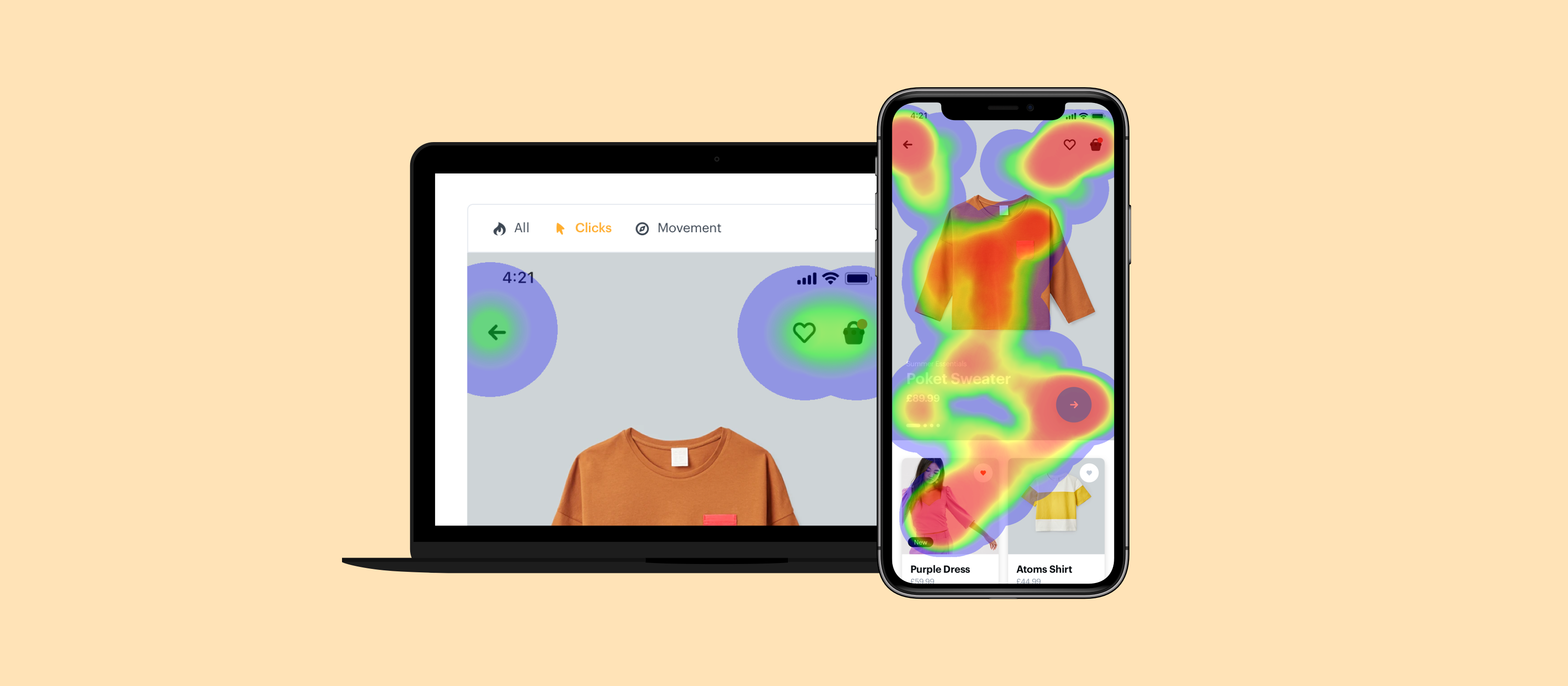
Heatmaps shows you a visual representation of mouse movements and clicks from your user tests. The longer the mouse hovers or spends in a particular area, the “warmer” the colour of the spot will appear, with red at the warmest end of the scale, and blue at the coolest.
Where an audio or video recording captures the user themselves (their voice, facial expressions and reactions), heatmaps records how they interacted with your prototype beyond simply where they clicked. Watching what they do, especially where they don’t get it right straight away can tell you what to change to improve your UX. Wherever you see patterns where users habitually mess up or click on the wrong thing first, or even hesitate while searching for something on the page tells you where there’s friction that ideally a design tweak would smooth out.
Heatmaps gives you a type of visual highlighting that make the insights spring off the screen, allowing improvements to the UX to be made based on actual interactions.
See how your design performs
At the simplest level, heatmaps can help you understand the usability of your design, and pick which versions of your design work the best. Heatmaps might give you insight into whether some screens in your design are sub-optimal. You might see for example that users are scrolling up and down searching for the button before finding it, or spending a lot more time in some areas than others. Depending on the mouse movement patterns, increased time spent on a page could indicate either increased engagement, or confusion. Heatmaps allows you to tell what’s going on in the UX, pick the best performing designs, and make optimisations.
With goal-based user-tests, heatmaps can give you insight into how easily or smoothly the user was able to reach the goal. For example if the goal was to search for a hotel booking for Spain, you’d be able to see with heatmaps whether they navigated straight to the search bar with no issues, or whether they got confused, waylaid or off track. Even an extra second or two to navigate to something in the design can have an impact on the final product, and heatmaps allows you to get that insight about where something might not be totally clear.

Which CTA gets the most clicks
Call-To-Action performance and improvements is a key part of the user testing journey. With heatmaps you can easily see which CTAs are being missed or passed over, and which ones are performing well. When you know how the various CTAs are performing, any improvements to the conversion journey through the product can be made.
Problem clicks are also something that heatmaps can help you identify. So if something looks clickable, you should see users click it several times, hovering there without anything happening before moving on. Where your user tries to click (as well as where they skip past and ignore) all gives you insights into optimisations and changes to the design to improve the UX.
Use heatmaps to review your navigation
One of the things most designers want to test out with real users, is how simple and clear the navigation menu is.
Is it easy to find in the first place, can the users easily “discover” it on their own?
Then once they get there, how many clicks do they make before they find what they’re looking for? You might find out through heatmaps data for example that a number of your users click on an option in the menu, only to go right back to choose something else. That might tell you that there are some ambiguously named items in the navigation bar that are leading some users to expect to find something else when they click there.
Lastly, users that quickly skip over some sections might indicate they’re too cluttered or confusing to figure out, and the user has moved on in search of a broader overview of the product. Any unwanted friction in users navigating to where they want to go might lead them to drop off without converting, and teatmaps reveals those friction points to be ironed out in the UX.
Combining heatmaps with other metrics
User Testing in Marvel also gives you audio and video recording of the user, time spent on screen, and the ability to link to a survey within a prototype. Each of those different elements gives you a rich set of insights from different angles.
Heatmaps lets you see how they move around a screen, while the audio and video recording layers in their vocal reactions and facial expressions. The time spent on screen might indicate where there was any friction, or where users typically lost interest. The survey gives an opportunity for the user to give feedback, their thoughts, and any rich commentary on their experience in the product. The survey is also an opportunity to gather quantitative data points on their likelihood to use the product again in the future, as well as any relevant demographic data to overlay into the feedback.
User Testing as a whole, including heatmaps offers a wealth of qualitative and quantitative data on the quality of the user experience, and sticking points, providing designers with exactly where they need to focus to improve the product. User tests can be run on iterative versions of the product until the tests comes back showing an improved flow, less friction, less ambiguity, and ultimately happier and more successful outcomes for users in your design.

