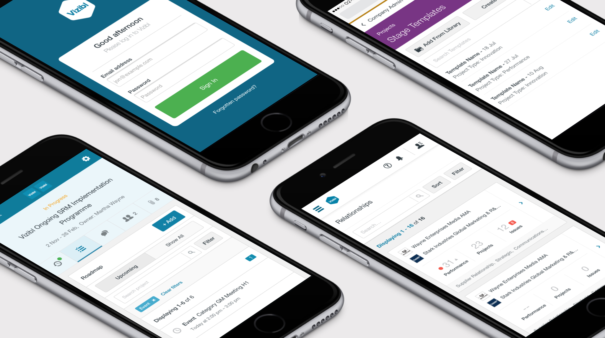
Mobile devices like smartphones and tablets give businesses another channel to connect with their customers, no matter where they are or what network they’re on. Mobile websites and applications should offer users an intuitive customer experience in the palm of their hand. At least, that's what good mobile design aims to achieve. But poor mobile design can make it tough for your visitors to find your most important user actions and will stunt your business's long-term growth. Ultimately, mobile websites that aren't user-centric waste time and attract few new visitors
The good news is that you can lay the foundation for a quality mobile design that guides your users to the desired outcome by following a few simple steps. Here are some of the most effective ways to create a user-centred, mobile experience that brings value to both your business as well as your customers:
Choose user-friendly design templates
Mobile websites have to guide their users towards taking action without confusing or misdirecting them. But for businesses who have little experience in designing a mobile customer experience, it's not always obvious how to create ease-of-use.
It's important to choose a user-friendly template for your mobile website and brand. These days, it’s simpler than ever to find free website templates with mobile versions that are effective at engaging your visitors and keeping them on your site for as long as possible. In fact, choosing from all the options available online can end up becoming the hardest part of selecting a template for your site.
As you’re browsing template selections, don't forget to decide on what components you want your template to use to guide your users to action. Key navigation features like search bars and dropdown menus, for example, make it easy for your visitors to find what they're looking for and fast. Always make sure that you're satisfied with your template's layout before you begin to design around it.
Secure your users’ information
Quality design for mobile websites isn't complete until it includes a security solution to protect its visitors’ data. Your users need to access and transmit data that safely reach your website's server from their mobile devices. Vulnerabilities in your mobile web design can potentially compromise your visitors' security and, ultimately, their sensitive and personal data.
Businesses that are interested in creating a mobile presence need to exercise constant vigilance against cyber threats. It's estimated that a new cyberattack is launched every 39 seconds against a mobile device, which equates to an average of 2,244 times every single day. For companies who are new to web design and want to establish an online presence, there are no second chances when it comes to mobile device security.
It's important to establish organization-wide mobile device rules that impact your mobile design and safeguard your users' data. Companies who are new to mobile design and need help establishing guidelines should consider working with a security partner who has specific experience in helping organizations create secure customer experiences for mobile users.
Don't forget usability testing
You want to make sure that you have at least a few pairs of eyes on your mobile web design before it goes live to your visitors. Usability testing is an important technique to confirm that your mobile website or application is usable. It's also one of the most easily forgotten components of quality web design, so make sure you have a plan in place to test your site for usability against a target audience of your choosing.
Common usability testing involves having an audience, typically users within your own organization, mimic the desired outcome you want your actual visitors to achieve. These outcomes can take the form of tasks such as signing up for a promotional discount or even completing an entire purchase. The main goal of these tasks, though, is to confirm that your website is guiding users as you've intended in your design, so be clear with your testing audience about what tasks you’re expecting them to achieve.
Emphasise on responsive design
Have you ever decided to visit your favourite website on a mobile device, only to discover in horror that the landing pages you know and love are in mangled disarray? This is an example of unresponsive web design built around content meant to be viewed on a desktop PC.
Responsive design for mobile websites uses navigation solutions and displays user-intuitive content on both desktop PCs as well as mobile devices. Users visiting your mobile site need to search for and locate what they're looking for, no matter what device they're browsing on. If your site is poorly responsive for mobile use, potential customers won't stay for long and will instead visit other sites that are easier to use and more responsive to mobile devices.
Businesses who aren't interested in spending time and resources on website development can instead choose from design tools that make responsive design possible. Many responsive web design services, such as Weebly or Wix, include tools that specifically let users take control of their mobile design themselves with drag and drop features that eliminate the need for manual and time-consuming coding and development.
Conclusion
The key to a successful mobile design that attracts new users is to continue to iterate on your mobile site’s design in ways that make it more user-centred. A constant approach toward usability and a responsive, mobile experience can keep your desired outcomes for your visitors realistic and achievable. Always continue to improve upon and change (if necessary) the way you approach website design for your mobile websites and applications.


