Yesterday I was listening to a podcast and heard someone who was about to ask a question saying something along the lines of "..long time fan, first time caller…" and for some reason that got me thinking about Medium. I've been consuming content here for a long time but have never contributed myself with my 2 cents. Today is the day this changes.
As my introduction I decided to write about something close to my heart, Visual Design (aka graphic design), more specifically the basic principles I learned to use which I consider essentials for me to perform my job well.
I want to keep this article short, for that reason I will try to be brief in each of these principles, for the ones that deserve a bit more depth I might dedicate a full length article in the future.
Ok, ready? It all starts with…
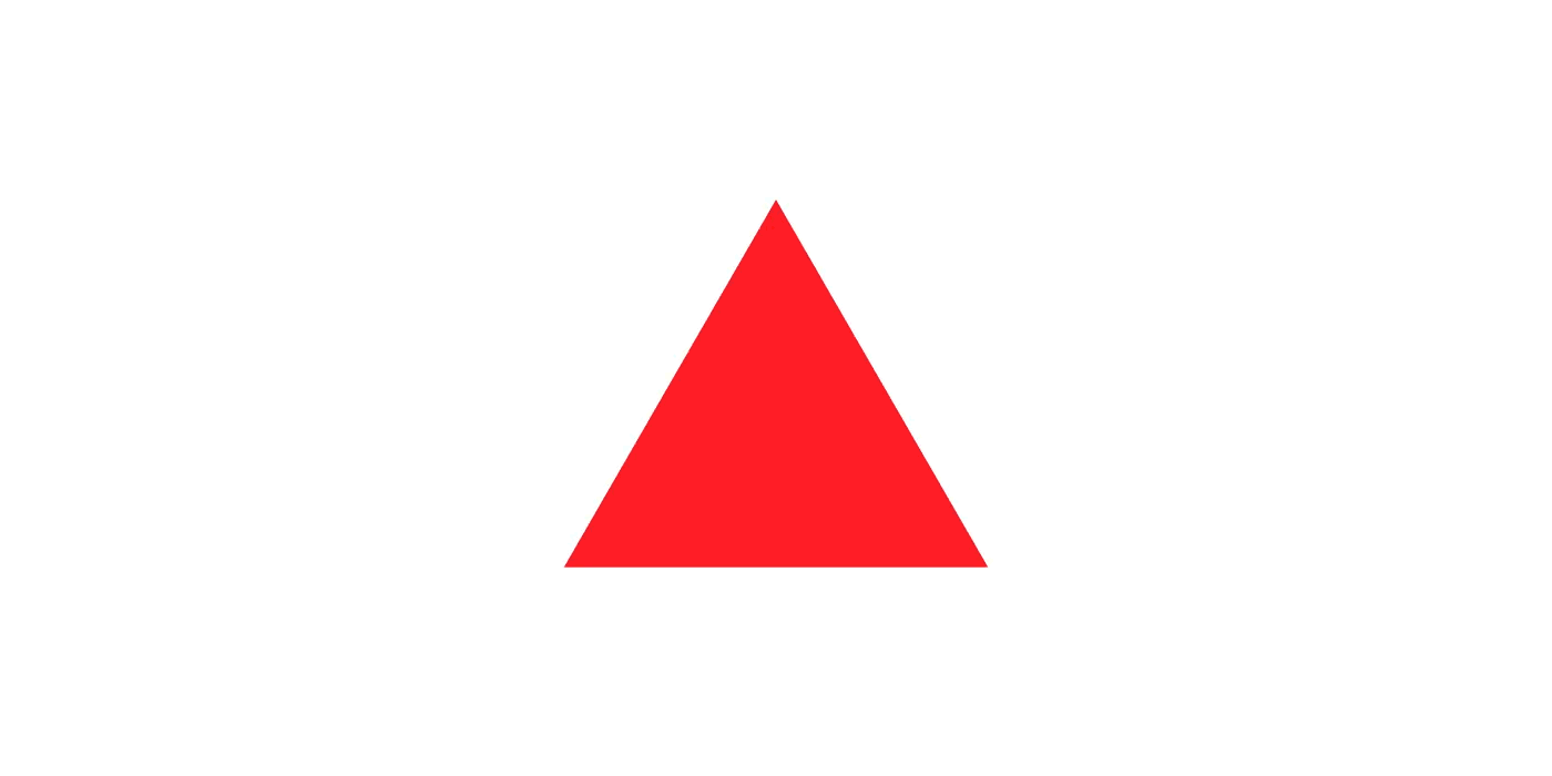
#1 Point, Line & Shape
These are the most basic building blocks of any design, no matter what it is. With these you can create anything you want, from simple icons to very complex illustrations, everything is made with the combination of these simple elements.
In geometry a point is a combination of x and y coordinates, add a z axis and you’re in 3D, but let's stick with 2 dimensions for this article.

Point > Line > Shape
If you connect two points you'll get a line. A line that is formed by an immensity of points, a bit like a bunch of atoms form molecules which, in turn, form all the objects around you. Then, if you add a third point and connect them all you have a shape, in this case a triangle, but as mentioned before you can use this basic elements to achieve pretty much anything that you want.
Now, to your eyes these shapes don't really exist until you add something to it…
#2 Color

Visible Color Spectrum.
The human eye can see over 10 million different colours from red to violet, and from young age all of us learn to attribute certain values or meanings to specific colours.
Imagine the traffic lights for instance. They’re just colours but we learn that red means stop, green means go and yellow means step on the metal because you can make it before it turns red. This to say that we take very different actions just based on a colour, sometimes even without thinking about it.
In my opinion this happens simply because we learn these things, not because a colour has an intrinsic meaning attached to it. This is more true if you consider that these meanings will change depending on your culture, where and when you were raised.
"All this to say that you can add meaning, intention and a tone just by picking the right colour, you just need to make sure you understand very well who you're designing for."
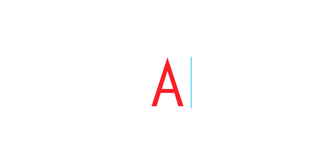
Now that you can see your triangle, how about making it more interesting…
#3 Typography
From a triangle to an A
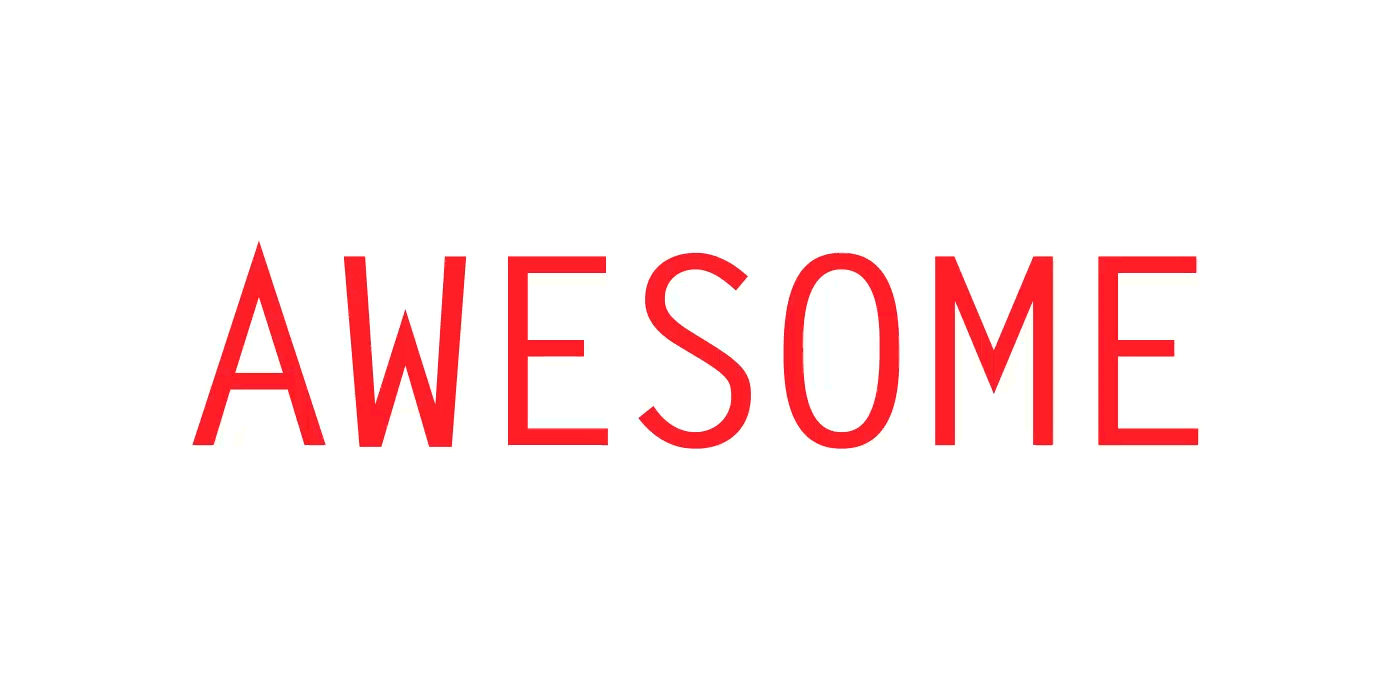
This is a big one and I consider one of the most important, and difficult, things for designer to get right. It’s not only about what you write but how you present it. Typography is how your words look like.
With the right typeface you can have a banal piece of text and make it powerful, but that’s not easy to do, what is easy is to completely mess up a powerful statement just by selecting the wrong typeface. Typography, as well as colour, allows you to define a tone.
"Most typefaces are designed with a purpose, you just need to learn what that is and use it in your favour."
Some typefaces are great for big blocks of text, some work great as titles. Some are merely functional and super clear and others are just meant to be fun or used ironically (you know what I'm talking about).
There are thousands of different typefaces to choose from but unless you need something whimsical or you're trying to make something very specific I would always advise to stick with the classics. However, if you're felling bold you can even design your own typeface, although I think that is one of the most challenging things to do properly as a designer, but if you think you’re up for the task one thing that you can't forget is…
#4 Space
"The way you balance your space can be a maker or a breaker, especially in typography."
You need to consider how each element/letter relates to each other, give them the precise breathing room they need, this is usually referred to as negative space (positive space are the actual letters).
Adjusting the negative space between letters (aka kerning).
You need to take the negative space as part of your design and use it well, space can be powerful and help your viewer to navigate through your design. It can also be a place to rest the eyes.
"Use it wisely though, too much space and your design will look unfinished, too little space and your design will seem too crowded."
Managing to find the right ratio between positive and negative space allows you to create…
#5 Balance, Rhythm & Contrast
This is when you’re starting to make a bunch of plain elements into something interesting and appealing. Balance well all the elements on your design by considering their visual weight. A big black square in the your bottom right corner will sink your design from that side. Compensate for that weight or move it to other position.
Adjusting the Visual Weight of the words to create rhythm and contrast.
The way you lay elements in the page is crucial, making some elements heavier than others will help to to create contrast and rhythm and lead your viewer's eyes through your design gracefully and effortlessly.
Something that may help you with rhythm and balance is also to play with…
#6 Scale

Taking it one step further by adjusting the scale of the words.
Scale helps you not only creating rhythm contrast and balance but also hierarchy. Basically not all the elements in your design should have the same importance, and one of the best ways to convey that is size.
Now, this must serve a purpose. Don’t go for the “make my logo bigger cream” approach and forget about the space I mentioned before.
For instance, take a newspaper page. What’s the biggest thing in the page?
The titles, that are also usually short. Why? So you can scan the page quickly and see if there’s something interesting for you to read. Then we have the subtitles that are smaller but give you a little more information about the article, and finally we have the article that has the smallest font size but also the most comfortable to read a long piece of text.
So, it’s all about making the size serve a purpose and never forget about the person who will consume your design. Speaking of newspaper, is time to bring some order with…
#7 Grid & Alignments
It’s like that oddly satisfying feeling when you're playing Tetris and you stack that last bar that clears your screen.
Creating some relationship between the elements to make it look more balanced and pleasant.
These are supposed to be invisible but you'll see them if you open a book or a newspaper, but (no matter what you’re designing) following a grid will structure your design and make it more pleasant and easier to digest.
"Even if you’re making a chaotic design purposefully, there must be an order for that chaos."
Alignment is specially important with text, there are several ways to align it but my rule of thumb is to align it left. It always depends on what and for whom you’re designing of course, but generally, people read from left to right, top to bottom, which makes text that is center or right aligned much more difficult to read.
#8 Framing
This is a key concept in photography but it also applies in visual design.
Whether you’re using a picture, an illustration or something else, framing something properly makes all the difference.
Reframing the composition to add interest and an extra element.
Try to direct the eye to what matters, crop/frame images to make your subject stand out or to reinforce your message. It’s all about telling the right story and telling it well.
After all this, if you feel there's something missing, you can play around with…
#9 Texture & Patterns

Trying out a noisy texture.
I personally see texture and patterns like accessories, you don’t have to use them necessarily and you can live without them but sometimes they can, almost on their own, make your design or add that little extra interest it was missing.
Textures are not as trendy as they used to be a while ago but with them you can add another dimension to your design, making it more three dimensional and touchable.
"The texture doesn't have to be in the composition itself, if it's something that is going to be printed, picking the right paper, add things like bevel, emboss or UV varnish can make your design pass from banal to something superb. But pick one, don't go crazy with the special finishings."
Patterns are all about repetition, and can be almost considered textures depending on how you’re using them. I see them mostly used as a way to inject rhythm and dynamism into a flat design and a way to compensate the excess of negative space.
Last but not least, and this is actually what I personally consider to be the holy grail of visual design…
#10 Visual Concept
This is the idea behind your design. What do you mean with it and what’s the deeper meaning behind the superficial image.

An idea lamp… cliché, I know :)
This is what distinguish a great design from something you can download from a stock website.
Design with intent and always have an idea that connects everything in your design. Pick your fonts carefully and with a purpose, think about how every tiny part of your design follows that base concept. Coherence is everything.
"If your concept is strong you’ll be able to defend it and sell the idea to your client/boss or whomever you're presenting it to."
Also, a properly thought out design will last for ages. Trendy hipster things are nice and cute but, as the moustaches and the checkered shirts, they come with an expiry date. I really believe that a good design does NOT follow trends, but it creates them instead.
There you have it, "my" 10 Principles to build a good design. Even thought I consider #10 the essential one, you need to pay attention to all the others principles and make sure you really become a master of your craft. You might have a great idea but I think you also need to know how to make it justice (or have someone who does it for you).
They say you can't judge a book by it's cover, but most people actually do. If what's inside the book isn't well portrayed in the cover that will definitely influence how well it does.
Alright! That is all.
As a final note I must mention: There are, of course, other things I take in consideration for a project/design, like understanding who is it for, and what do we want to achieve with it, however I didn't make those part of this list of principles because I consider these "constraints" an essential part of defining the visual concept. The idea might be brilliant but if it doesn't answer the project's needs it will sooner or later fail.
I hope you find this useful even if you already know all this. I’ve definitely used this set of principles as much as I use my Staedtler pens and it actually was an interesting exercise for me to deconstruct my designs into it’s bare “building blocks”.
This article was originally published on Jose's Medium page.

