"Just as in nature systems of order govern the growth and structure of animate and inanimate matter, so human activity itself has, since the earliest time, been distinguished by the quest for order. Even the most ancient peoples created ornamnets with mathematical forms of great beauty. The desire to bring order to the bewildering confusion of appearances reflects a deep human need."
Josef Muller-Brockmann - Grid Systems
"IMMACULATE typography is certainly the most brittle of all the arts. To create a whole from many petrified, disconnected and given parts, to make this whole appear alive and of a piece — only sculpture in stone approaches the unyielding stiffness of perfect typography. For most people, even impeccable typography does not hold any particular aesthetic appeal. In its inaccessibility, it resembles great music. Under the best of circumstances, it is gratefully, accepted. To remain nameless and without specific appreciation, yet to have been of service to a valuable work and to the small number of visually sensitive readers — this, as a rule, is the only compensation for the long, and indeed neverending, indenture of the typographer.
THE REAL reason for the number of deficiencies in books and other printed matter is the lack of - or the deliberate dispensation with tradition, and the arrogant disdain for all convention."
Jan Tschichold - The Form of the Book
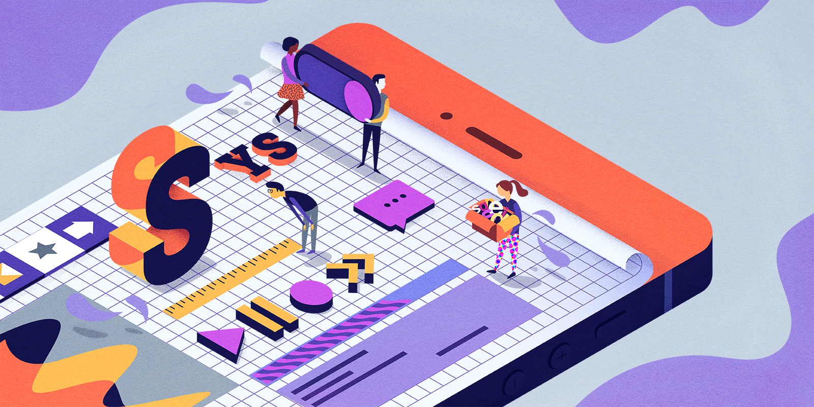
FORM & VARIANCE
The web is fluid. This should be considered when designing screens that are to be rendered by browsers. Last month people visited bluebottlecoffee.com using 1,222 different screen sizes. Building sites that are responsive is only one of the design considerations this introduces. How do you build an interface that is well balanced across all screen sizes? How do you build these interfaces quickly? How do you build them to be readable? How to do you build them to be performant? How do you account for the unknown?
ACCOUNTING FOR THE UNKNOWN
Besides designing for an ever growing number of screensizes and resolutions we must also account for the settings a user picks for their browser. One of these settings is the base font-size. While this can't be detected with site analytics, it's estimated from user research studies that 10-12% of people set their default font-size to something other than 16px. So how do we build designs that scale proportionally and relatively for the myriad of combinations between devices and font-sizes that people choose to view the web on? How do we design components and interfaces to be harmonious with each other in the faces of so many unknowns?
PROPORTIONS
Using relative sizing units - we can ensure that measurements will remain proportional no matter what font-size a user has chosen. An explicit pixel value however - will not scale relative to a users settings. This leads to designs that may be responsive - but do not posess the desired visual harmony. Static comps with explicit pixel values are not reflective of the raw materials that make up the web.
"Static comps with explicit pixel values are not reflective of the raw materials that make up the web"
ALIGNMENT
The reality of front-end development is that people of varying skill levels will inherently touch your front-end code. This is not a bad thing, but it is a problem that requires design solutions. You must have a system in place that makes it easy for people to build well balanced interfaces with as little difficulty as possible. Not everyone will care about the quality of code, or how it renders to the browser. Not everyone will test the interface on a wide variety of devices with various font-size settings. The best solution I have seen so far is to use a defined system for people to work within, that doesn't make them think about things they don't want to think about. The result of this is that regardless of the interface you are working on - your components will all have the same sets of relative proportions and things will just magically line up without time lost to debugging or re-inventing the wheel.
IT'S JUST TEXT
The web, is mostly text. People have been studying typography for centuries and we would be smart to leverage the findings of brilliant designers dedicated to this craft. Regardless of the medium - most great design is mathematically based. When designing around text, modular scales and attention to proportion is considered to be the start of a sound approach. Consider this exerpt from Tschichold's "Form of the Book":
The geometrically definable irrational page proportions like 1:1.618 (Golden Section), 1: V^2, 1: V^3, 1: V^5, 1:1.538, and the simple rational proportions of 1:2, 2:3, 5:8 and 5:9 I call clear, intentional and definite. All others are unclear and accidental ratios. The difference between a clear and an unclear ratio, though frequently slight, is noticeable.
While all of these scales would be a good starting point to use for creating a beautiful and harmonious design - all but one lead to sequences of non integer numbers. The 1:2 scale (powers of two) leads to a series of integers that browsers don't have difficulty rendering. While computers were largely invented to compute mathematical problems, browsers are notoriously horrible at math. They compute simple arithmetic equations and render values inconsistently. To avoid complicated and unsolvable debugging sessions where things don't line up - integers are the best route.
These ratios are common patterns that can be seen in print, architecture and music so often it is hard to deny them as an elegant underlying order.
Katsura Villa, a Japanese residence and temple is "founded on the unit of the tatami mat which measures 90:180cm" or a 1:2, powers of two ratio. "The aesthetics of this architecture lie in the beauty of its proportions and the materials used."


A scale comprised of 5, 10, 20, 25, 30 etc. cannot be represented by a ratio. They are ticks on a numberline not seen anywhere else in nature, print, architecture or music when studying cohesive design systems.
WHY USE 16 AS A BASE?
The default font-size for most browsers is 16px and this is no accident. This is a font-size comparable to type in a book. While printed type is often smaller it's partly because books are often times held closer to the face then digital screens. While mobile phones and tablets are generally held at the same distance as books they are also used while moving more frequently - this movement affects the readability of word shapes and so 16px is generally the smallest type for content you want to serve up to a user.
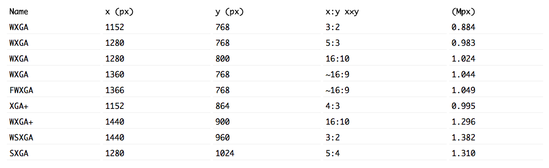
In this sample list of graphics display resolutions, you will notice that all of these numbers are divisible by 16, one exception that is not listed here is the SXGA+ graphics resolution that is not approved by any organization and was a break from the mold. It resulted in some weird graphics problems... but that is a different story for a different time.
Granted not all browsers are used at full screen 100% of the time - but it's a good thing to consider when trying to create proportional designs that scale well. While we aren't print designers working within a fixed medium - there are consistencies in almost every graphics resolution which we can use to our advantage. It should be noted that these numbers are often times indivisible by 5 and only divisible by 10 50% of the time.
While 5 and 10 are common units because we are (generally) born with ten digits on our hands - it seems more suitable to use 16 as a base measurement for this medium. Time in music is most commonly divided this way as well. 1/16, 1/8, 1/4 1/2 and whole notes. These paralells are not a coincidence. Math and music are the sisters of design.
INCLUSIVE DESIGN
It's easy to fall into the trap of designing for one context. If you have working legs, you are not likely to notice that a building has been constructed with a long staircase that is not accessible to someone in a wheelchair. If you can't walk up stairs, you definitely notice.
"It’s important to not make assumptions about our users and their capabilities"
It's important to not make assumptions about our users and their capabilities. And we have to actively question our designs and identify where we are making assumptions. I have better than 20/20 vision. When I first started out as a designer I used a lot of small font-sizes. I thought they looked aesthetically pleasing. I still do.
"When I’m designing, I’m not designing for myself. I’m designing for everyone"
But when I'm designing, I'm not designing for myself. I'm designing for everyone. It should be considered that compared to a 20 year old's retina, the retina of a 40 year old only receives about 50% of available light. An 80 year old retina only receives about 20%. So text set at lower font-sizes and/or low contrasts are actually impossible for some people to read. For reference, a quick scan of age demographics from my personal site analtyics reveals that 40%+ of people that visit my websites are above the age of 35.
"Everyone can read large type. Not everyone can read small type"
Everyone can read large type. Not everyone can read small type. In a similar fasion: everyone can walk up a ramp, while only some people can walk up stairs. I think we should be welcoming to our web guests and cater to their accessibility needs because it's the right thing to do. It's a frustrating experience to be required to zoom in just to read text. So let's not make people do it.
BIBLIOGRAPHY / FURTHER READING
Modular Scales
What Screens Want
The Web's Grain
The Form of the Book
Easy-2-Read Standard
Mathematical web typography
This post was originally published on Adam's blog.
