Empathy maps are a powerful tool for helping teams better understand users. But that doesn’t mean they are perfect. You should feel free to adapt them to your circumstances.
As user experience professionals we face two significant challenges. Getting our colleagues to think about the needs of users and ensuring they don’t forget about them.
There are many techniques for achieving these goals. But one of the more popular ones seems to be empathy maps. They are faster to create than a customer journey map and easier to read at a glance. Creating an empathy map is a great workshop exercise. But the final map is also a visual that people can refer to. A nice reminder about what users are thinking and feeling.
What is an empathy map?
An empathy map is a collaborative tool that teams can use to better understand their customers. It consists of an image of the customer surrounded by six sections. These sections are:
- Think and feel. What matters to the user? What occupies her thinking? What worries and aspirations does she have?
- Hear. What are friends, family and other influencers saying to her that impacts her thinking?
- See. What things in her environment influence her? What competitors is she seeing? What is she seeing friends do?
- Say and do. What is her attitude towards others? What does she do in public? How has her behaviour changed?
- Pain. What fears, frustrations or obstacles is she facing?
- Gain. What is she hoping to get? What does success look like?

Creating an empathy map is a great workshop tool. It helps attendees really consider user needs.
The group draws an outline of an empathy map on a large sheet of paper. The team then works together to complete each section using their knowledge of the user and any data collected.
The drawbacks of empathy mapping
Although I have been using empathy maps for sometime I confess I have found them frustrating.
For a start I found workshop attendees struggled with some of the sections. There was often overlap between what our users sees and hears. Also attendees would struggle to express what the user gains. In essence, they were perfect for general customer segmentation. But they were too generic for a workshop focused on user experience design.
The second problem related to long term impact. Attendees would go away with a better understanding of the user. But this understanding didn’t seem to stick or influenced the wider organisation.
Adapting the empathy map
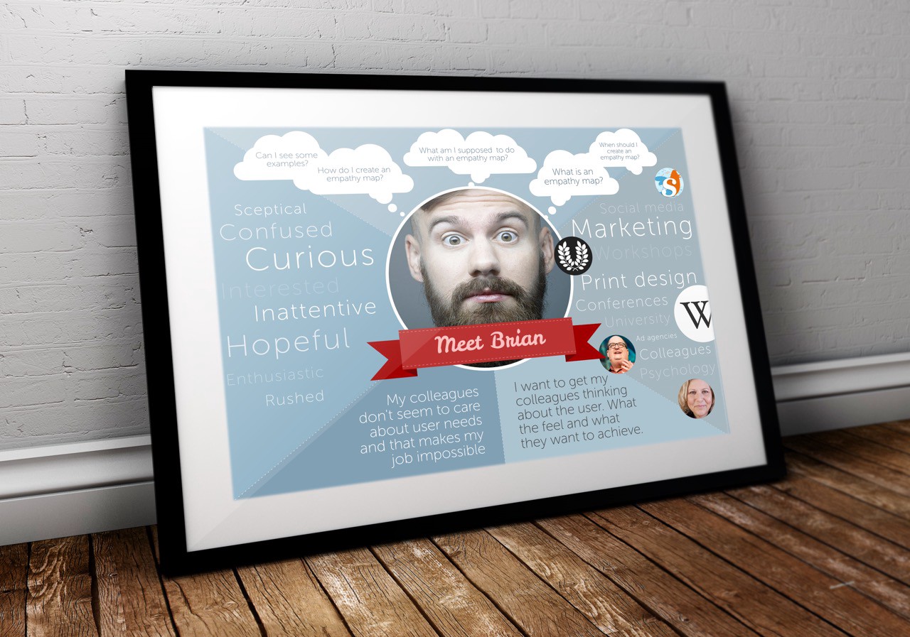
In the end I started adapting the empathy map for my specific needs. For a start I changed the segments. Instead I went with:
- Tasks. What tasks are users trying to complete? What questions do they need answered?
- Feelings. How is the user feeling about the experience? What matters to them?
- Influences. What people, things or places may influence how the user acts?
- Pain points. What pain points might the user be experiencing that they hope to overcome?
- Goals. What is the users ultimate goal? What are they trying to achieve?

I decided to adapt the empathy map format to better suit the work I was doing.
The result was that attendees found it much simpler to complete in the context of my work. Also the outcome was much more useful in informing future deliverables.
"By turning an empathy map into a poster that can be hung around the office, it doesn’t end up forgotten."
I was also keen that the benefits of the empathy mapping didn’t end with the workshop. Inspired by Mailchimp’s personas I turn the empathy maps into posters. Posters that are then displayed around the organisation. This helps to ensure the user remains in people’s minds as they work.

By turning an empathy map into a poster that can be hung around the office, it doesn’t end up forgotten.
Don’t be afraid to adapt
Don’t misunderstand me. I am not suggesting my approach to empathy mapping is better than the original. My message here is that we need to adapt these tools to our own needs. We have so many tools from personas to customer journey maps. But we tend to blindly use them. We should be adapting them for our circumstances and maybe in the process evolving their quality over time.
This post was originally published on Paul's blog and Medium profile.