The Problem
It drives me crazy that the text bounding box almost always brings in extra space above and below the actual text. Therefore, when the bounding box is used to measure space, it ends up being bigger than you intended. The bigger the line height, the bigger the problem. In the example below, the design was created by measuring the space between bounding boxes. When all the spacing is set to 32px (in the 1st card), visually all the vertical spacing is actually much bigger than 32px (as shown in the 2nd card), even though you meant them to be equal by setting them all to 32px.
 Photo by Max Delsid on Unsplash
The Solution
Because of this problem, I use the 4px baseline grid to achieve better visual accuracy. Here's my process:
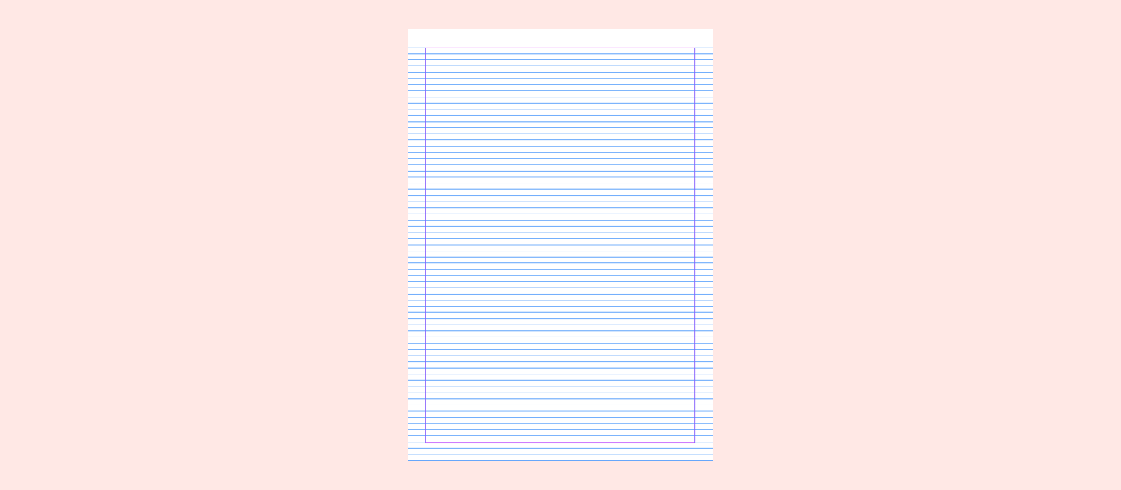
- I set up a 4px grid in the background.
- Snapped all the UI elements and text baselines to the baseline grid.
- I use the grid to measure vertical space around text instead of using the text's bounding box. Specifically, I measure space above text from the grid line that's closest to the type's cap height and space below text from the text's baseline.
- Additionally, I defined a set of spacing values for our team to use, inspired by this Medium article: Space in Design Systems by Nathan Curtis

In order for all the baselines to sit on the grid, this approach essentially rounds the visual height of the text (cap height to baseline) to a multiple of 4px (shown in the gif below). This could introduce a 1–2px error; however, it’s still more accurate than using the bounding box to decide spacing.
 Measure space above the text from the closest grid to the cap height.
There is an exception: I vertically center icons or text within a component or container regardless of whether they sit on the baseline grid, because most of the time developers can use flexbox to center an element, and that is easier than using static spacing to do centering, for both parties ????.
 The text in each table row is centered using the "Align layer to middle" command in Sketch, and it's okay that the baseline doesn't snap to the grid.
The Why
The baseline grid has traditionally been used in print design to create a vertical rhythm. In my day to day work designing web experiences, I haven't encountered that many use cases where such rhythm was obviously needed to make the alignment better.
To me, using the 4px baseline grid is a balance between visual accuracy (for users) and design efficiency (for me). In the Problem section, I talked about how measuring from text bounding box would introduce extra space. At the end of the day, user can't see the bounding box. So it doesn't really make sense to use this approach especially if it creates visual imbalance and doesn't benefit users. On the other hand, ignoring the bounding box and measuring using the baseline grid is able to achieve better visual accuracy. See below for a comparison between these two approaches. As we can see, when the same set of spacing values (32px, 12px, 32px, 32px) is being used, the design measured using the baseline grid reflects the intended spacing much more accurately.

One might say, if measuring from the bounding box yields too much space, then for example in the first card, reducing the first spacing value from 32px to 28px or 24px would make “Seattle”’s top and left padding look equal. But at that point, it becomes a guessing game; you would never know for sure unless you count the pixels. On the other hand, the 4px grid approach provides a more accurate and predictable way to know it’s ~32px (taking into account the 1–2px error introduced by rounding).
In terms of design efficiency, this might seem like more work, but because of the grid, the design tool (Sketch) can help snap elements and type baseline to the grid, so aligning and spacing become relatively easy. Below is my workflow using the baseline grid to lay out text.
 My workflow using the baseline grid to lay out text.
Alternatively, you can choose not to use the grid and manually measure from the cap height (as shown in the gif below), but it would require zooming all the way in and out of the pixel grid. Plus, the size of the container that holds your text might not be a multiple of 4px.
 Above is an alternative workflow that measures directly from the cap height.
Known Issues - Design-Dev Handoff
Layout measured using the baseline grid approach would have seemingly random spacing numbers when developers use redlining tools to inspect the design. The design below was created using the baseline grid. The numbers show what you would get from a redlining tool:

I briefly mentioned the Space in Design Systems article above. It talks about how spacing values could be represented using CSS classes, which helps enforce consistency for both designers and developers. Unfortunately, by using the baseline grid approach, it is nearly impossible to represent the spacing numbers as a set of CSS classes because of the randomness that comes with the different combinations of types.
"Using the 4px baseline grid is a balance between visual accuracy (for users) and design efficiency (for the designer)."
We also looked at a popular technique many people proposed to mitigate the randomness issue, which is to use ::before and ::after CSS pseudo-elements to "crop" the bounding box (which is essentially applying a correctional spacing to the line box). However, my code ninja boyfriend Chris Caruso told me:
Using ::before and ::after CSS pseudo-elements is not ideal because it is not consistent across different fonts, browsers, operating systems, and even screen resolutions. Targeting a single combination may lead to spacing issues in others. From the developer’s perspective, the technique does not follow good coding practices because it uses negative margins and applies extraneous elements to the DOM — both of which can lead to unintended side effects. Therefore, in production applications, this technique is not worth the risk. ????
What About Localization?
I once did a localization study and looked at 8 writing scripts (Latin, Chinese, Cyrillic, Devanagari, Greek, Hangul, Kana and Thai) that our product supports. Then I realized that no matter which measuring approach you use, at the end of the day, it's the bounding box spacing that the developer takes from the redlining tool and puts into CSS. Depending on the font you use for other non-English languages, even if the line height is the same, the visual height of the type can be taller or smaller than the latin letters. Their baselines can also shift. Therefore, no matter what measurement approach you use, localization will always change the spacing a little. However as shown in the example below, all languages' text stayed relatively centered in the white space despite those minor changes.
(I still don't know a lot about non-latin writing scripts, but want to learn more. Please let me know if any of the observations made above are not correct or can be improved. I only know English and Chinese. Shout out to my friends at work who helped me translate this line to the other languages!)
 Design created in English and localized to the other 7 writing scripts. Photo by Joshua Sortino on Unsplash
Questions?
Please let me know if there's anything that doesn't make sense, or if you have any questions, feedback, or a better solution! I've been doing research on this topic for a long time now, so I would love to hear your thoughts! Please feel free to reach out to me directly through email (ethanw@microsoft.com) as well if you want to chat!
Thanks to Chris Caruso.
Originally posted on Ethan's Medium page.