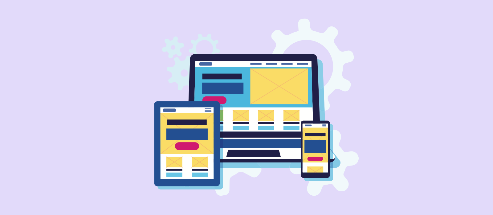
Prototyping has become an essential part of any design and development process for every company. Traditionally, to create a prototype, you needed to code your work, which required nearly the same cost and effort as the final product. Nowadays, designers can cut costs and save time by quickly creating prototypes that resemble the next screens of a website or application by rapid prototyping.
In this article, we’ll discuss the importance of rapid prototyping and different techniques that you can take to speed up your design process.
So, what exactly is rapid prototyping?
Before you invest a lot of time and money into developing an idea or product, you’ll want to know that it’s user-friendly and prototypes can help with this. They can range from hand-drawn sketches (low fidelity) to interactive mockups (high fidelity) that look and feel like the finished product.
The purpose of rapid prototyping is to demonstrate possibilities quickly by building a series of inexpensive mock-ups so that you’re able to get early feedback and adjust designs accordingly.
"In a recent report, IBM found that discovering errors after releasing software costs 30 times morethan catching them at the design stage."
This process will be quicker and cheaper than creating a full-blown and fully functional version of your idea. Prototyping helps individuals and teams quickly experiment with multiple ideas; facilitating discussion through visuals rather than words and ensures that everyone is on the same page.
What are the benefits of rapid prototyping?
There are many advantages of rapid prototyping over other design approaches:
- Communicate ideas effectively
Compared to a written specification, a prototype is much easier to understand simply because it’s visual. This is the best way to ensure that everyone shares a common understanding of how your product should look and feel, reducing risk, and leading to better feedback. - Explore new ideas and concepts quickly
Traditionally, making mockups was slow and often ended up costing a lot of money. Rapid prototyping opens up new creative opportunities for innovation by cutting out the restrictions of conventional methods but also focuses you to think less and ideate faster. - Save time
As the old expression goes, ‘time is money’, and being able to map out user flows early in the ideation stage will lead to time reduction between the initial design and testing, reducing difficulties in the usability. - Lower risk of rework
Everything created has its own risks, for example, the risk of failure, costs, security, and many others. At the end of the day, most risks can be reduced and handled before you launch your product with rapid prototyping. The process provides a precise model for usability testing and therefore reduces the risk of problems further down the line that by that point might require expensive dev work. - Anyone can do it
You don’t need a software developer or specialist designer to help you create a prototype of your app. You might want them for additional insights later down the process, but if you are just starting off, then this is a process for anyone to just jot down their idea.
How to choose your rapid prototyping tool
When it comes to creating prototypes, there are many tools and methods out there that make choosing one no simple task. Every few weeks a new prototyping app would be released, and it’s hard to give them a proper try without essential resources like time.
You might not find one tool that does everything, but prototyping tools should help you move through your process smoothly, especially when you are under tight deadlines. Here are a few objectives that could help you narrow down your search for that perfect tool.
- Learning curve
Tools or software that have familiar interfaces will be easier to learn than ones new in every way. Compare the time that you expect to invest in learning a new tool with how much time you will be using the tool in your process. The ideal situation would be to have a very small learning curve for a tool you’ll use frequently. - Support for collaboration
Whichever tool you’ll choose will need it to be able to collect feedback, whether that is from your team or clients, so that you can use the information to improve your work and then be able to share the new and updated version with them. - Integration with your workflow
Another point to think about is how this tool will fit in your design process and the other tools that you use. Prototyping is only one part of a much broader process that includes many other moving parts like research, testing, communicating with stakeholders, and sharing designs with developers for implementation. - Fidelity level
This is covered in more detail below, but depending on where you are in your design, you’ll want to choose a tool that will allow you to build for the level of fidelity you are aiming for. For example, if you are just looking to test an idea, then the tool of choice should allow navigation from one screen to the next. But if you are looking to create an almost ready, looking prototype that has all the bells and whistles, then you’ll want your tool to have the ability to add motion and transitions. - Ease of use and comfort
This one is more of a personal thing but if you are going to be using said tool day in and out then it should feel good. Look for a tool that really helps you and your work, not one that slows you down by additional steps or puts hurdles in your way.
How to build a prototype?
The beauty of this process is that it’s really quite simple and hugely beneficial.
Low Fidelity Prototyping: Grab some pen and paper

The quickest way to start is also the easiest and that’s by sketching with pen and paper. Paper prototypes are very simple to create, ranging from rough sketches to storyboarding and allow you to check that your concept and requirements have been fully understood without investing too much time.
Paper prototyping is often done in the very early stages of a design process, particularly during a brainstorm or conceptual session with the client to understand their brief. Low fidelity prototyping has very little to no learning curve and allows you to make changes quickly and easily.
Medium fidelity: Jump on the computer

As you start using software to prototype, the fidelity increases to create medium fidelity prototypes. Anything created at this level will take a little more time and effort but the look and feel of the product will become more refined and formal.
Most designers will use this stage to focus on showing off the user journey of the application, but visual elements of branding, colour, and style can be also introduced here. Interactivity can be imitated by linking pages or screens together. This type of prototype is best suited to test whether users' needs are met and optimised as possible. It’s best to save any templates or reusable elements to reduce the time spent on this stage and as you become more proficient with your choice of tool this part of the process will get faster!
High fidelity: Time to get interactive

High fidelity prototypes are the most realistic and could be mistaken for the final product. These are usually built to test on real devices and often used for usability testing with real users. Nowadays, there are apps that allow both designers and non-designers to create visually rich and powerful prototypes with drag-and-drop UI components, creating realistic user experiences by simulating the functionality of the final product.
Rapid prototyping best practices
You’ve got a good idea about different things to look out for in a prototyping tool and an understanding of the different levels of prototyping fidelity. Here are a few best practices aka the do's and don’ts of rapid prototyping.
Tips for getting started:
The Do’s
- Establish a clear purpose: Before starting your sketch, have a clear idea and understanding of what pages/layouts you’ll need and why. It will be easier to explain your ideas or user flow to others who have no or limited design experience.
- Record your work: It’s easy to lose bits of paper when creativity takes hold but making a digital copy, like taking a photo of each sketch can make it easier to find and share with others for feedback.
- Reuse code or design elements: Where possible reuse code snippets or components as this will help tie in the overall look and feel of your product.
- Sharing is caring: Don’t forget to share what you’ve learned with others, this helps build relationships outside of your team and encourages stakeholders to participate earlier in the process.
The Don’ts
- Don’t be too precious about your first idea: In the early stages of ideation, your first few ideas won’t be your best but that’s absolutely fine - keep focused on generating as many designs as possible.
- It doesn’t need to be pretty: When creating sketches, it’s always tempting to spend time making them look amazing, but it’s best to avoid that and focus instead of getting your ideas down. Remember, you’ll go through a few iterations before you finalise your prototype.
- Don’t worry if part of your prototype doesn’t work: If you are using prototyping for user testing, make sure that anyone who interacts with it knows that it is just a prototype, and not the final solution.
- Avoid dummy text:< When you reach the early stages of digital prototyping, think medium to high-fidelity prototypes, start using real content to help your team, stakeholders and testers understand the impact that it will have on the overall design.
It’s all rapid
Prototyping exists to test and explore uncharted possibilities, validate ideas. Whilst keeping costs low and engaging end-users to stakeholders, in ways that inform design decisions going forward.
Rapid prototyping can be used at any stage of the product development cycle. It's the most effective early in the process, allowing designs to evolve more efficiently. This process is also one of the best strategies for developing successful digital products, for any size company. Remember that the more prototypes you create and share, the better your product and solution will be.


