In this post, I’ll share some simple design and UX facilitation methods I use on the job in order to create definition, expedite the design process and create transparency with various stakeholders and team members on any given project.
These design and UX facilitation methods are highly collaborative. I’m a huge fan of collaboration design and facilitation because it’s such a great way to include people in the process as well as integrate each person’s unique perspective and knowledge on the subject matter at hand. If you’re interested to hear more about Collaborative Design, check out these posts:
“If everyone is moving forward together, then success takes care of itself.” — Henry Ford
Design UX Facilitation Methods, Here We Go…
1. Business Assumptions Exercise
Over the years I’ve had many people come to me with just a product idea in mind and nothing else. In order to ground their idea in a more concrete way and also as an easy way to transfer knowledge, we’ll do the Business Assumptions Exercise. This is a great way to see if they have thought through some of the major components of the business such as:
- The customer pain points
- The solution being offered
- Who the customer(s) is
- Customer acquisition channels
- The business model
- Competitors and the current market
- Product risks and business assumptions
This may look like a lot of ground to cover and there are other, more extensive ways of getting to similar conclusions such as the Business Model Canvas. However, this exercise is meant to be very lightweight. It’s simply a 12 question survey. It’s fascinating to see the results come in and if there are multiple people, it’s super interesting to see how they all answer — assuming they haven’t solidified their answers together.
"It ain’t what you don’t know that gets you into trouble. It’s what you know for sure that just ain’t so."
(Quote: Mark Twain)
This exercise will also give you a starting point for understanding what you need to validate moving forward. In the context of product creation and development, a big part of a UXD’s job is to mitigate risk to market by understanding product assumptions and using UX methodologies to test them.

2. Persona Development
Personas are the cornerstone of any UXD project. Creating and designing solutions for the user can only be done if we know who they are, what their pain points are and some idea on how to solve for those pain points. My approach to persona development uses a combination of working with company stakeholders to identify persona types and develop a solid first draft; then build on those personas by talking to real people. I start with a simple 4-up persona.
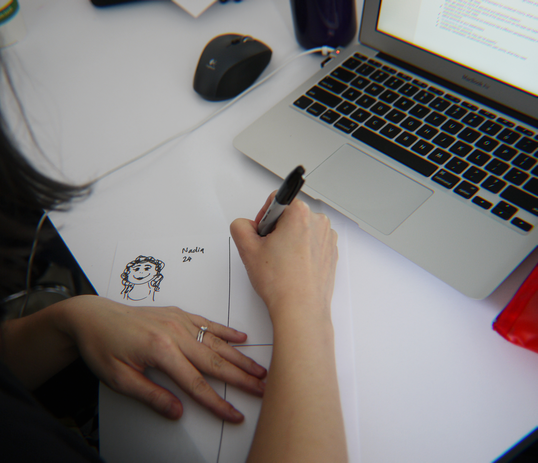
A 4-up Persona. It has four main areas:
- Memorable sketch and name
- Their situation and environment
- Their pain points
- What they need (that we can provide)
I use a Persona 4up because like the Business Assumptions exercise, it’s very lightweight and produces results immediately. It’s a great starting point in order to build out more extensive personas and a great way to engage with your client or project stakeholders. My method for producing these with the client is to simply share a screen and fill in the boxes together or do the exercise on paper. When complete I’ll use this information to higher fidelity and more informational personas.

3. Collaboration Design Sketching (a.k.a. “Design Studio)
Oh, my favorite! This one is just magical; it produces great results every time. Design Studio is an exercise where key stakeholders of different roles and or backgrounds are engaged to take part in a focused and time-based sketching exercise.
The benefit of Design Studio is the ability to diverge by sketching many design solutions, then converge by honing in on ones that work well and that the group has identified as valuable and interesting.
In my experience, Design Studio works best with no more than five people. Although you can run the exercise with more than five it just becomes a bit time consuming as the format includes time for discussion and feedback after each time-based sketching round.
Design Studio Format — High-Level
- A focused goal for the exercise
(i.e. a checkout page for an eCommerce site) - Three rounds (or roughly as many as you need, give or take — to reach an outcome) of time-based sketching.
- You’ll need paper, markers and a timer.
Design Studio Format — Detailed
ROUND #1
- Five minutes of solo, quiet sketching based on the defined goal.
- Focus on quantity, not quality, i.e. sketch as many ideas as you can, do not worry about if they are good or not.
- When the time is up, each person has a couple minutes to present their ideas and the group has a couple minutes for feedback. Time spent here is important as it adds to the overall time of the exercise. For example, for a group of five, round one can take 20 minutes easily.
- The group is encouraged to put a green checkmark next to ideas they think work very well so they can be referenced later.
ROUND #2
- Same as round #1 except each participant is encouraged to steal one idea that they liked from another participant and fold it into their sketches.
- The focus becomes more about quality than quantity.
ROUND #3
- Same as previous rounds except the third round is hypothetically the last round and participants are encouraged to focus on one sketch only that encompasses their best thinking as well as the best thinking from the group that they’d like to incorporate.

4. 20 Second Gut Test
The 20 Second Gut Test is a great way to establish early aesthetic preferences in visual design for project. It’s tempting to think that this sort of thing can’t be done so early on before a lick of design work has been produced, but this activity makes it possible.
When designing interfaces for software I follow a pretty similar design process that consists of collaborative design (pen sketching) — which are used to create high-fidelity wireframes (the heavy lifting)— which are finished with visual design (the look and feel). Having a clearly established visual aesthetic that the group of stakeholders has validated, makes the last step of visual design so much easier.
How it Works
As a design facilitator you gather 10–20 UI examples that have varying styles of visual design. You show each one individually for 20 seconds (Keynote, Powerpoint, etc.). Participants use that time to examine each and rank it with a simple scoring method of 5 being the highest and 1 being the lowest, i.e. — their gut reaction (more than 20 seconds leads to overthinking). At the end you tally up the scores and share the results with the group. It’s not only great for creating definition, but it’s also really exciting for the group to see the results come together in real-time.
For more detailed information on this exercise, see here.

5. Design Pattern Review
When working closely with a client or group of stakeholders, it’s really important that you’re all speaking the same language. As many UXD practitioners will tell you, educating the client is something you spend time doing. Since user experience is so collaborative and the client is an active part of the process and journey, it’s imperative that everyone can effectively communicate.
Design patterns — or universal design conventions are helpful because they quickly convey function and intent to the user. Through using sites, apps and software, we have all learned that similar things such as checkout pages, news feeds and messaging screens — although in in different apps or sites, behave in very similar ways. It’s useful to leverage this knowledge when working on a design project as reinventing the wheel rarely makes sense.
However, the first step is to have a deep understanding of the design pattern(s) you’re working with as well as cast a wide net to see the different ways in which a similar design pattern can be executed. As the UXD you may already know this, but your stakeholders don’t.
The GIF above shows a bunch of “list” (or feed) design patterns. Reviewing design pattern(s) with your client is a great way to educate them and start the conversation around design before actually starting the design process. They will start to understand common UI terminology and with this in place, you can have better conversations.
This is a pretty unstructured exercise. I usually tack up a bunch of examples on the wall and walk through each of them, educating and collecting feedback as I go.

6. Establishing Business Goals & User Goals
This is such a good one! This exercise truly helps cuts to the chase when getting clients and stakeholders to articulate real goals of the business and the users. Business and user goals (which are always different from one another) are at the heart of any UXD project; it’s why we are doing the work; they are problems we are solving for. It’s important they are clearly articulated as they drive much of the early decision making and overall product design and strategy. Let’s take a look at some examples:
Based on a competitive analysis of many e-commerce product detail pages, here are some user and business goals for a product detail page.
→ User Goals ←
PRIMARY USER GOAL
I want to learn more about this product’s design, features and specifications to determine whether it fits my budget, needs and preferences.
SECONDARY USER GOAL
I want to purchase this product.
WHAT IS *NOT* A USER GOAL
I want a Webpage that’s easy to use (good user experience).
→ Business Goals ←
PRIMARY BUSINESS GOAL
We want to increase the ratio of add-to-carts to page views for the product detail page to x%.
SECONDARY BUSINESS GOAL
We want to increase cross-sells to y% of total add-to-carts.
WHAT IS *NOT* A BUSINESS GOAL
We want the Website to make more money.
Goals can be extremely vague (thereby unusable) if not done correctly, which is why the UX facilitation and guidance is so important. You can take this one step further and attach S.M.A.R.T. criteria to each goal.
SMART is a mnemonic acronym and used as a guide to setting objectives. It forces you to really think about how the goal can be tracked and achieved, making it real (not vague).
Specific
Target a specific area for improvement.
Measurable
Quantify or at least suggest an indicator of progress.
Assignable
specify who will do it.
Realistic
State what results can realistically be achieved, given available resources.
Time-related
Specify when the result(s) can be achieved.
There are heaps of templates and examples you can reference to learn more.
In Summary
These are just some of the design and UX facilitation methods I use in the early stages of a design project. There are many more - Atlassian’s playbook is worth checking out but these are a few that I’ve found highly valuable and rewarding. Any questions, please ask!


