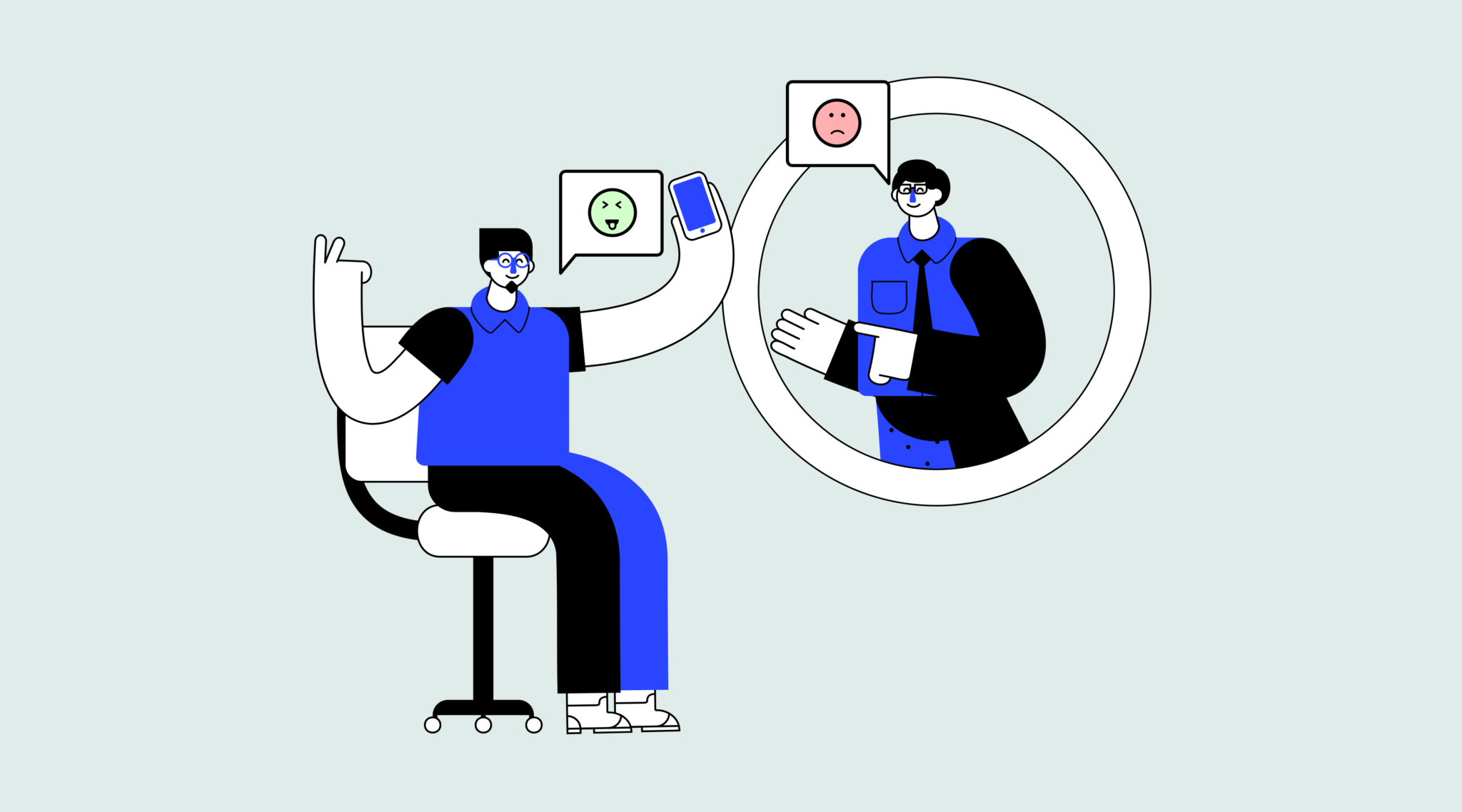
UX Psychology plays a big part in a user’s experience with an application. By understanding how our designs are perceived, we can make adjustments so that the apps we create are more effective in achieving the goals of the user.
To help you understand the perception of the user, I will introduce some design principles which I think are the most important, and also provide common examples of these principles in practice. Let's start with the Von Restorff effect:
Von Restorff effect
The Von Restorff effect (also known as the isolation effect) predicts that when multiple similar objects are present, the one that differs from the rest is most likely to be remembered!
Does this ring any bells?
This is the main reason why all call-to-actions (CTAs) look different from the rest of the action buttons on a site or application!
We want users to be able to differentiate between a simple action button and a CTA, in order for them to have a clear understanding what the CTA does, whilst also remembering it throughout their use of the application or site.
"When multiple similar objects are present, the one that differs from the rest is most likely to be remembered!"
Serial position effect
The Serial Position Effect is the propensity of a user to best remember the first and last items in a series.
This is why most applications nowadays ditch the hamburger menu and go for a bottom or top bar navigation, placing the most important user actions to the right or left. In the image above, you can see some examples from popular iOS applications. Each put the “Home” and “Profile” items all the way to the left and right, with serial position effect in mind.
Cognitive load
Cognitive load refers to the total amount of mental effort being used in a person's working memory. To put it simply, it is the amount of thought you need to exercise in order to complete a specific task.
"Cognitive load is the amount of thought you need to exercise in order to complete a specific task."
Cognitive load theory can be differentiated into three types:
- Intrinsic cognitive load
- Extraneous cognitive load
- Germane cognitive load
I will touch upon the Intrinsic and Germane types as I think that these are the most applicable to UX design.
Intrinsic Cognitive Load
Intrinsic cognitive load is the difficulty associated with a specific instructional topic. It's the main reason micro-copy and copy play a huge role in a good user experience.
For example most of the time on applications’ empty states, we prompt users to complete a task. Here, the copy needs to be short, simple and with the appropriate words in order for the user to be able to easily follow the instructions.
Germane Cognitive Load
Germane cognitive load is the cognitive load devoted to processing information and construction of schemas. The schemas describe a pattern of thought that organises categories of information and any relationships among them.
One of the reasons we use design patterns is because they're something we're programmed to do by default – so it’s easier for the users to recognise and learn something new if they can discern it into a pattern from something they already understand.
"It’s easier for users to learn something new if they can discern it to a pattern from something they understand"
Hick’s Law
Hick’s Law is the most popular principle, along with the Gestalt Laws.
It’s also very simple to understand and practice. Hick's Law describes that the time it takes for a person to make a decision depends on the choices available to him or her. So if the number of choices increases, the time to make a decision increases logarithmically.
A very nice example of Hick’s Law that applies to user experience design are lists:
Law of Proximity
Law of proximity is part of the Gestalt Laws of Perceptual Organization, and it states that objects that are near, or proximate to each other, tend to be grouped together. To put it in simpler terms, our brain can easily associate objects close to each other, better than it does objects that are spaced far apart. This clustering occurs because humans have a natural tendency to organise and group things together.
"The Law of Proximity states that objects that are near, or proximate to each other, tend to be grouped together"
In the example above, there are 72 circles. We recognise the circles in groups, based on the distance between them. Categorically, we also perceive that there's a group of 36 circles on the left side of the image, and 3 groups of 12 circles on the right side of the image.
I believe this example makes it clear that there is a need to group things together when designing a UI, as well as the importance of being careful when putting things together since users may naturally think they are associated with each other.
Thanks for reading, you can see more of my work on Behance and GitHub. Feel free to get in touch on Twitter with your thoughts!


