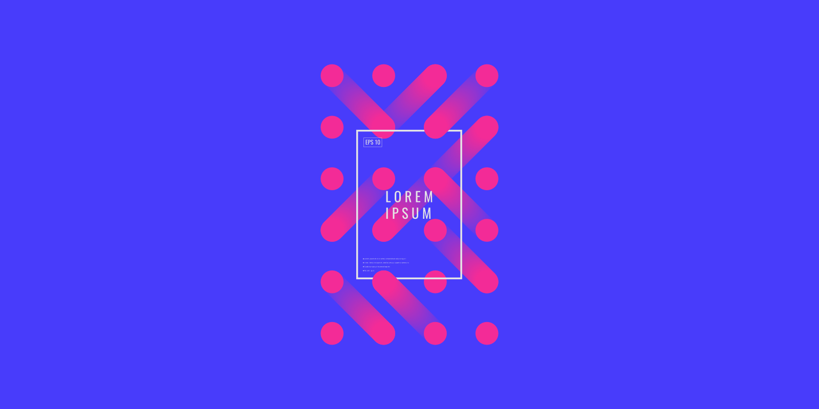
For a long time, using gradients was the biggest no-no in design. Designers tended to avoid gradients because they created a strong impression of design from the 90s.
But that is no longer the case. If you open Dribbble or Behance right now, there is a strong chance you will see dozens of designs that use gradients. The gradients designers use are loud and full of color.
In this article, I want to share some tips on how to use gradients in design.
Why do we actually tend to use gradients in design?
To find the answer to this question, we need to go back to 2014. It was the year when flat design became popular — Google released Material Design and Apple updated their macOS with a flat UI design. Back then the flat design was fresh and exciting, especially in the comparison to skeuomorphic design.
But the flat design has its own limitations, and one of the significant limitations is in the context of colors and styles that designers can use. It’s hard to name more than 10–15 colors that you can use for flat design.
By using gradients designers:
- Get more creative freedom. While flat colors stifle design’s potential, gradients open the door to infinite possibilities. By blending colors, designers can create eye-catching and memorable visual designs.
- Can introduce depth and dimension to design. Gradients solve the problem of ultra flat design (designs that look ‘too flat’)
Gradients are a surprisingly versatile tool
Using gradients, designers can:
Make bold statements
Gradients help create something new and unexpected. Even a tiny element such as a logo can be exciting if you apply a gradient to it.
Empathize certain elements
A great user experience intuitively directs users through the product. The well-designed gradient subconsciously leads users toward the focal point.
By making some parts of the page more intense, you put more visual weight on them and make them more noticeable.
Take a look at Mixpanel homepage. Illustration plays a vital role in this layout, and gradient background visually prioritizes it.

Gradients are perfect when you need to draw people’s attention to a certain area. Mixpanel uses gradients to highlight illustration
Six Tips for creating an impressive gradient
1. Learn basic types of gradients
There are several types of gradients. All involve a central starting point where the color starts and progressively blends into other colors. For this article, I want to cover three common types of gradients:
Linear
A linear gradient creates a band of colors that progress in a straight line. The gradient transitions smoothly from one color to the next.

Linear gradient. To create a linear gradient, you need to specify two colors (or two tints of the one color).
Radial
Radial gradients are similar to linear gradients, except that they radiate out from a central point. As a designer, you can dictate where that central point should be and specify the size of the gradient.
The Instagram logo that you saw above was created using a Radial gradient.
Conic
A conic gradient is similar to a radial gradient — both are circular and use the center of the element as the source point for color stops. However, for a radial gradient, the color stops emerge from the center of the circle, while a conic gradient places color stops around the circle.

Creating a conic gradient in Adobe Illustrator. Image: stackexchange
2. Don’t choose color randomly!
Not all colors work well with each other. For example, by pairing complementary colors, you probably get that bad-looking color transition.
The red-to-green gradient in the following example looks dirty:
Try to avoid using complementary colors when creating a gradient
It’s better to use either analogous colors (colors that are next to each other on the color wheel):
or shades of the same color (i.e. shades of the blue)
3. Create smooth transitions
The transition between colors should be really smooth. Ideally, the user shouldn’t notice the place where one color flows to another.
Take a look at the following example. You can notice a line that separates two colors. This line creates the impression of an abrupt transition.
Don’t: Create an abrupt transition
"User’s eyes should relax as they scan the page."
To create a smooth transition, you need to spend more time playing with color stops.
Do: Create a smooth transition
4. Convey emotion or mood
Color evokes emotional responses. We can use this color property to connect with the audience on a deeper level.
"Think about what you want your users to feel when they interact with your product."
For example, if you want to create a highly energetic atmosphere, you can use the red-to-orange gradient.
But if you want to create a relaxing atmosphere, you probably want to use dark blue-to-blue gradient.
5. Don’t forget about color contrast
No matter how beautiful your design is, you shouldn't forget about accessibility. Always check the color-contrast ratio.
Don’t: Lack of color contrast leads to bad readability.
WCAG 2 level AA requires a contrast ratio of at least 4.5:1 for normal text and 3:1 for large text, and a contrast ratio of at least 3:1 for graphics and user interface components

6. Use special tools
It’s easy to create gradients using Adobe Illustrator. But there are also a lot of special tools for creating gradients:
. . .
References
- Oh Mamma, I’m in love with Gradient by Ludmila Shevchenko
- Using Gradients In User Experience Design by Manuela Langella


