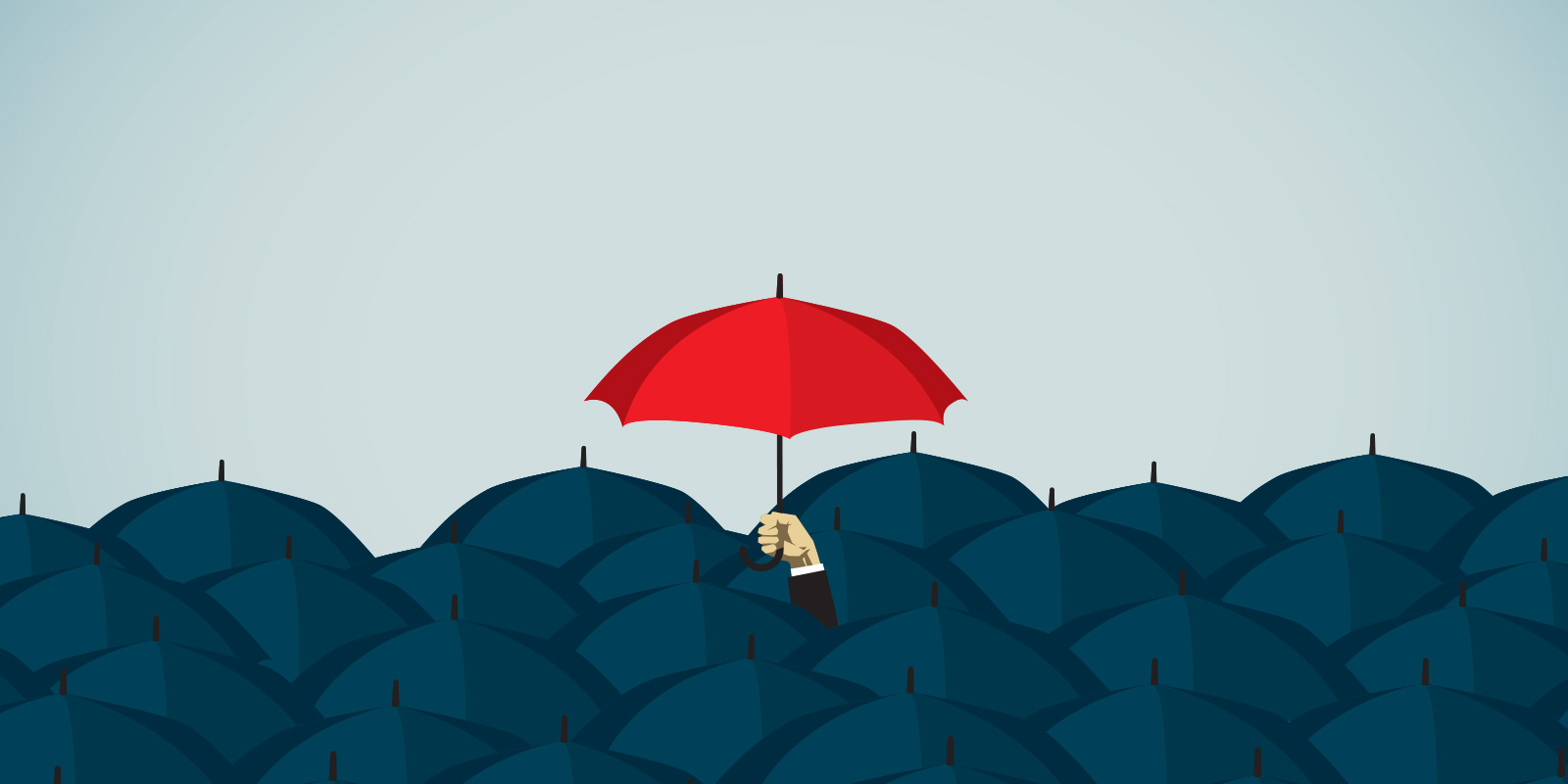
The whole “Homogeneity of Design” topic is creeping up again. That’s cool. We’re all special flowers in our own way. But I’d like to make a few points about product design, as I see it.
"In digital product design, industry wide established paradigms are good"
The first thing I’d like to say is that I am a very visual person. I really like to create unique and distinct visual experiences and have enjoyed doing so my entire career.
But…
In digital product design, industry wide established paradigms are good (I assume most of us know this, but I think it is worth reminding). Users learn to expect certain behaviors, because they are used in so many places. Pull to refresh, swipe to dismiss, navigation patterns, even underlines for links. These are all style or interaction choices in a designers arsenal that a user, off the bat, would probably know how to use or what they stand for. This is good. It means that we are all collectively teaching users how to use digital products. We are all, in a way, in this together. Yeay! It does mean that your app might slightly resemble a different app, but that is ok. Jackets all look the same too, but hey, I’m pretty sure I know where my pockets are.
"Digital product design isn’t abstract visual expression."
It’s funny, I don’t see anyone complaining about the homogeneity of, say, a book’s table-of-contents or an ATM interface. They don’t because it works and has worked for such a long time, why change it? On the other hand, every TV manufacturer thinks they need to be unique and create random remote and interface designs. Needless to say no one likes relearning how to use their new TV, amirite?
Digital product design isn’t abstract visual expression. It’s a conversation framework between a human and a computer. The components and interactions we create as designers are like parts of a global language. Just like you wouldn't want to have a conversation that’s fragmented into multiple languages, you wouldn’t want unique fragmentation in the way you communicate with your computer.
"The components and interactions we create as designers are like parts of a global language."
Building products in the digital space really does mean you need to let your ego go. Designing a slick homepage that looks different than the rest is super important but not my only goal. My first goal is to make sure that people understand and enjoy using the product I am working on. Making it look visually different from the competition is important for the brand, but can’t be in exchange for it’s usability and function because a bad experience is sometimes way more costly to the brand than homogeneity. Remember Ello? Exactly.
I see a lot of complaining about Dribbble. Look I get it, it has its issues it needs to solve, but blaming it for instigating homogeneity within the industry is completely missing the point. For example, the homogeneity of a product’s color isn’t because of Dribbble but because of the very nature of choosing colors for a product. We product designers need to consider accessibility, consistent primary action colors that work for links and for buttons, error states, confirmation states, etc. The reason there is a lot of blue in digital products is the same reason there is a lot of black in fashion, it just works.
"Try creating a robust product styleguide using bright yellow as a primary action color, I dare you."
Now, I’m not here to say we’re suppose to all use Bootstrap and call it a day. God no. Character is super important in a product, but a lot of that character isn’t only in its visual design. In fact, a lot of it isn’t. It’s in the micro interactions, it’s in the copy, it’s in the nuance. Perhaps a sign up screen shouldn't be too adventurous with its visual design, but it can have fun with its call to action copy, or with its animations, or with its error states.
Understanding when to break free from common or platform native patterns is part of the art of product design. It’s like a secret weapon that should be used sparingly and only at the right time. When used too frequently, people lose trust in the product because it breaks from the norm causing confusion and begging the question if the creators are compensating for something. When never used, people lose trust because it seems like the creators didn't put any time into making the experience feel welcoming or abandoned it completely. Nuance is hard to get right and it takes time and experience.
"Understanding when to break free from common or platform native patterns is part of the art of product design."
It’s easy to blame product designers that we are not looking for “better answers” (i.e. better designs, or new ways of thinking of things), but this sounds very naive to me. If I know certain patterns work and make users happy, why risk their happiness? Would you want your bank’s app to feel like a “new experience”, or do you just want to know your checking balance and how to transfer some cash?
80% of the time the wow factor of a product is getting the user to their desired intent in the shortest time possible. Sure, make them smile along the way with some character in the other 20%, but don’t let your “unique” design get in the way. (I’m just throwing numbers here, this isn't backed by science clearly but you get the point.)
Of course, I’m not saying don’t ever experiment. Nothing in life (or in product design) is black or white. But if you do experiment, do it slowly and responsibly. Make sure it has a purpose that serves your users and not only serves to impress Designer News Bros™. You may come up with a unique interaction that is actually an improvement to common paradigms, a new metaphor here, a new layout there. But this doesn’t happen over night. It’s not like graphic design or traditional content driven web design that relies almost exclusively on infinite possible aesthetic choices.
So, in the time being, swallow your pride and allow yourself to be a tad homogeneous for the sake of your users and your business. We talk so much about having empathy as a designer. Well, perhaps here’s where some of our empathy is needed, by applying restraint.
This post was originally published on Yaron's Medium profile.

