The rules for mixed reality content creation are still in flux. This is an exciting time to be working in mixed reality because there isn’t a standard way of designing yet. Once more content is created, the audience for mixed reality will grow, and we’ll be able to see which designs work and which don’t.
Working as a group named Team HoloGlass, my teammates and I designed and developed a holographic artist portfolio for the Microsoft HoloLens. Our portfolio allows users to interact with 3D holographic artwork by placing the artwork in the real-world environment, adjusting its size, and rotating it. Users can also see information about the artwork, as well as details about how the artwork was created.

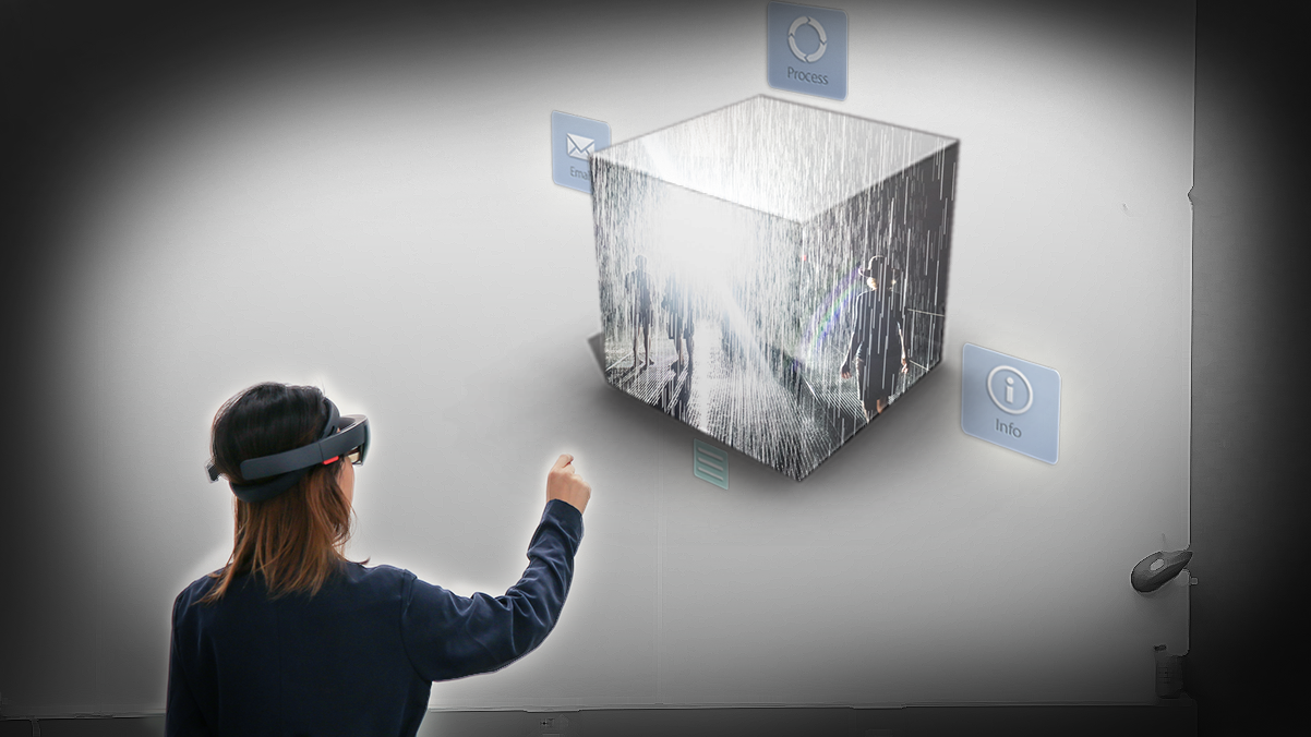
A user places a holographic art object on a real wall. This is what selecting an interactive installation looks like in our mixed reality art portfolio.
A typical user flow for web and mobile applications only describes what happens when a user clicks something. In a mixed reality experience, there is much more going on than clicking and viewing. In a HoloLens mixed reality experience, these these basic interactions make up the fundamentals of the experience:
- Airtap: User selects a holographic object by tapping their thumb and index finger together while pointing at the object
- Double Airtap: User taps their fingers together twice. Similar to a doubleclick on a mouse.
- Bloom: User raises their hand, holds their thumb up, and touches their thumb to their middle finger in a “bloom” gesture. Similar to the Italian hand gesture for capisce. The bloom is used as a way to go back or to return to the home menu.
- Voice Command: Users can interact with a HoloLens application by speaking. Users can also use voice commands to access Cortana, Microsoft’s digital assistant, anytime during their HoloLens experience.
- 360 Sound: HoloLens applications use 360 sound. Games, music, movies and more can be experienced in mix.
"In a mixed reality experience, there is much more going on than clicking and viewing."
All of these interactions are much different from web and mobile interactions. They call for a new kind of user flow.

This is a user flow for how a person experiences an interactive installation in our holographic art portfolio. Notice how we have placed a script next to a visualization. Next to the visualization, there is text describing what is happening and icons indicating potential actions. At the bottom of our user flow is an icon “key,” which shows which actions are available in any given window. Another full user flow can be seen at the end of this article.
This is a user flow for how a person experiences an interactive installation in our holographic art portfolio. Notice how we have placed a script next to a visualization. Next to the visualization, there is text describing what is happening and icons indicating potential actions. At the bottom of our user flow is an icon “key,” which shows which actions are available in any given window. Another full user flow can be seen at the end of this article.
Here are 6 ideas to keep in mind when creating mixed reality user flows.
- Storyboard!
In mixed reality, your user’s journey is a story, and you, the designer, are the author.
"Your user’s journey is a story, and you, the designer, are the author."
Sketch out your story in third person and first person. Sketching in third person allows you to view the experience at a distance, and can help you describe the big picture components of the experience you’re creating. Sketching in first person allows you to understand the field of view of the device you are creating for. Sketching from the user’s perspective lets you make sure that you are including everything that you need to in the user’s line of vision. It allows you to place each element of your experience in a thoughtful way, since you are likely designing an application with 360 movement (i.e. the user has to move her head around while wearing the device to see everything that is available).
We found inspiration for mixed reality storyboarding from many articles on Medium about sketching for VR. Virtual Reality Pop’s article “How to Sketch for VR Like a Pro” was especially helpful.
2. Describe Every Component and Available Interaction in Your Experience

A spreadsheet we made to describe the nitty gritty interaction details of our mixed reality art portfolio experience. Notice how a script is written for the instructional audio column. Also note the physical space column.
"Describe Every Component and Available Interaction in Your Experience"
Designing in mixed reality means you’re designing interactions related to sound, voice, sight, and gesture. A good mixed reality experience incorporates all of these elements (this is part of what makes mixed reality so cool!). You must design for a variety of “what if” experiences in each window (e.g. What if the user selects the object via an air tap? What if the user selects the same object via voice command? What if the user doesn’t hear the audio instructions the first time they play? What if the user double airtaps instead of single airtaps?).
With all these moving parts, it can be difficult to keep track of everything. We recommend writing everything down. Kind of like a story! Ask yourself the relevant “what if” questions for your experience, and answer them. If your mixed reality experience is complex, make a spreadsheet with the what if questions and answers for each window. When you’re making your final user flow, it will be useful to return to this document to reorient yourself and stay focused.
Also, make sure to describe the physical space in your experience. Mixed reality is great because digital objects interact with the real world environment. It’s crucial to describe the real world environment when outlining your designs, otherwise context can get lost.
3. Describe What is *Not* Happening in the Experience
If you don’t describe which components are not available in your mixed reality experience, the person you’re communicating your design to will assume *everything* is available in *every* window of your application.
For example, if your application uses instructional audio in some windows, but not all, show the absence in your flow. Describing these components is key when showing your work to stakeholders.

Notice how we indicated that no instructional audio is playing in this section of the “Painting” user flow. The green circle is used for emphasis in for this article.
4. Bodystorm
It’s challenging to express a mixed reality 3D experience in a different format. But it’s a challenge worth tackling. Before you spend tons of time developing in Unity, map out your experience in other ways.
Try bodystoming (i.e. acting out your experience with a group of people). You’re designing 3D interactive objects. Humans are also 3D interactive objects! Have one person put on a makeshift headset (we used a sandwich box) and pretend to be the user. The headset is a must, because it allows you to mimic the field of view of the device you’re designing for. Have a second person pretend to be the object the user is interacting with. Have them respond to the user’s gestures accordingly. If you have text in your mixed reality experience, write down the text on paper and use it is a prop/object. Have the user run through the “what if” scenarios you’ve written down. Act out what the user hears, what the user can say (voice command), and what the user can do with gestures.
"Before you spend tons of time developing in Unity, map out your experience in other ways."
Doing this is the quickest and most effective way to get a sense for how your experience will feel. Bodystorming will allow you to design a natural feeling flow that is intuitive. It will also help you understand how to improve the clarity of your experience from the user’s perspective. Creating a makeshift headset builds deep user empathy, allowing you to understand what the user feels like when they have a limited field of view. Lastly, bodystorming helps you see which interactions are essential and intuitive, and which are not.
5. Prototype in 2D First
Prototyping in 2D is not the best for user testing, because the actual mixed reality experience will be drastically different. However, it is incredibly helpful for determining flow.
Nail down all your interactions in a 2D, clickable prototype. We used Marvel. This will save your developers time and energy — they will be thankful!

This is a Marvel render of what it would be like to watch a video in our mixed reality portfolio app. Each icon is clickable and brings the user to a different window.
Prototyping in an app like Marvel is more clear and concrete than bodystorming. While bodystorming helps you design feeling, Marvel helps you design for usability. Make images clickable to represent the holograms in your mixed reality experience. When there is audio or text, write it out in your Marvel window. It’s okay if your Marvel window gets cluttered with text. Creating a 2D interactive prototype for a mixed reality experience isn’t about making something beautiful for your user tests. It’s about making your user experience clear, and planning for all the different answers to the “what if” questions you’ve been working with. A 2D prototype is a pragmatic, time-saving approach for designers who need to describe detailed concepts to developers. The 2D prototype serves as a roadmap for your developers to follow, and lessens the chance that there will be major mistakes or communication errors.

Note the instructional audio written on the left. This could be even more detailed if an exact script was written instead of placeholder text.
Here is the Marvel prototype:
Click here to open it up in you browser.
6. Be Consistent
All of the options re: gestures, sounds, visible objects, and voice commands can come together to create an amazing user experience. However, if done messily, the various options can create a bad, confusing user experience. We recommend keeping your design consistent. For example, if an object can be selected via an airtap, make it selectable via a voice command, too. Assume that the rules you create apply to everything, in every way, unless otherwise noted.
"We recommend keeping your design consistent."
Being consistent with the options you provide your user is not only essential for a smooth, clean experience, it is also important when considering accessibility. For example, some people may not be able to do the physical gesture of an airtap, and may rely on voice commands to navigate their experience. Good design is inclusive design.
Outcomes
It will be great to see what other processes emerge in the near future as mixed reality continues to take off. Below is a full user flow for someone viewing a painting in our mixed reality art portfolio application. This flow is the outcome of the process I’ve written about above.
Viewing a Painting
Additional Resources
For more insight on on designing for mixed reality, check out Microsoft’s Interaction Design Fundamentals and Designing for Mixed Reality documents. Also, explore Medium — there are great articles on mixed reality design basics like this, this and this.


