- Part 1: Building Upon a Platform Ethically: Examples of how to build your app on top of an established platform in an ethical manner.
- Part 2: Avoiding Dark Patterns: Sometimes a UI can trick users into spamming their friends— here's how to avoid that.
- Part 3: Ethical Design in Add-on Products: Google Chrome is a huge platform for developers to add extra functionality— in this part, we'll explore ethical approaches to creating such add-ons.
- Conclusion: Work Together to Make Better Products: To wrap up, we'll see how working together is the best way to build better tools and products.
You can build the best product in the world, but if nobody knows it exists can it really be the best? Getting discovered can be as important as creating a great product nowadays. This has lead to many startups creating products the other way round: instead of ‘build it, and they will come’, it's become: ‘go to where they are, and build it’.
"You can build the best product in the world, but if nobody knows it exists can it really be the best?"
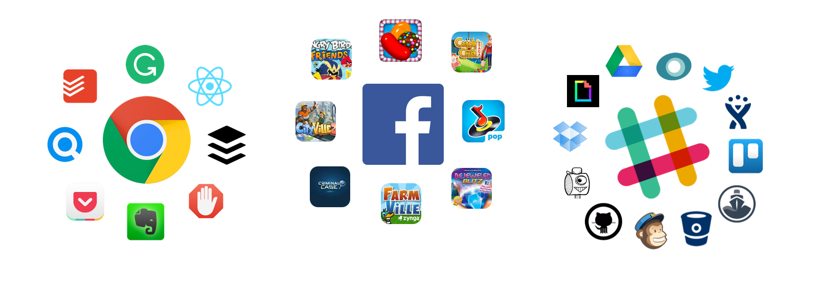
A great way to do this is to ‘piggyback’ top of an existing product or platform. For example, Paypal piggybacked eBay, and Buffer grew through Twitter. In fact, lots of businesses have been built upon larger platforms— from Chrome plugins to Facebook games and Slack integrations:
-

- Apps & Platforms
Andy Cook summarises how valuable this growth tactic can be in his article “Building on Slack Saved our Startup”:
If you’re early enough to a platform and build on top of it right, hopefully eventually you’ll grow big enough to become a platform yourself.
How user experience can be affected
Whilst it’s a great growth tactic, it can also lead to large changes to the user experience of the established platform. For example, Google Adblock totally removes adds from a browser, changing the experience of reading on the web— this may be good for some people, but not for others:

Add Blocker Plus (Image: Add Blocker Plus on Chrome Library)
Smaller products may even take advantage of a large platform’s network, introducing unethical design practices which can create breeding grounds for dark design patterns. There are many in-betweens, and unanswered questions on ethical approaches to building products on top of established ones, so this is what we’ll explore in this article.
What we'll cover:
Part 1: Building Upon a Platform Ethically
Piggybacking is a term introduced by Sangeet Paul Choudary, best-selling author of the books ‘Platform Revolution’ and ‘Platform Scale’. He coined it as such since it gives the smaller company the chance to access the large user base of an established platform, and then grow through it.

Piggybacking concept "Udy and Emmy" by Pablo Stanley
It’s most ethical and useful when the relationship is mutually beneficial. Both parties should add value to each other, whilst, maybe most importantly, creating a better product/service for the end user.
"Startups can piggyback on established platforms, & grow through their user base."
Let’s take a look at a couple examples to see how it can be done well:
1. Paperbot + Slack ???? ????

Paperbot for Slack (Image: Paperbot.ai)
“Both apps should bring value to each other, whilst creating a better product/service for the end user.”
A cool recent example is Paperbot’s Slack integration. Paperbot is a useful tool for designers— it creates a ‘Pinterest-like’ board for inspiration, straight from links shared in your Slack channels. Users can even search through curated links:

Paperbot for Slack (Image: Paperbot.ai)
It’s a good approach to building a product upon existing platform because it creates a win for absolutely everyone involved, including the end user:
- Paperbot wins by reaching Slack’s huge user base.
- Slack wins by becoming even more useful (cool links don’t get lost).
- The end users win as they gain a curated list of content based on their team’s interest ????
2. Upscribe + Medium ????
Another recent example is the Medium and Upscribe relationship. Medium is a large content platform, holding a huge network of writers. This network provides a great opportunity for smaller ‘add-on’ services to grow within the platform, that enable writers and readers gain more value.
Upscribe, provide this extra value by offering “Embeddable newsletter sign up forms for Medium”. Essentially, Upscribe enables writers to collect readers’ email addresses through a form embedded within their articles, like this:

Upscribe for Medium (Image: Upscribe on Product Hunt)
Just like Paperbot for Slack, this relationship creates value for everyone:
- Upscribe gain access to Medium’s huge network of users.
- Medium get a better way for users to subscribe to newsletters.
- Writers and publishers can gain value outside of Medium ????
Ethicalness Depends on Context
Looking at the examples above, despite both having similar outcomes, they do so in quite different ways:
Paperbot use existing features of Slack’s platform, whereas Upscribe introduce a completely new feature on Medium’s platform.
The difference here shows just how much context can play a role in determining ethicalness, especially in the case of Medium:
- Upscribe bring a large change to Medium, enabling users to gain value outside the platform.
- If Medium hadn’t supported this themselves, debates on how ethical this use of their platform could have arisen.
Thinking forwards, what happens if the smaller product is able to abuse the large platform’s network by using features in ways they weren’t intended? Let’s explore this next.
“When large platforms are very open, they become easier to access, and therefore take advantage of.”
Part 2: Avoiding Dark Patterns
When large platforms are very open, they become easier to access, and therefore take advantage of. For instance, did you ever see these Candy Crush notifications on Facebook?

Candy Crush Notifications
Well that happened mainly because of this:

Candy Crush 'Ask Friends' Screen
…which probably lead to this, and lots of tears ????:

Facebook remove friend
Friend Spam
The mechanics and UI of Candy Crush encourage players to invite their friends just to continue playing. In doing so, Candy Crush (intentionally or unintentionally) takes advantage of Facebook’s friend network, also leading to ‘aggressive use of notifications’. It’s a behaviour can show shades of the dark design pattern, ‘friend spam’.
Dark Patterns are tricks used in websites and apps that make you buy or sign up for things that you didn’t mean to. (Harry Brignull, creator of Darkpatterns.org)
To ensure we design ethically upon another platform, we can make sure our app design doesn’t cause a change in people’s behaviour, making them do things they wouldn’t normally want to do. Shades of dark design patterns can be unintentional too, so let’s next look at some practical tips on how we can avoid such patterns.
“Does the design cause a change in behaviour, making people do things they wouldn’t normally do?”
Using Notifications Appropriately
In the case of Candy Crush, it’s either invite your friends, or pay. Given these options, most of us choose the former, cheaper option which causes an increase in the number of notifications— bordering on being aggressive. Whilst there is an intent to send invites, it can be argued that the context of the game encourages it.

Facebook notification
Here’s how Facebook dealt with this invitation/notification overload problem:
Make it convenient for users to unsubscribe
Facebook managed to reduce aggressive notifications by attaching a useful action to their notification list elements. The ‘x’ icon (see below) gives the user an immediate chance to unsubscribe from related notifications— at the very same point from which they see them:

Facebook remove friend
The user does not need to navigate away from the notification, or go into privacy settings— it can be done in the very same place.
Personalise notifications based on user behaviour
Instead of causing people to dismiss notifications themselves, a better method could be to ensure the right people get the right message in the first place.
“Ensure the right people get the right message in the first place.”
Some Facebook gamers truly want to receive game notifications, whereas others see those very same notifications as spam. Therefore, notifications can be made relevant if they’re sent based on user’s activity. Facebook actually took this approach, slowing the flow of notifications based on a user’s gaming activity:
“There are some tools that are kind of outdated that allow people to send invitations to people who’ve never used a game, who have gotten invitations in the past but don’t play games on Facebook. We hadn’t prioritized shutting that down, we just had other priorities. But if this is the top thing that people care about, we’ll prioritize that and do it.”
In line with this, only if a user plays Facebook games will they get game notifications, as they’re more likely to want them.
Good notifications are timely, precise, and relevant
To further ensure your notifications don’t become aggressive, you can make sure they are timely, precise and relevant. Google provide some useful guidelines on effective notifications:

Part 3: Ethical Design in Add-on Products
As well as apps on platforms like Facebook, many great examples of ‘piggybacking-like’ activity are present in Google Chrome extensions, where third party developers can add extra functionality to the browser. This section will take a look at various Chrome extensions: from bookmarking apps like Refind, to spell checkers like Grammarly.
We'll see how we can avoid any shades of dark design, with the most common one being 'Disguised Ads':
Disguised Ads
Smaller products built on established platforms often add features to the platform’s interface (like Upscribe + Medium). Sometimes this additional content may actually become disguised to look just like content made by platform itself, showing shades of the dark pattern, ‘Disguised Adds’, defined as:
Adverts that are disguised as other kinds of content or navigation, in order to get you to click on them.
However it can actually be done by accident with the good intention of keeping consistency with the main platform’s UI. To demonstrate this, a Chrome plugin that comes to mind is the bookmarking app, Refind. Once installed, Refind sits in the browser toolbar, and is used to bookmark web pages with a single click:

Refind browser extension (Image: Refind on Chrome Library)
“A problem emerges when a product does extra things— things unexpected by users of the platform.”
A problem emerges when the product does extra things— things unexpected by users. Upon installing Refind, it can be a surprise to find your bookmarked pages appearing amongst Google search results, and even looking just like Google search results:
Avoid Disguising Content

Refind embedded search result
Personally, I actually find these additional results very useful, and sometimes more relevant than the Google search itself. A question here though is whether the feature actually enhances the experience of the search engine, or takes away from it— and this often depends on individual user preference.
“Does it enhance a user’s experience of the search engine, or take away from the search engine itself?”
Some may argue against the additional search results as the Refind links look almost exactly the same as Google’s links, but they aren’t in any way from Google (shwoing possible shades of disguised ads).
A couple ways to avoid this are to:
- Make embedded content visually different.
- Make additional content self-contained (as seen in the next example of Evernote).
We could also take further steps to improve this scenario such as by: informing the user, asking permission, or making it obvious to remove features— all of which we’ll explore next.
Make it obvious to remove features
Providing users a way to easily remove features is a good way of keeping them in control of the platform they’re using. Therefore, as we saw previously in the Facebook notification example, it’s useful to have a way for people to dismiss features right from where they appear. Refind make it fairly straight forward:

Refind settings link on additional search results
You can simply click the settings button, which then allows you to edit all Refind’s permissions. Similar to Refind, Pocket is a bookmarking app which also sneaks content onto your Google pages. They insert content onto the Google search page, but also add a quick way to remove it:

Pocket: Removing trending pocket stories from Google search page
Inform the user before adding features
A better way to keep users in control and informed is to ask them before adding extra features and content to a platform.
“Provide information about what’s going to happen— keep the user in the know”
Evernote is a good example, that works similarly to Refind and Pocket. However, before embedding content onto the Google search, they first provide information about what’s going to happen— keeping the user in the know. A user can also dismiss the feature from the initial ‘request’:

Evernote ask for permission

Farewell additional features and notifications
Make Add-on Content Relevant
To add features without ruining the existing platform’s user experience, it’s also good to ensure that whatever gets introduced is consistent with the goal of the user in the given context.
“The design must fit a user's intent in the given context”
Candy Crush achieved this to a certain extent by adding their invite button when a user needed more lives. However, despite being in the right place, it wasn’t right for all users— it annoyed many people. Let’s have a look at how Buffer have done it, as they have a more ethical approach:
The content must fit the context
The Buffer Chrome plugin works really well in combination with Twitter:
- On Twitter, two main user intents are to ‘retweet’ (if viewing a tweet), or to simply ‘tweet’ (if writing a tweet).
- Buffer adds their own button in both these contexts, as it’s the perfect time to add a tweet to your Buffer queue:

Buffer button next to Tweet button
“It works well because the action matches the intent of the user.”
It works well because the action matches the intent of the user. Furthermore, in accordance with the previous tips, the Buffer button is not disguised in any way— it’s bright green and says ‘Buffer’.
Don’t break the user’s natural flow
Another good example is the Grammarly plugin. Grammarly is proof-reading app that checks your spelling and grammar as you type on the web.

Grammarly
Like Buffer, Grammarly matches the goal of the user and improves the overall platform. It attaches it's grammar-checking features to every text-box you can type in on the web, and gives you hints as you type. The timing is key, as the flow of the user isn't disrupted:

Thanks to Grammarly & Facebook, I can share my important thoughts with my friends, whilst spelling really well.
- You don’t have to wait until you’ve finished typing or even press ‘check’.
- Grammarly doesn’t break up the flow of writing.
“Timing is key— the user’s flow shouldn’t be disrupted”
Offer alternatives
If an add-on doesn’t work the way a user would like, they’ll find a way to delete or remove it as soon as possible. Therefore, it’s useful to offer alternatives. The newsreader app called Panda, for example, does this well. Panda is a design inspiration plugin which gives users the latest design news, and changes your ‘new tab’ page to their website in the process.
This is useful to some, but others who prefer to use their 'new tab' page for other apps won’t want the feature. Therefore, Panda provides a solution whereby people can use a ‘shortcut’ version of their app instead:

Shortcut version of Panda
This option only becomes available upon uninstalling Panda— maybe offering different flavours of an app from the very start could be a good way to go.
Avoid over-automation
We’ve mainly looked at Chrome extensions above, as they’re one of the most common and popular ways for apps to reach larger audiences. However, any large platform that offers an API can be an avenue for smaller products to grow.

Bots on Twitter
"Any large platform that offers an API can be an avenue for smaller products to grow."
For example, there are many ‘Bots’ built primarily to grow traffic and engagement on Twitter or Instagram. One bot is called Archie, which ‘auto-favourites’ tweets based on predefined settings. Here’s how it works:

Screenshot from Archie.co
The question here is whether bots like this could actually be ruining Twitter, the platform the app is built for. For example, this is happening today:
- ???????? A bot makes a tweet (e.g. from an RSS feed)
- ????❤️ Another bot favourites it (using Archie.co)
This creates both tweets and engagement, and also a bizarre cycle of bots talking to bots. Yes, it’s effective in increasing engagement and stats, but how much of it is real? And does it embrace what social media is really for?
Conclusion: Work Together to Make Better Products
Making your product available and convenient to access for as many people as possible can be key to building a successful product. Additionally, making a platform as easy to build upon as possible can be great to help it grow even further.
"A platform without contributors will get left behind, and a tool without users will never be used"
We’ve even seen this with design tools such as Sketch— it’s almost become a development platform now, which sets it apart from similar vector tools. There are hundreds of plugins popping up, each bringing new features to the platform. You can find many in the Sketch Toolbox.

Sketch Toolbox
And don’t forget to pick up ours too, we’ve made it possible to play and record Prototypes from within Sketch! Check it out here:
Overall, there must be some balance between the smaller app and the platform it's built on to maintain a good user experience. It's best when sustained from both sides:
- The platform being built upon can monitor how the smaller product behaves (like Facebook monitoring Candy Crush notifications).
- Smaller products can be designed ethically in regards to the platform they’re building upon (Like Paper Bot built upon Slack).
"If you're building on a platform, try to make it better than it was before you touched it."
In the end, a platform without contributors will get left behind, and a tool without users will never be used. So if you are building on a platform, try to make it better than it was before you touched it.