When you’re working on something new, it’s exciting and unfamiliar, making it tempting to skip over the wireframing stage and dive straight into designing a solution. But, by doing this, you’re missing out on an opportunity to better understand the problem and may end up spending more time revising, editing or even recreating your design.
Wireframing can sometimes feel like an unnecessary stage in the design process, but in the long run it’ll make you a more effective designer. Done right, both Lo-Fi (low fidelity) and Hi-Fi (high fidelity) wireframing can help you get crucial feedback in the earliest stages of your design process, putting you on the right track earlier.
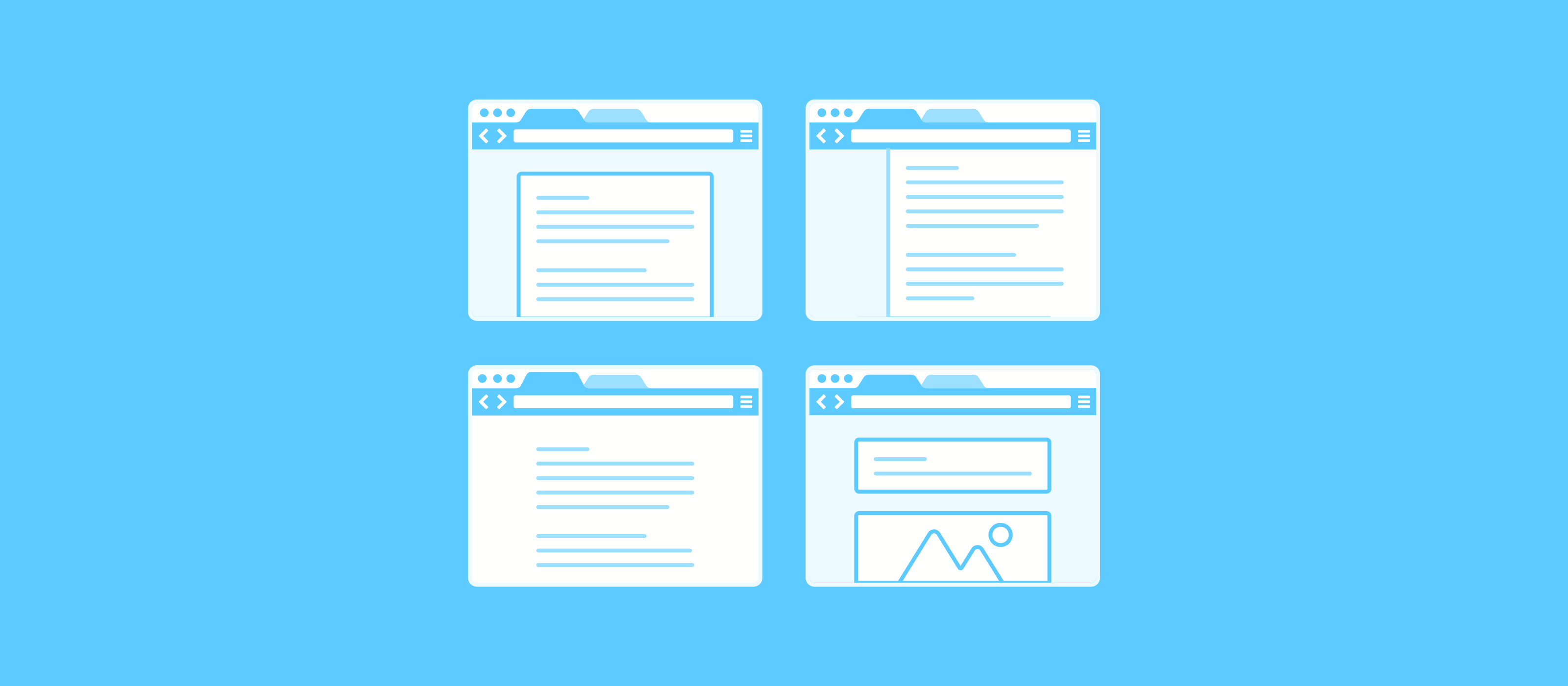
When we talk about ‘fidelity,’ this refers to the level of detail in a design, which can range from no detail at all, to a rich, fully finished UI.
Here’s what the different phases of wireframing mean, and how they can fit into the projects you’re working on every day.
Lo-Fi wireframing, explained
‘Lo-Fi’ wireframes should be the quickest possible sketches of the UI, right out of the gate as you start your project. Ideally, you’re drawing a bunch of boxes on paper just to get the ideas out because this forces you to experiment without tools getting in the way or defining how it might appear.
The beauty of lo-fi prototypes is that you can throw them away as you begin experimenting and discover new information. That’s the point!
Think of this as a brainstorm: if you were trying to create the next hit Disney movie, you’d expect a bunch of scribbled down notes, characters and storylines on a napkin to be the catalyst, not a highly-polished render of the scenes you see in the final cut.
Paper prototypes are a valuable way to validate with your team quickly: draw your ideas on paper, cut it out, and have team members interact with them as you observe. You’ll learn valuable insights that might challenge your own assumptions before you move forward with higher fidelity wireframes.
So, what about Hi-Fi Wireframing?
Hi-Fi wireframes are the next step for discovering more about your assumptions, and ensuring they holistically address the need you’re solving.
Tools like Marvel help you produce wireframes with higher levels of polish, rapidly. Without getting in the way of the process, they’re a useful way to demonstrate to others how using the product in the real world will feel.
High fidelity wireframes do more than their low fidelity counterparts: they often show what real interface elements will be used, contain much more detail about potential design decisions, but generally avoid making conscious choices about color, fonts or other aesthetics.
They also help communicate potential outcomes much earlier in your process. Presenting your work early can ensure your client, manager, other stakeholders are onboard, rather than springing the final product on them.
Here’s a great practical example of how your process may improve; using Marvel to make your wireframes interactive will give you a more tangible insight into crucial UX decisions like user flow. Another excellent benefit of these high-fi wireframes is involving developers early on will help you learn about any potential technical limitations.
Ultimately, high fidelity wireframes will help avoid stopping the design process later when a new use case is discovered, which may require changes across your entire solution and waste many more hours creating a fix.
Lo-Fi or Hi-Fi, don’t skip the wireframing stage
Wireframing doesn’t need to feel unnecessary; if implemented thoughtfully, and practiced on a regular basis, it won’t feel like they are getting in the way of producing your final design, but instead will help you stay on track and get better at what you do.
Skipping the wireframing process means you’re spending more time creating designs that aren’t fit for purpose. If you find out too late that your users don’t think it makes sense, the work might need to be done from the beginning.
You can easily start small, introducing low-fidelity prototypes into your workflow today, gradually adding higher-fidelity processes and tools to solicit further feedback only once you’re comfortable.
On your next project, scribble something down before you open any design tools, ask for feedback, and see what you learn: you might find that you discover an entirely new way to solve the problem, or that a whole different approach is needed!


