There are many “right” ways to design an application, so I want to be clear that this is my workflow (and the one I recommend), but it’s not mandatory. I know other designers who just jump right into Photoshop (or code) and produce great work. But if you find yourself having trouble visualizing a design or workflow in your head, give this wireframing method a try.
The mental model
The hardest part of designing any application is picturing the entire thing in your head. When you are in the dreaming stage you can plan through an interaction a bunch of different ways, think through all the possible screens, and have fun doing it… except that if you’re like me, you forget things. Often I find myself unable to think through additional interactions since I can’t think that far ahead. For me it’s like trying to think through chess moves three or four moves out. It just makes my head hurt.
My solution is to get it out of my head and onto paper.
I use either blank sheets of standard printer paper or, lately, the DotGrid book from Behance. Start with regular paper. I don’t want the wait for the perfect tool to arrive to keep you from getting started today.
On the right side of the paper I usually make two lists:
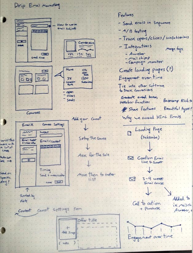
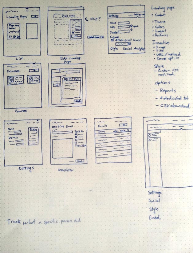
The first is a feature list of sorts. For ConvertKit it included Landing Pages, Courses, Settings, etc. The list doesn’t need to be exact, but instead it’s a quick list of what I am thinking of including.
The second is a list of questions to save for later. As you plan out the features and workflow, all kinds of questions will come up. These are important, but also a distraction for the stage of the process you are at. If you stopped to research each one every time, you wouldn’t get anywhere. I write them down so that I can forget them (at least for now). Here are a few of the questions I wrote down for ConvertKit:
- Which email delivery provider should I use?
- How do you support custom domains for landing pages?
- Which rich text editor should be used? Can it be stripped down to just what we need?
- Should there be a one-to-one relationship between Landing Pages and Courses?
At the time I had some ideas about each of these, but certainly didn’t have the answer. To avoid distraction, I saved them for later.
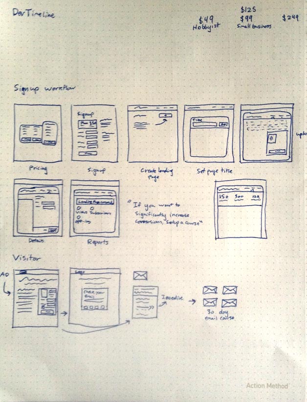
Postage stamps
Next I use the rest of the page, starting in the top left, to draw small postage- stamp-size wireframes. At this point I am just interested in the user flow and main elements.
"Drawing too large will cause me to focus on the details, which I don’t want to do."
Other designers accomplish the same thing by drawing large wireframes using a marker instead of a pen. The exact implementation comes down to your preference, but the point is to draw at a low resolution.


The Workflow
When I plan out interactions between screens, I think I have everything covered. But inevitably there is something I missed. So until I draw out each screen and step through it in my head, I can’t fill in the missing pieces.
"Interactions are always simpler when you imagine them."
That’s why it’s important to add every screen to your interaction to make sure you aren’t missing anything. Then complete a task, just pointing at the buttons with your pen. Which button would you click? Where would it take you? Would there be a success message?
Increasing Resolution
Once you have the basic interactions in place and have tried several different iterations, it’s time to make higher-fidelity mockups, where you can actually pay attention to the copy and basic layout, and make sure you have all the elements. You could do this directly in code, use a wireframing tool online, or a use a design tool like Photoshop or Fireworks. I like to use Photoshop.
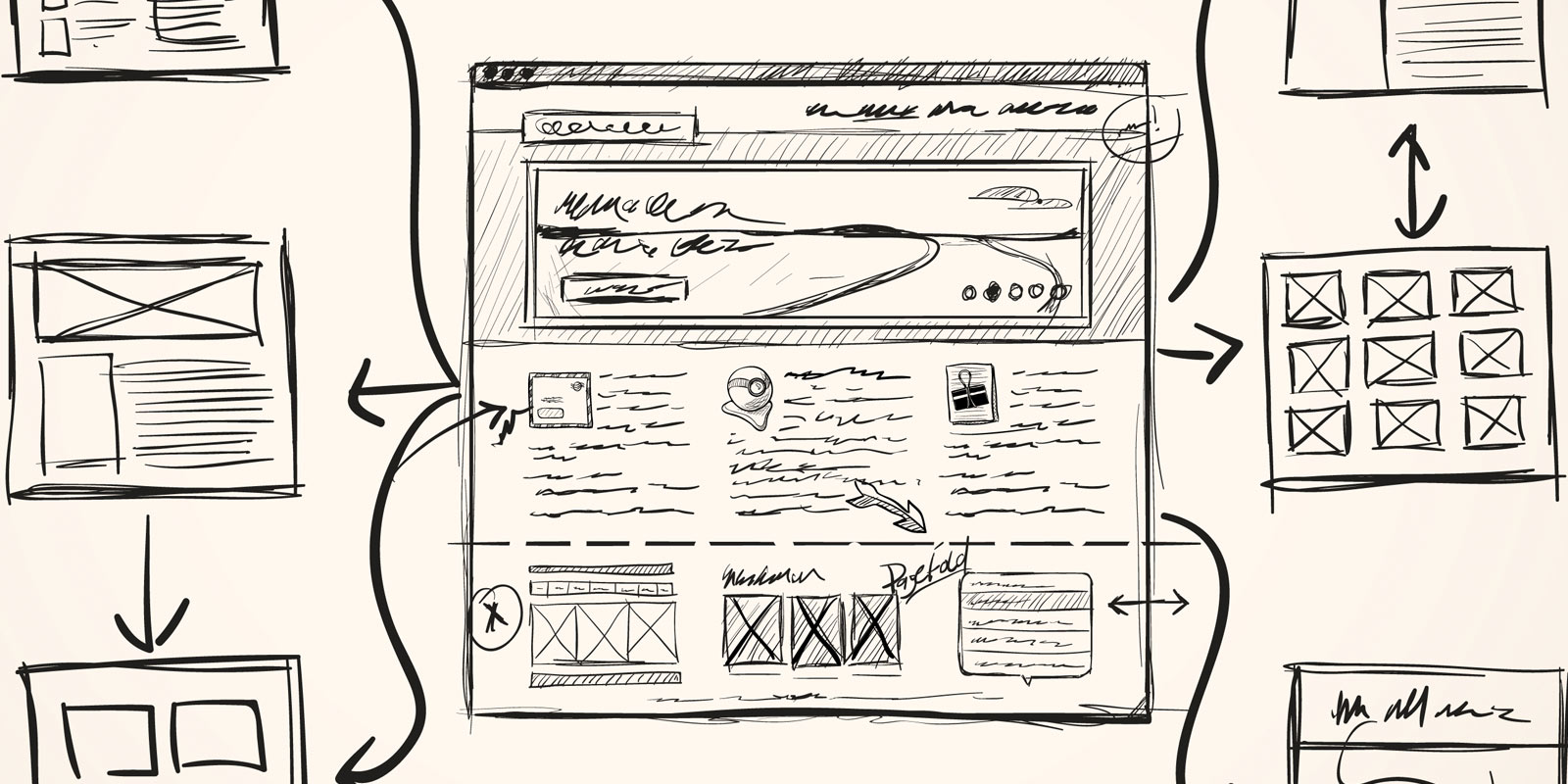
These are my first three higher-resolution mockups of the landing page process. First is a list of all the landing pages (showing some basic stats), next is the landing page edit screen, and finally I add the landing page settings.

At this stage I can put everything on the page to get a better feel for development time and how I will lay things out. The edit screen stayed largely unchanged throughout the process, but the settings page is radically different. This is mainly because in the version you see here I just put everything on the screen, so it looks incredibly busy.
Hiding Complexity
The next step is to take that busy screen and hide the complexity. All those features and settings will be wanted at some point, so I need a design that works well without overwhelming the user.
My solution in this instance is to use tabs down the side to only show some of the features at a time. Most everything is still there (I removed a few features that aren’t needed until later), but it is in a much more manageable format.

Designing Courses
Landing pages are an important part of ConvertKit, but the real magic is in the email courses. Setting up a drip email series is a pain in nearly all email marketing software, so ConvertKit’s core value is in making that process easy. Below is an early iteration of the screen. I imagine I will spend a ton of time reworking and improving it over the next few months.

Each email in the course is listed down the side in a tab format. That way it is really easy to think of your course as a series (which it is), rather than clicking in and out of specific emails as you would in MailChimp.
Adding Polish
Taking the course page through to a completed design didn’t require a lot of changes, but one is important enough to discuss. Take a look at the date setting of the email. It reads in a sentence format with two editable values:
“This email will be sent [2] [weeks] after subscription.”
So you can fill in the number [2] and then select days or weeks depending on how you want to schedule your course. Turns out that could be a lot simpler. Since days are a subset of weeks (seven days in a week), we can get rid of that second option and just use days.
“This email will be sent [2] day(s) after subscription.”
This also removes complexity from the list of emails where each one specifies the time since subscription (2 weeks after subscription). If we allow both days or weeks to be entered it becomes a chore to list both options in the sidebar and keep them ordered by send date.
It would be nice to remove the (s) in “day(s)” to fake whether it makes a grammatically correct sentence. The solution I thought of is to use JavaScript to switch from “days” to “day” if the number in the field is 1, but for now it isn’t worth the effort.

The other details that add a level of polish are basic colors, subtle gradients, icons, and improved typography.
That’s my process. This design is simple enough that I could have skipped directly from a sketch to the coded design, but I think I achieved a better result by completing each step. One shortcut I did use was to define the style (colors and typography) on this page only and just apply it to the other pages in code.
What is your design process? Let me know.
This post was originally published on Nathan Barry's blog.
Further reading:
- Your Design Could Suffer If You Skip The Wireframing Phase
- A Guide to Finding Free and Paid Participants for Usability Testing
- How to Become a User Experience Designer at 40 with No Digital or Design Experience!
- Dear Developers, I feel like the universe is telling me to code
- Making the Case for Design Sprints

