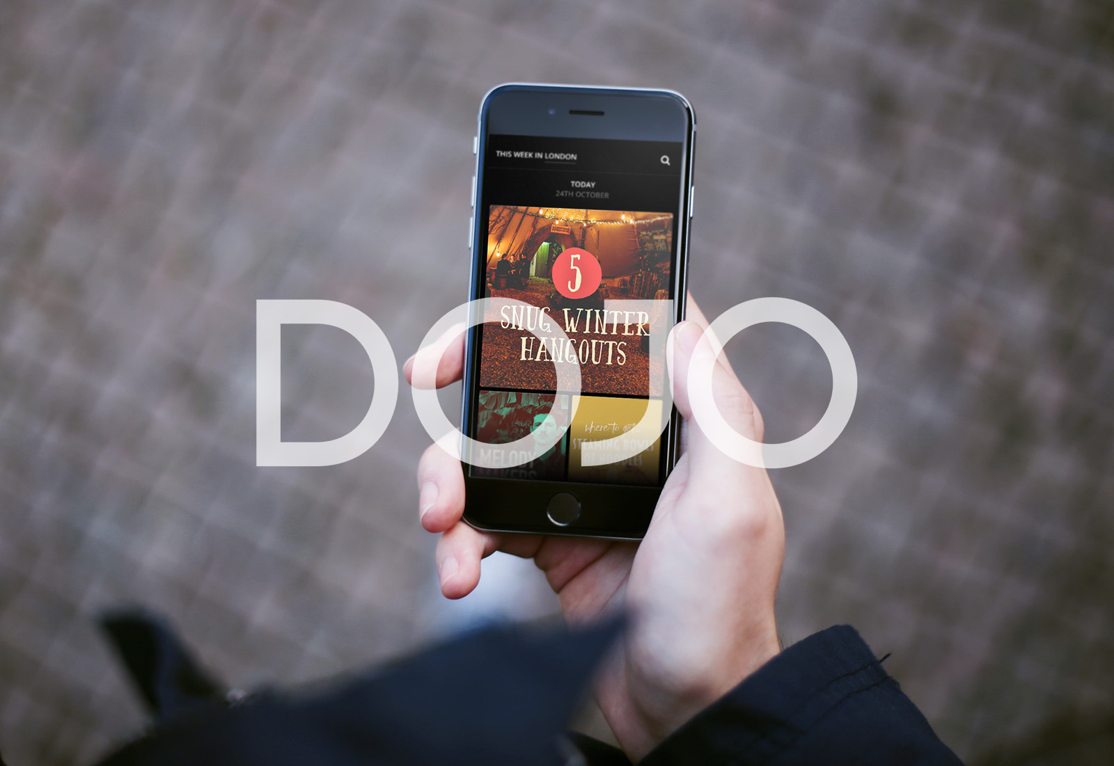
Sometimes things are so obvious, it’s easy to miss them. Sometimes the best way through, or the simplest solution is right there. We spoke to Dojo about why their app feels so fun and personable (spoiler: it’s because they are fun and personable!), and how they built a tool just for them to do what they do best.
Dojo App was created by a young, London-based team out of a shared need to discover new things to do and try beyond the local pub or nearest Starbucks. Unlike Timeout, Yelp! or Foursquare, Dojo App is deeply curated so as to offer just a neat selection to choose from. Plus, each recommendation is supplemented with aspirational photography and a write up from the Dojo team. Everything about Dojo feels chatty, charming, relevant and - in the best way - normal. It’s not corporate, it’s not so polished it’s devoid of personality, it’s not what you’d expect.
“Uber, CityMapper and Airbnb challenge conventions”, explains Jamie Shoard, the lead designer at Dojo. “They quickly made what they were doing seem obvious, and the old systems seem crazy”. Like the people behind it, and the people it’s for, Dojo operates on the belief that there’s other ways of doing things. At every turn, swipe and flick, there’s something surprising and fun - exactly how discovering a city should be.
So, when the team noticed that old systems and processes were getting in the way of their productivity, they fixed it. Other, more traditional companies would have just carried on, growing slower and more ground down, but Dojo took the time to make something new, knowing it would serve them, and ultimately their users, better in the long term.
As John Maeda wrote in his latest Design In Tech report, “products are the product of a company’s culture”. At Dojo, that chatty, charming feel was no accident, it was the result of a happy culture where everyone’s personalities came out through their work - from design and UX, to content and marketing.
“When I joined Dojo, the content team was just a few people so they only needed a basic content system and publishing tool”, explains Jamie. “Now the team has grown, and the tool felt like using Ceefax to browse the internet! Dojo exists because of our content team, it’s their style and approach that makes people love us, so of course we want to enhance their productivity and, even better, enable them to enjoy their work”.
Building from the ground up, a designer worked closely with the content team to understand their day-to-day needs, that included creating listings, scheduling content, briefing stories and photography, and collaborating with the design team. “We found out that one of team needed 20 tabs open just to do her job every day!”, said Jamie, “The frustration she felt was bound, eventually, to come out in her work”. The team used Marvel to build out the entire ‘Dojo operating system’, continually testing it with the content team to guarantee that each feature was bespoke to their needs with nothing surplus. “It’s one of the most beneficial projects we’ve done”, said Jamie, “We’re a close-knit team anyway, but the new OS makes us even more collaborative”.
It seems obvious that a happy, energised team will create a happy, energised product, and yet it’s been overlooked by so many bigger, stronger business before them. Like the newer companies they admire and sit alongside, Dojo not only challenge the old ways of doing things, they build the new ways. In answering the timeless question of “what shall we do tonight?”, Dojo are re-thinking the solutions to timeless problems both for their users, and each other.
Are you using Marvel to make things better for your team? We’d love to hear about it! Drop an email to camilla@marvelapp.com and we may feature you here on our blog.
To see how other creative teams are using Marvel to work better together, check out our DICEfm case study here.


