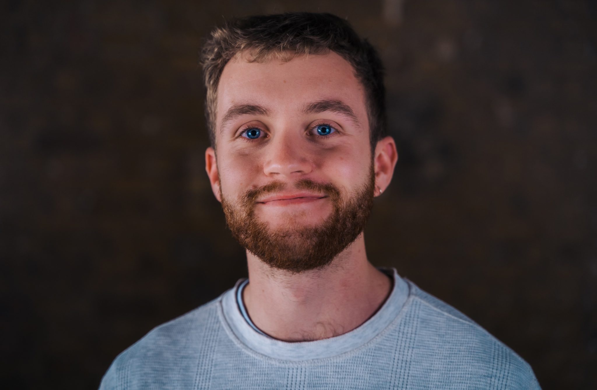
As part of our series of interviews with the design and creative community, we had the pleasure of interviewing James Terry, CPO and co-founder at Dishpatch about his journey into design, and how he thinks about building a product in a new category.
Tell me a bit about yourself! Who are you, and what are you working on?
Hi, I’m James, I’m the CPO and co-founder of Dishpatch. Dishpatch was born the first week of the first lockdown when we noticed loads of restaurants closing overnight and supply chains being disrupted. The hospitality sector was turned upside down and people were forced to reinvent their products and the one product that stood out as one of the most exciting was this new idea of restaurant meal kits. Dishpatch partners with restaurants on end to end logistics to help them operate, fulfil and deliver their own at-home meal kits.
My specific role in the business and my background is in product and design. I run the consumer side of the business which includes design, visuals and marketing.
What’s been your journey into product design?
I started building websites for fun when I was 14. My first project was a clothing line which I don’t like to talk about 🙈 where I was designing t-shirts from scratch, printing and tie-dying them at home and selling them on a website. That was my first step into design, and to begin with I was shit at it! I started out as a really bad designer, and it’s a skill I’ve finessed over time. Now I’d say I’ve got good attention to detail and a good eye for design, so it’s a space that I’ve come to really enjoy.
As part of that first project I also had to teach myself how to build a website, which led me into code and marketing. Because I was learning the technical and business strategy pieces as well, I wasn’t just thinking “how can I make it pretty,” but also how can I take into consideration everything else you need to decide when launching a product.
One thing I’ve learned about design is not to reinvent the wheel. There are tried and tested design principles that work, and you don’t need to reinvent those aspects. Time is better spent focusing in on the things you need to change.
There are tried and tested design principles that work, and you don’t need to reinvent those aspects. Time is better spent focusing in on the things you need to change.
So I guess, working with loads of different startups, and all of my own projects being very design led is how I’ve ended up being a CPO, and that being my role and what I enjoy.
What are some of the challenges around designing a service like Dishpatch that other designers who aren’t in the same space might not realise?
One thing that has been a challenge is that Dishpatch is a new category - it’s very different from what’s been prevalent in food delivery up until now, which has been on-demand hot food delivery. I haven’t been able to take much from existing food delivery platforms. Obviously you never want to copy someone, but at the same time, there are certain things that have been figured out in established categories, where the design and in-app customer experience is actually quite good.
In many ways what we’re doing is the antithesis to hot food delivery and those kinds of product experiences. If anything, I looked at those designs and experiences and turned them on their head. For example, if you look at the interfaces of apps like Deliveroo, Uber eats or Just Eat, the experience is biased towards convenience and speed. Choices are ordered by how quickly it can be delivered to you, and discounts are prominently displayed. Our approach has been to invert that. We only deliver once a week, so you often can’t even buy for the week you’re in, the food is completely different, and we don’t do discounts. This isn’t fast food, this is slow food.
This isn’t fast food, this is slow food.
It’s been a challenge to design something that is completely counter to most product experiences in food or even wider e-commerce and delivery, where speed is a competitive advantage. We’ve had to design an experience that didn’t deliver that at all, but still make people be alright with it. We’ve designed it to position the product as a weekend treat, and the product lends itself well to that. And I think we’ve done it quite well! I’ve been surprised that we so rarely get inbound requests for a quicker delivery, or more delivery days.
It’s been a challenge to design something that is completely counter to most product experiences
What would you say the most important skill is for product leadership to have, and why?
I think the most useful skill in product leadership is the ability to balance data with instinct or intuition. Leaning on one or the other too heavily can be a mistake.
For example being too data-driven can lead to a messy product experience because you’re saying yes to a lot of things because the data says so, rather than saying no because you don’t believe that’s where you should be going.
Then on the other side, if you’re completely ignoring data because you’re this incredible visionary leader, you might get it right, but if you don’t, you have no clue what to do when your idea doesn’t work. You’ve not built in a process to check your data or your assumptions and hypotheses properly.
So there’s something in there on how you build data in to a process to make the right decisions, but it’s an art as well. When to say yes to data, and when to push on with the vision you have. It’s a tricky thing , but when people do that right, they really get it right, they build great product experiences off the back of it.
There are many frameworks and processes out there when it comes to building product (Jobs-to-be-done etc) - how do you approach building product?
Jobs to be done is something we think about, although we frame it in a slightly different way. We look at what experience or what feelings in the user we are trying to create, rather than it being functional. I find jobs to be done can be quite functional, and you sometimes lose the sexiness of your product when you’re doing that.
We look at what experience or what feelings in the user we are trying to create, rather than it being functional.
We always try to focus on one battle at a time. There’s a temptation to try and do 6 or 7 things at once, but then you end up with mixed up data, and in a place with no answers to any of your questions because you’ve changed so much at once. In terms of a process, and we’re just me plus one customer researcher right now, so we’re hardly a big team, but we ask ourselves: “What’s the one thing that’s blocking us or that we want to test?” And we try to answer that question properly by designing something to test it, setting up user interviews and tracking data to have some quantitative insights as well as qualitative. We do the upfront work of deciding why we’re doing it, and where we want to get with it.
One thing we’re testing right now is an a la carte menu choice (rather than a set menu). The first phase was finding out if this was something that conceptually was interesting to customers. We did a lot of interviews and looked at a lot of data to understand - is this even worth us diving into. The interviews and our churn data did seem to come back to problems that could be solved by a la carte, such as dietary requirements or wanting to eat something different to your partner.
From there we had enough proof to move to the next stage, which was working out what the design flow would be. We put together a prototype in Marvel, to show to users and test the flow, and work out how it would work within the broader product.
We put together a prototype in Marvel, to show to users and test the flow
After that, we define what metrics we want to hit. For a la carte it would be conversion and basket size, which would indicate that greater flexibility is working for customers.
So our process is all about simplicity. One thing at a time, and always focussing in on what experience we're trying to create and deliver for customers.
How do you use Marvel in your workflow?
I use Marvel for testing changes in flow with users, and for testing look and feel of the product. Testing changes in flow is actually where I’ve used Marvel the most. We’ve changed up the product flow a couple of times, and each time we’ve used Marvel to test out our ideas with users. For example we used it when we were testing having a monthly menu, and now we’re testing out the a la carte flow using Marvel.
Because it’s mostly just me working on product at the moment, I’ve been using it for big projects like that, but once we have a bigger product team, we would definitely be using Marvel for each change. We’re at an early enough stage where we have the luxury of overhauling the whole product experience if we think it’s the right thing to do. As we get to a later stage of the business, we’ll have to do smaller tests, and that’s when it will be more important to get that right before we release, or release to a cohort.
As we grow out the team, I see Marvel becoming more embedded in our day-to-day workflow. I would want us to build out a cleaner process where everything happens in one platform.
Being an early stage startup, you naturally have to wear multiple hats - what are the different things that are part of your week?
My focus should be working on the product, which is both digital and the physical product we send out to people. So I spend a lot of time working on the product experiences that we have, what menus, what types of restaurants resonate well with customers.
I also work on packaging; the unboxing experience, as well as how the printed materials look and feel.
But then my time gets taken up with lots of other stuff like all of marketing (a lot of which is done through the restaurants), content, social, emails. Then there’s parcel operations managing orders and stock and fulfilment, and bits of internal tech within that.
And at the moment we’re sending out so many orders per week there is a fair amount of packing boxes too! We’ve grown so quickly and are still a small team considering our run rate, so we all have to pitch in on that front too.
Just a few things then! What’s been your single biggest challenge of your career so far?
I spent a year building completely the wrong product with my last company. I was being led by the wrong things. I was listening to every piece of customer feedback which led to the creation of a Frankenstein of a product. No one, not even we could clearly explain what it was or what it did. We were throwing features at problems, rather than focusing in on the one feature that was really necessary, and doubling down on that.
Our users were dropping off a cliff, and I suddenly realised no one knew what we did. It did loads of things but each one was mediocre.
The solution ended up being focussing in on the one feature that everyone found really useful. We ended up deleting the entire code base, pivoted the whole company, and just focussed on it being a planner. And suddenly everyone understood it. As soon as you find that simple idea that both you and customers can explain clearly, that’s when it works.
As soon as you find that simple idea that both you and customers can explain clearly, that’s when it works.
That was a big learning for me, which is why now, I’m more comfortable with keeping the broader vision in mind, and sometimes saying no to what the data might show. When you have clarity on what you’re trying to build, you end up with a way better product experience.
Slightly off topic, but I have to ask...what’s it like working with so much delicious food?
It’s great! We’re not allowed to touch it during the week, but if we have any spares after orders have been delivered, we get to eat through the whole weekend. The photoshoots are another great part of the job, getting to try all the food from the chefs.
Where do you see design going in the next few years?
Consumer expectations of design are much higher than they used to be. Historically there were a lot of companies who had shit design and got away with it. But the tide is changing with consumers. I think everyone now feels like they should be buying from companies that have a good visual identity. For brands, good design is now almost table stakes I feel like that will become more and more commonplace.
I mean, people now laugh at Microsoft because their UX is awful, their design is awful. They’ve got so many products, and it’s taken them so long to move towards a better visual identity, they literally get laughed out of the room.
Generally consumer expectations of design are forcing more companies to pay more attention to their design which is a very good thing for consumers and for the competitive landscape.
Where do you go to get inspired?
I don’t use the typical places people go to get inspired like Dribble or Behance. I don’t like how everything ends up looking the same. They’re all really nice rounded edges and gifs flying all over the place.
I prefer looking at products which have stayed the same and performed really well for a long amount of time. They often have lessons in simplicity and usability.
Take the London underground for example: the design is not sexy but it’s so simple that everyone including tourists and newcomers can understand how to use it. It’s a great example of communicating simply.
Another example would be The New Yorker or other publications that have kept the same design for ages, and it clearly works for them. I like to look at the small things such as what font they use, or the layout or artwork they’re using.
I like looking at older products like that rather than swanky new UI that’s flying around. There isn’t one place I go, but I pick up on little things, make notes and keep links to refer back to.
What can we expect next from Dishpatch?
We see restaurant meal kits as being a category that’s here to stay. It’s been enabled and invented during the covid lockdowns but it’s something that for the long term is here to stay. We think there’s probably going to be one winner in that market, and that winner put simply will be the best product.
The best product will be a combination of the best food (working with the best chefs and restaurants), and the best product experience, which is all the other aspects of the product - the packaging, the delivery, communications, brand, visual identity, digital products, all of that.
So we’re firstly focussing on the food. You can expect a lot more menus from incredible restaurants. Then we’ll be working on getting more depth from the product experience and improving the experience for customers, like with the a la carte idea we’re testing. We’ve got lots of ideas!
Where can we follow you or keep up to date with your work?
I’m always @phatjme. My very first company was that awful clothing line called phat clothing, which I don’t want to talk about 🙈 but it stuck. So you can find me on every platform by that handle.
Thanks James, Dishpatch sounds like a really exciting product to be working on. Thanks for taking the time, and look forward to seeing where you take it next!


