Could you tell us a bit about yourself? Who are you? And what are you working on?
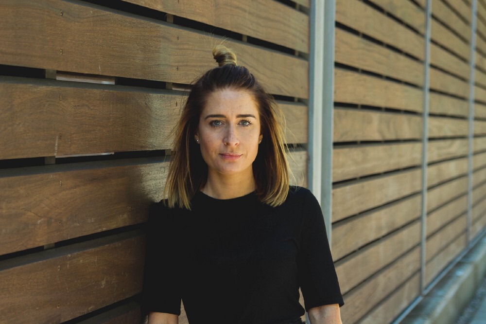
I'm Michelle, Design Manager at Moneybox. I joined about a year and a half ago when we were only two designers, and we've been scaling the team ever since. We're now a team of ten designers, and as we've scaled, it's been really important to scale our processes as well.
We launched our Moneybox Mortgage Advice Service earlier this year and did quite a bit of testing using Marvel. It’s a new proposition for us, helping first-time buyers buy their first property. It was exciting to take customers from their savings journey into the actual home buying journey. It was very new, but really fun to work on, and spoke to our mission of helping people with their financial goals. A lot of the team have been focused around that during the pandemic, and it’s been great that it's been a really successful launch for us.
The other big project we've been working on is a redesign of the app. When the app first launched about five years ago, it was designed with one product in mind: we had the stocks and shares ISA, with a round-up feature. We've grown quite a lot since then, and now have lots of different products. We've still got investment products for longer-term goals, as well as products for helping people save for a home, buy a home, save for their retirement, as well as short term savings goals for things like holidays. The app was still very single-product focused, so we needed to redesign it in a structural way to make it useful and workable for those customers with more than one goal.
You were drawn to design from a young age - tell us a bit more about what drew you in, and the journey you’ve taken to where you are today.
I always loved to draw as a child, I used to love drawing buildings and houses. And then I got a little bit obsessed with interiors, and I thought I was going to become an interior designer. I went to college and studied art and design. I came across a module on graphic design. It was the first time I'd ever used a Mac computer or used Photoshop. And I absolutely loved it, so went on to do a full graphic design course at uni.
After uni I joined a digital design agency, which needed quite different skills from what I'd learned in uni, it was like learning everything from scratch again. I had to learn how people used actual websites; luckily I had a great mentor. When the iPhone came along, I had to start designing for mobile which was a new and even more exciting challenge.
We had quite a lot of financial clients at that agency, so I found myself working on a lot of financial products. I found it really interesting. It was complicated and made me use my brain a lot.
I was already a user and fan of the Moneybox brand and app, so when the opportunity to join the Moneybox team came along, I jumped at the chance.
What were some of the challenges of moving from almost a decade in agency to a start-up/scale-up?
It wasn't too challenging because I had already been doing a fair amount of work with FinTech startups plus some larger banks in my agency work. We'd often go in-house and help them with certain projects, help them innovate. But joining Moneybox was definitely different. It was nice to work somewhere where everybody was aligned behind one product, and focused on one goal. There's also a deeper level of detail required working on one product full time. I enjoyed working on projects where I had to get into the detail during my agency time. But when you're actually working in-house, there's just another level of detail that you didn't quite see working in an agency. I think that's been incredibly useful. That's helped me grow as a designer, a person and a thinker, which I see as a plus as opposed to a challenge 🙂
The other difference was I worked at a small agency, which meant I was used to wearing a lot of different hats and doing a lot of different things. Moneybox is a much bigger team, so it's been interesting to figure out who is responsible for what and how everybody works together. So working in a bigger team with more specialised team members has been a good learning curve too.
You’ve worked on some of the world’s best financial services products. How did you find your niche, and was it by accident or design?
Definitely by accident. The owner of the agency I worked at had a financial background and he had a lot of contacts in the industry. I worked on a project for Barclays, going into the business to help transform the way they worked. I had worked on a few smaller financial products before, but that was the biggest one. I was learning to move from a work waterfall method to agile, working on their online banking platform. That was very, very interesting. A lot of compliance and a lot of things that I didn't even know existed.
I enjoyed it so much, I stayed on to work on the mobile banking app. And that's where I really found my niche - moving from web to app. Smart phones and apps were quite new, and I found working on them really enjoyable. With mobile, there's the challenge of designing on small screens, and lots of different edge cases and patterns to consider. And I just found it really fascinating and challenging.
What would you say is the most important skill for design leadership to have and why?
One of the most important skills, I would say, is to lead by example. You can tell people lots of great things, but if you're not acting in that way, then it's not going to work.
I think people respect you and look up to you more when you're living and breathing, your mantra.
What are the parts of your role that you really love? Talk us through the best parts of your week.
One of the biggest enjoyments in my role is watching my team succeed. I'm not super hands on anymore, that is the nature of my role as Design Manager, but I've got ten designers to look after and it's been really rewarding seeing the team accomplish things together.
My role means I get to see and appreciate the whole lifecycle of product design, which is incredibly rewarding. We work collaboratively, all designers in the team feedback on designs, so everybody's had input, and helped get the design to the level where it needs to be in order to meet the requirements.
When the design is launched, and it gets amazing feedback, or we see in the data that there’s been a real positive impact, it makes me feel incredibly proud that the design team accomplished that. And the fact that it’s a whole team accomplishment, where we’ve all worked collaboratively to achieve it is amazing and makes me feel really proud.
What advice could you share with other designers looking to become design leaders at a startup or scale up?
It's all about the detail, and understanding all aspects. You have to be able to hold lots of things in mind as a design leader, whether that's helping your team with their personal development or with their design work. While also making sure that the work meets all of the requirements from a user perspective, and from a business objective perspective as well.
I think that's always the biggest challenge: finding a way to balance the business goals with the user goals, which can sometimes be very, very different. Knowing when to put the user first, and when the business goal has to come first. Being able to get into the detail of what backs each of those options, and figuring out the trade offs.
Then once you've launched that feature or product, it's making sure that you're continuously monitoring to see if it's performing well. If it's not, it's down to you as the design leader to highlight when to go back and iterate that and keep improving.
One example of this was the new mortgage flow that we built. We had an optimal journey from a user perspective, it was a lovely prototype. We tested it, and it tested well. But it had a lot of different edge cases, a lot of paths the customer could take, which meant from a technical perspective, it was quite large to implement. From a user perspective, the design would take them on a customised journey based on their answers. But from a business perspective, we needed to get something out quickly by a certain date. The original design was so technically complicated, it would take us over our desired launch date. We had to make a call to simplify the user experience a little bit by creating one single journey, which meant we had to group some questions in a suboptimal way. It wasn't the most optimal customer experience. But we had to hit our business objective to launch by a certain date.
The trade off in this case was the user experience. But we knew after launch we would start iterating to gradually improve it. The most important thing was to launch it, test to see if people had the appetite for it, then learn and iterate from there.
How do you use Marvel in your workflow?
We use Marvel to create prototypes to present to internal stakeholders across the business. This could be in wireframe format, or high fidelity format so people can get a feel for what we're designing, so they can try on their own devices.
We also have used the user testing platform recently. We did some testing on our new app designs with some of our customers, and it's great that you can get video and audio feedback. Also you can see where they're tapping on the screen to see if they're hitting the right touch-point. That helps us decide if we've designed something successfully based on where somebody is tapping. It's been really useful, because everything is recorded, we can go back and look at it again. Sometimes running the interview yourself, you don't remember every single detail. Going back and looking at it later means you might find a few little nuggets that are useful.
We've conducted both moderated and unmoderated tests. We conduct more unmoderated tests because it's not interfering in somebody's life - you can just send it out to them and they can complete it at any time. But the moderated tests were really great for the app redesign project because we wanted to get more qualitative feedback from our customers and understand their goals, what they like and dislike about Moneybox.
What are your biggest challenges with user research?
User research can be quite time consuming. It'd be great to have template discussion guides that you can use again, especially when you're sending out moderated tests. It would make it really easy to capture that feedback.
The other challenge is where you've done all of the tests and you need to collate all of the feedback. That takes quite a long time. It would be great to have a tool that would capture the key insights, and play that back in a report that could be shared across the company. That would be really helpful to break it down for people, and give them an overview of how the tests went.
Where do you see design or user research going in the next few years?
Design is becoming more and more important in every business, which is great, because it's what can make your business really successful. I think now, people in this age are just obsessed with how things look and feel. I think it's super important to find out what your customers think and feel about your products and services, but also what prospective customers think, feel and desire.
Where do you go to get inspired?
I get inspired by listening to podcasts and I read a lot of design blogs on medium. Generally I also look at a lot of apps for inspiration. So the likes of Airbnb, Pinterest, constantly checking out what new updates they've released.
I saw something new on Pinterest today, they've got this new feature with an embedded video in a bottom sheet, that you tap and it expands allowing you to explore the content. I've never seen anything like that before. The Airbnb Design Language System series is really interesting as well.
What can we expect next from you, or Moneybox?
At Moneybox we are spending a lot of time improving the app this year. As I mentioned, the app was originally designed to house one product, whereas now we’re an app where you can manage all of your financial future.
Some customers might have one specific goal in mind, say to buy a house, which is typically very expensive. They might put all their money and effort and focus into achieving that one goal. But we also have customers with multiple goals at one time. Our mission is to be an app to help customers achieve all of their financial goals.
We’ve got lots of changes coming this year revamping the app and making it more useful to customers.
Where can we follow you or keep up to date with your work?
You can follow me on LinkedIn @mishaaron
We also have a Moneybox blog on Medium, where we're now posting about our design achievements. We've got a recent blog post up at the moment on our mortgage Advice Service, we'll be writing another one soon for the redesign of the app.
Thanks so much Michelle! It’s been great getting to chat to you and hear about your journey. Looking forward to seeing what’s next from you and from Moneybox 💙


