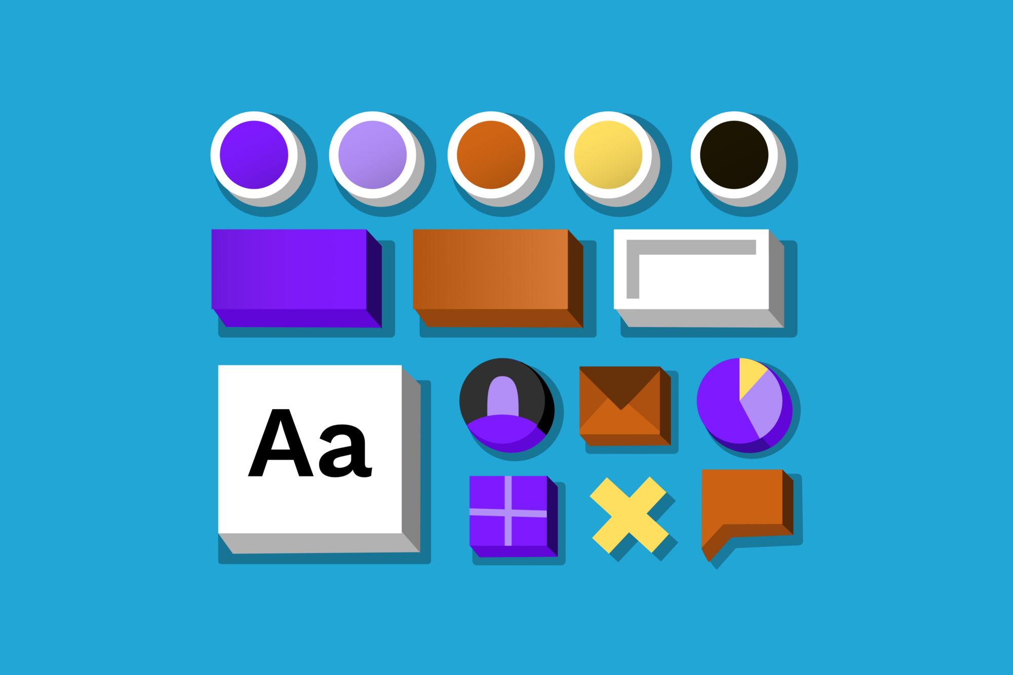
After working 4 years in the field of digital design I got obsessed with tidying up and sorting information. This lead to the creation of a systematic approach for designing user interfaces.
It is an object-oriented, programming-inspired approach, a collection of various ideas that are universal. Use it for working with your favourite design software or for coding. It helps to connect designers with programmers and puts them on the same page — better communication leads to a better understanding and creating better things.
"It is an object-oriented, programming-inspired approach, a collection of various ideas that are universal."
This approach is used mainly at a later designing stage, usually during finetuning of the project when you have more time to think about the relationships in your visual system. Utilising in the early stages of the project while prototyping and wireframing would mean an easier adaptation into both designing and programming.
Of course, the general idea of visual collections and their application into the design process is old news. I was inspired by Material Design, SCSS variables, Macaw, Origami, Atomic Design and various pattern libraries.
My Intentions Are Pure
While working on larger-scale projects I got fed up with the troublesome designing process in Sketch because of the lack of structure. Although the latest updates (like nesting symbols) and styles plugin in Craft made some progress in the right direction, it still doesn’t reach the level necessary for a flawless workflow. To get a better picture, here are some examples:
Clear Overview Of Variables
I want to have a clearer overview and to see what kinds of rounded corners, font sizes, font colors or background colors I am using, to avoid ending up with 20 various text sizes or 50 shades of grey.
Grouping Of Styles
Which parts of the design are linked with certain changes in variables? I want to define which font is suitable for certain cases — a sans-serif for the UI styles and serif for larger texts to ensure better readability. In another example: having 2 types of typography styles — one version for light backgrounds and one for dark ones.
Pairings of Variables
I want all of my 16px font sizes of Karla to have a height of 1.2, regardless of it being a paragraph, a note, an item description or a quote.
Changing Only One Variable
I want to make a small change in the middle of the project with a 50+ artboards and I don’t want to go through all of them. Let’s say I want to change a font for all of the headings in one place and see it synchronized in each heading style.
I realized that I keep repeating the same course of action in every project– like using the main font color, the secondary font color and disabled font color. I also realized I don’t have any control of the visual hierarchy I have created. That’s why I tried to automate the changes I applied the most.
Basic Principles
Everything Is An Object
Every layout consists of objects — headers, footers, headlines, buttons, dropdowns, links. You can think of these objects as separate entities and design them on their own.
Properties for Everything
Everything has its own properties. Every headline has its own color, size or line height. Every button has a certain size, background color or font. That’s how it works in code. Why not use this way of thinking while designing?
Inheritance Of Properties
Here comes the real fun. You create basic building blocks, the swatches variables— i.e. $font-size-s, $grey-500, $border-radius-s or $sans-serif.
All of it together forms a basic building library of variables that you combine to create a visual hierarchy.
Then you could create some categories variables, let’s say, $font-size-main, $color-link-secondary, $border-radius-secondary or $font-headlines. They would act as middlemen between the base swatches and your objects. Assign those variables to various uses and situations, just like in SCSS.
Finally, you apply those inherited variables on the objects — buttons, paragraphs, headlines, list item names, list item descriptions, quotes, etc… And voilà:
Be Prepared For Everything
You can design every possible type (main, secondary, clear or lined button) or state (disabled, normal, hover button) of an object. It takes some effort but it doesn’t take much time and you will be prepared. Maybe you will thank yourself later.
How To Use This While Designing
The basic approach is to organize your stuff and think about all the relationships. The next level would be to hack or improve our tools to support this system, thus making us more productive.
For example, styles cannot be inherited in Sketch like in SCSS. That’s why I create visual styles for every visual combination.
To change just the size of the list items descriptions, I inevitably change all the objects that use the same text style, even though I would like to change only the specific item. I have to change all objects that use the font-size-s at once.
Imagine a node based editor (something like Mindnode) in which you can see and maintain the visual relationships of your projects. It would be able to read SCSS files and connect to Sketch to update your shared styles.
Examples Of Use
You can have a $sans-serif font for UI and headlines, $serif for longer texts and $display for fancier occasions.
In this example line heights are paired with particular fonts of particular font sizes (For example: Every 12 px Karla font should have a line height of 1.8, while 14px should have a line height of 1.75, 16px of 1.6 etc….). You can think of them separately but their are inevitably connected. And remember — bigger font sizes need smaller line heights, because they seem proportionally larger. You could also differentiate between one lined objects (with line height: 1) and multi lined objects (with specific line heights), so you can set their paddings appropriately.
Colors
Like I mentioned before, when choosing colors for UI typography I realized I am always in need of some basic, secondary and disabled font colors with continuity throughout the whole project.
Define your basic color palette by shading the colors that you use. Pick more shades of a color at the ends of the spectrum — you’ll need them for finer details in light or dark interfaces
Why Think Like This
Easier to Maintain
 Creating a system of relationships and styles gives you more control in your work. Collections of objects serve as an overview or documentation, enabling you to change things really fast. It’s easier to put together a page from some objects than starting with a blank page. It’s also easier to assemble new designs a long time after you haven’t worked on the project or if you have to hand it down to another designer.
Better Consistency
 Using a basic set of objects and parameters forces you to use a lesser amount of types of paragraphs, headers, footers, modals, buttons, or list items that you would use if you made something from scratch. Use something from your library first and if it doesn’t work, create a new object. This makes your work more consistent. You will never have 6 types of almost the same text color again.
Easier To Understand
 Consistency is also better for users. Using just the right amount of styles in UI will not make them feel overwhelmed. By saying just the right amount I mean the level of simplicity depends on the complexity of an interface?—?you could easily screw up a page with complex content if it has a simple design.
Example File
There is a myriad of options how to create a visual hierarchy. You can download here a Sketch file with some examples of mine (you’ll need a Karla font, which you can download here on Google Fonts).
Have fun!
This article was originally published on Marek's Medium page.


