“Golden Ratio” is of great importance in the design of architecture, appliances, logos and photos. I don’t want to write about it a lot, you can learn it in Wikipedia. I will say briefly: our consciousness tends to harmony and beauty, and the “golden ratio” is the elegant way to make a product more comfortable and nice for perception. Simply put, it’s a tool to strike a balance in the design.
This technique is not so popular in the design of interfaces because it seems difficult. I will explain in simple terms how to build a classic golden ratio and how to apply it in practice.
"The 'golden ratio' is the elegant way to make a product more comfortable and nice for perception."
Geometry
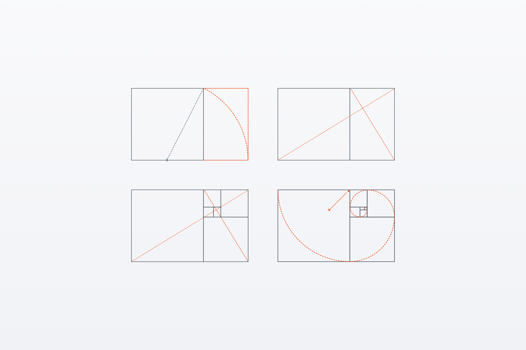
Golden Ratio is the ratio of the parties to each other as 1: 1.618. It is pretty easy to build:
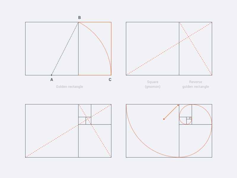
- Draw a square
- From the middle of the square (A) draw a diagonal to the opposite corner (B).
- The resulting diagonal is the radius of the arc. We draw the circle to get a rectangle. The resulting shape of the square and the rectangle is the “golden rectangle”.
- If we draw diagonally in large and small rectangle, then in the point of intersection we get a “focal point”. It is a good idea to place the most important interface objects near this point to attract the attention of users.
- The unique property of this shape is that during its division, we obtain a smaller rectangle that consists of a square and a rectangle, a reverse “large.”
- And the most beautiful thing is: if in each of the squares of the arc with the radius equal to the side of the square, we get the “golden spiral.”
The rectangle may be rotated and adjusted to the desired size of the canvas and the interface.
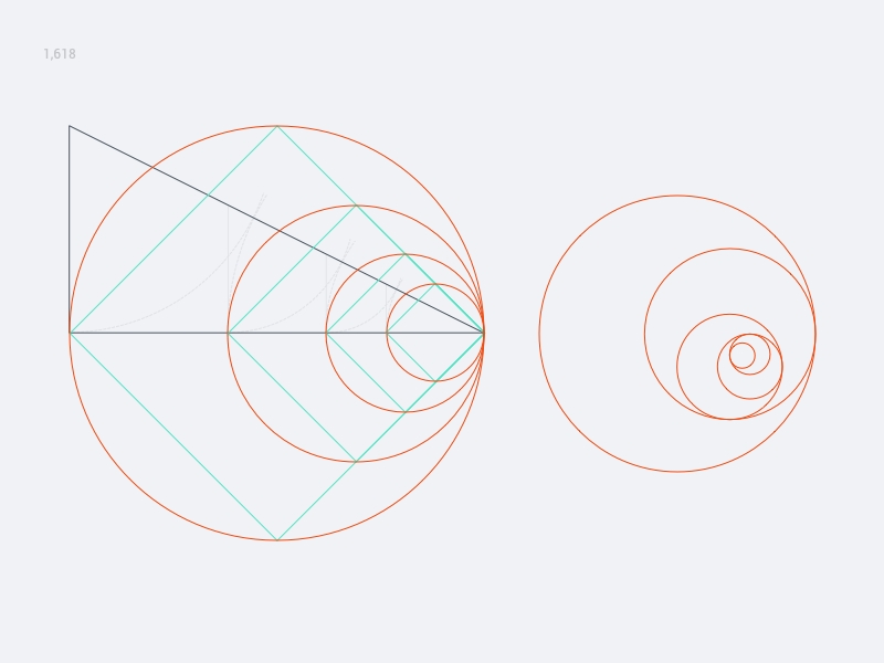
Now triangle

- Draw a triangle, one side of which is two times bigger than the other.
- Draw an arc from the center at the point (B) with radius AB. Arc crosses the hypotenuse with a point (D)
- Now draw an arc from the center point © with radius CD and we get point (E)
- From the point (E) draw a straight line on the hypotenuse.
As a result, we split the triangle into smaller triangles proportional to each other. By the way, there is a clearly noticeable “Golden ratio” of the two elements as 1: 1,618. That is one element is 1.618 from another element.
"It becomes clear why almost everything created by nature is the subject to the laws of Golden ratio"
Beauty of nature
If we continue to divide triangles and draw circles between them, it becomes clear why almost everything created by nature is the subject to the laws of Golden ratio, sometimes with the Fibonacci sequence:
1, 1, 2, 3, 5, 8, 13, 21, 34, 55, 89, ..
(each successive number is the sum of the previous two)

If you take the “Golden spiral” and rotate it at an angle of 40° or 60° then you will create this beauty:

Here is an example with a smaller angle of rotation of 20° and a reflection of the shape on the horizontal:

With the help of the golden ratio one can draw any shape used in the design of icons, logos, interfaces, etc.
"If you draw a 'Golden rectangle', it becomes evident how to place elements."
Design of mobile interfaces
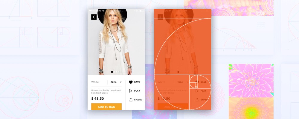
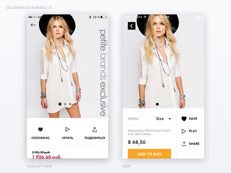
I made a couple of examples to demonstrate the “Golden ratio”. The first is a card product of ASOS store. On the first screen of the app only viewing of photos and actions is available: save in favorites, play video and share. It is uncomfortable because you should swipe the page to find info about size, colors, fabric description or to add to shopping bag. As a result, a “quick” viewing of products is very difficult.
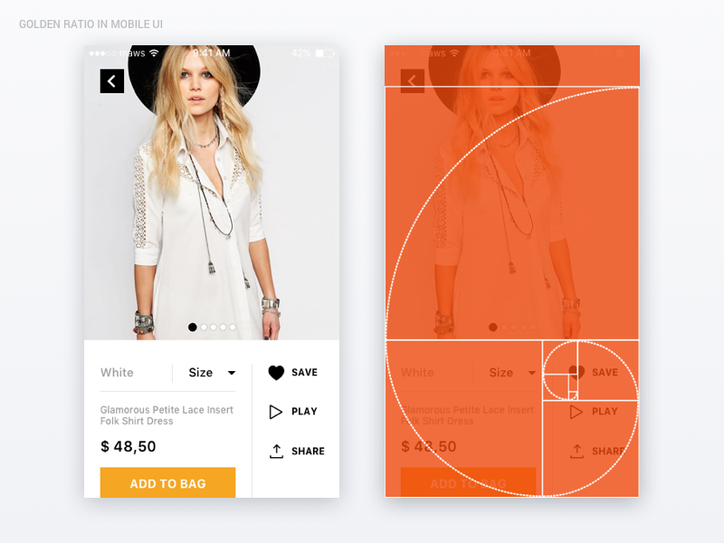
If you draw a “Golden rectangle”, it becomes evident how to place elements. This structure makes it possible to show the most appropriate user data on the first screen.
As we can see, in the “focal point” we have action “Save to favourites”, one of the key actions in the app.
Elements are large and located within the comfortable distance from each other and from the edges of the screen, so they are easy to press with a thumb.
The second example is the blog post screen. Rectangle puts everything in places: we have quite a large photo and a large area for text. If the picture is based on the golden ratio, it is not distorted in a mobile size.
“Elements are a comfortable distance from the edge of the screen, so they’re easy to press with a thumb.”
Arrangement of elements “like” and “comment” in the lower right corner makes it possible to make them larger, but unobtrusive. They do not overlap the image, but visible to the user.

That’s all. Hopefully now you are not afraid of proportion “1: 1,618”, and willingto try it to create user interfaces.
:)
This post was originally published on Mariya's Medium profile.