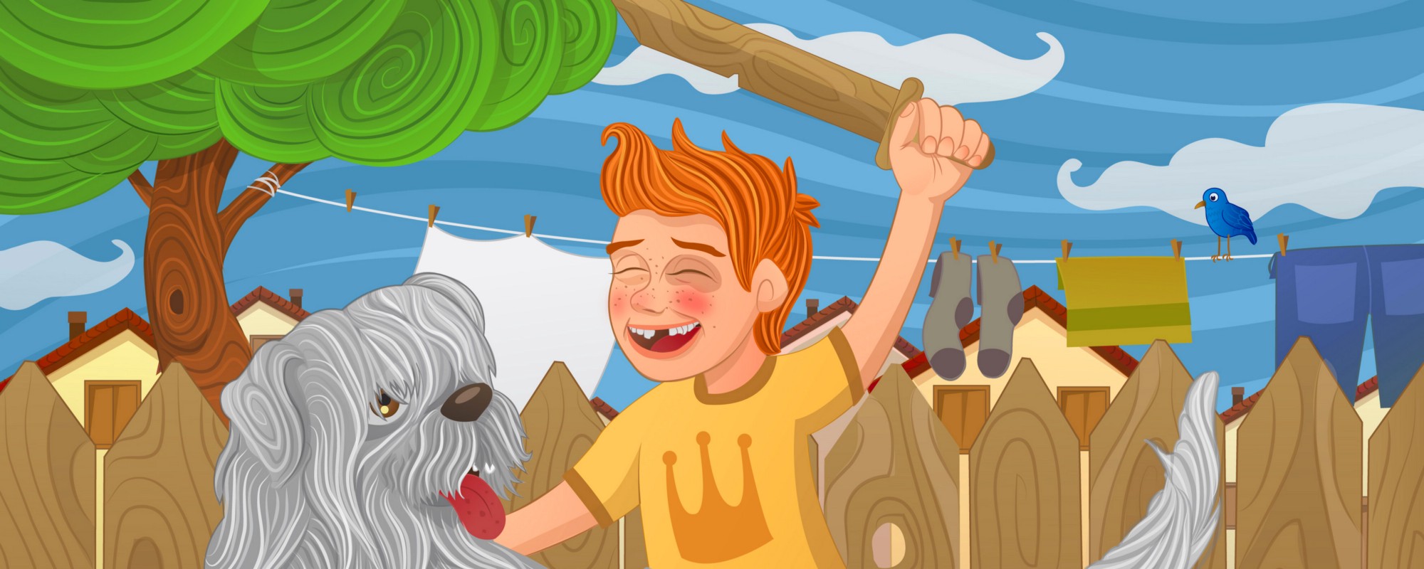
Illustrations should be embraced in product design because they can make a large difference. I know that the “making a difference” cliché is so over-used in product design in general, but in the case of well-used illustrations applied to user interfaces, it happens to be true.
Having said that, I don’t mean that illustrations will work for every single product out there – it is not like that at all. If you disagree with this and you think you can add nice illustrations everywhere, try it for websites such as the White house (even if Trump’s hair gives us a lot to play with), or the Red Cross website. You might find a great style which fits the nature and specifications of the product, but not really something that will add value to its concept or mission. Illustrations in such cases could actually turn out to deform the identity and personality of such institutions.
I love illustrations, I have been drawing since I was a child and I haven’t stopped doing it. During my career as a product designer and illustrator, I have learned to identify some key points that make illustrations a great fit and an added value to both your product and your user’s journey.
Yes or No to Illustration?
In product design, we need to understand illustrations as a resource first, before talking about style, applications or concepts. And like every resource, it may or may not be valid, and can also be implemented in different ways according to the nature and evolution of a product.
"We need to understand illustrations as a resource first, before talking about style, applications or concepts."
What works for a travel company doesn’t necessarily work for an online bank, a school website or a tech magazine.
Before thinking of adding illustrations to your product, there are 2 questions to be asked:
- Will Illustrations bring an added value to the product?
- If yes, will it represent an UI/UX improvement or a concept/content/brand reinforcement? (Maybe both?)
1. Illustration as part of the UI
If you want to add illustrations as part of your UI, there are some points to take into consideration:
- Merge the illustrations and the UI – illustrations have to be there to enhance the actions and/or information on that screen, not to interrupt or divert the attention of what is important.

Hostelworld iOS app (Right)
- Respect Brand and UI Guidelines. The illustrations should be incorporated into the guidelines instead of being used as independent components.
- Be consistent. Generally, you wouldn’t use a set of flat and outline style assets on the same UI. Well, don’t do this with your illustrations either. The illustration style and the use you give to them must be consistent across the UI.
"Illustrations should be incorporated into the guidelines instead of being used as independent components."
- Differentiate your product. As I mentioned before, it makes a difference. There are as many talented designers and illustrators as styles out there. Identify the style that works the best with your product/content, and the message you want to deliver. The better you know your target, your mission and the characteristics of your product, the easier will be to fulfill the requirements to get those wonderful illustrations you need.
2. Illustration as a Brand/Content enhancer
When using illustrations as part of your content, you have more creative freedom since there is less impact on the UI. The illustrations, in this case, don’t have to follow the same guidelines as the rest of the components since they are shown as an external element, more related to the content than to the area of interaction on the screen.
There is an opportunity here to make a difference. And by making a difference, I'm not talking about changing the life of your users or making them jump for joy thanks to a wonderful user experience given by some unique illustrations – we already have Disney for that :). I mean making a difference in the way people perceive your product, content, and mission. You can deliver the same message with a bunch of text and a stock photo or icon, or you can deliver it with a title, 2 lines of text, and an illustration made specifically to fit in the context of the rest of your message. You don’t need to be a UX researcher to know that the response of people to the same message will vary according to the tone of voice, and sometimes, the difference could be as simple as a graphic image:
Conclusion
Illustrations are not only a nicer, stylish or a more artistic way to represent certain aspects of your product. The (right) use of illustrations is a natural statement of something made with much more love and creativity than the purchase of any beautiful stock photo/icon. As product designers, we need to see them as a potential resource to create a whole unique identity for our product and as an important part of the story we want to tell.
Thank you for reading :)
También disponible en ???????? español aquí.
This article was originally published on Carlos's Medium page.


