- My Marvel Prototype: The perfect reference point
- The Real Deal: First peak at my website
- Divs, Unique IDs and Classes: The 'major key' of HTML & CSS so far
- My Thought Process: What I learnt whilst I practiced what I learnt
My last posts in the Dear Developers series so far have been focused on the lessons I've learned from various coding classes and the step by step basics of HTML & CSS. This post is a something a little more special as I'm going to share my progress in building my own website from scratch. I'll be sharing some nuggets of information I've picked up from my own mistakes, how I get my head around some of the hard stuff and also a run down of organising your code.
Here's what to expect:
My Marvel Prototype
Why do this first? Well, prototyping your website is the perfect reference point for your CSS styling. In Marvel, I could quickly decide on the visuals like the colour scheme and typography, the content and button placement before diving into code. It holds all the hex codes I need, in the places I need and things like element sizing as well. Let's think of it as an interactive, visual map of my website.
Now obviously I work at Marvel and have a couple of projects I've created already to make sure I know it inside out. But this is the first serious project where I've (tried) to create an appropriate and acceptable looking website mockup. I have to say, as a newbie to design, it couldn't have been more simple to use. I used Canvas to create my screens and then linked them together into a lifelike website in the prototype editor - but if you're already a pro you can easily pull in artboards from Photoshop and Sketch.
I appreciate the design is pretty basic but there's nothing wrong with 'simple'. Remember, the KISS principle? Keep it Simple, Stupid. Which can be read as calling yourself stupid, or telling you to keep things both simple and stupid. Either way, same meaning - one slightly less insulting.
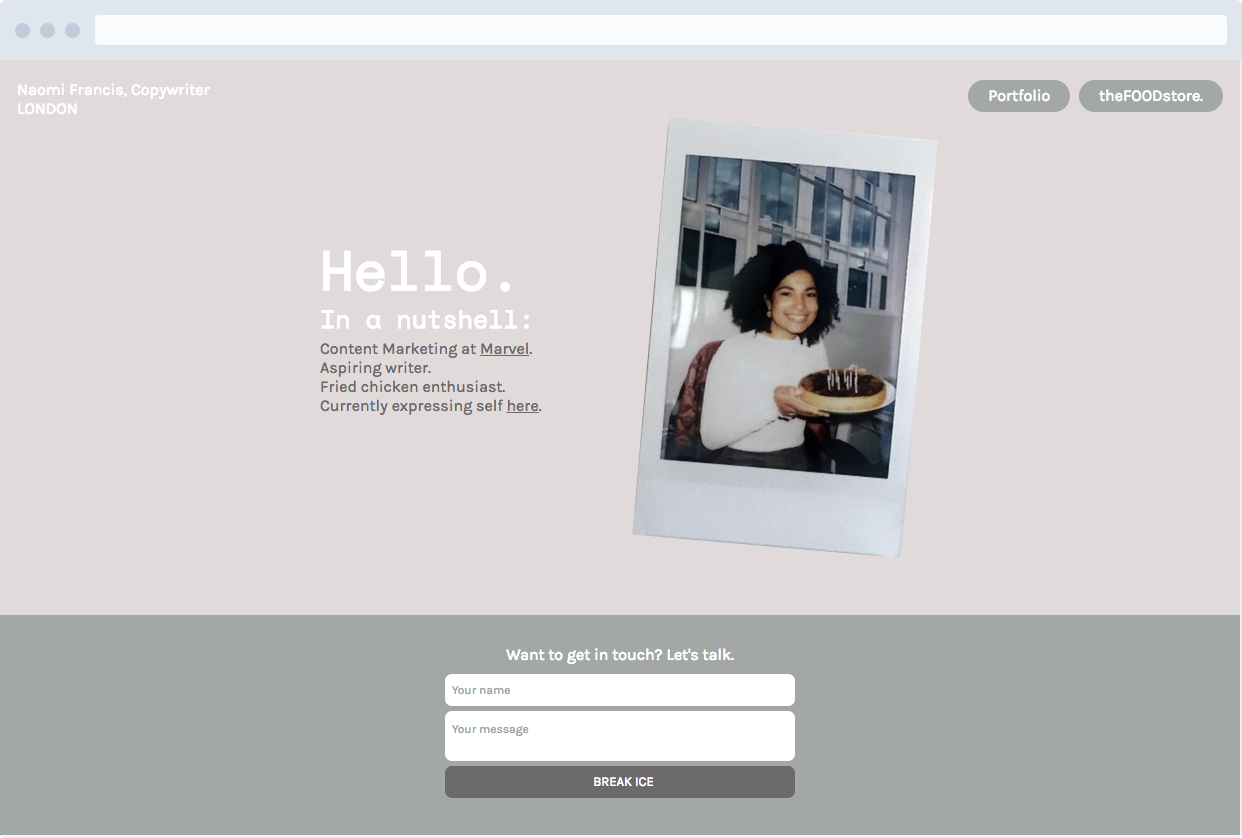
So, as you can see I have three screens, I've got my homepage with basic information. Two buttons in the top right which will lead to my portfolio and a hypothetical blog. As I've said previously, I am not a designer so please do not judge me on my lil' site. It's my baby.
The Real Deal
Now here's what I've built so far - I give you, the first page!
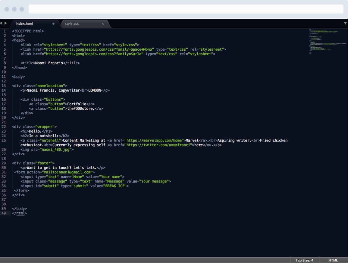
How that looks in my HTML doc:
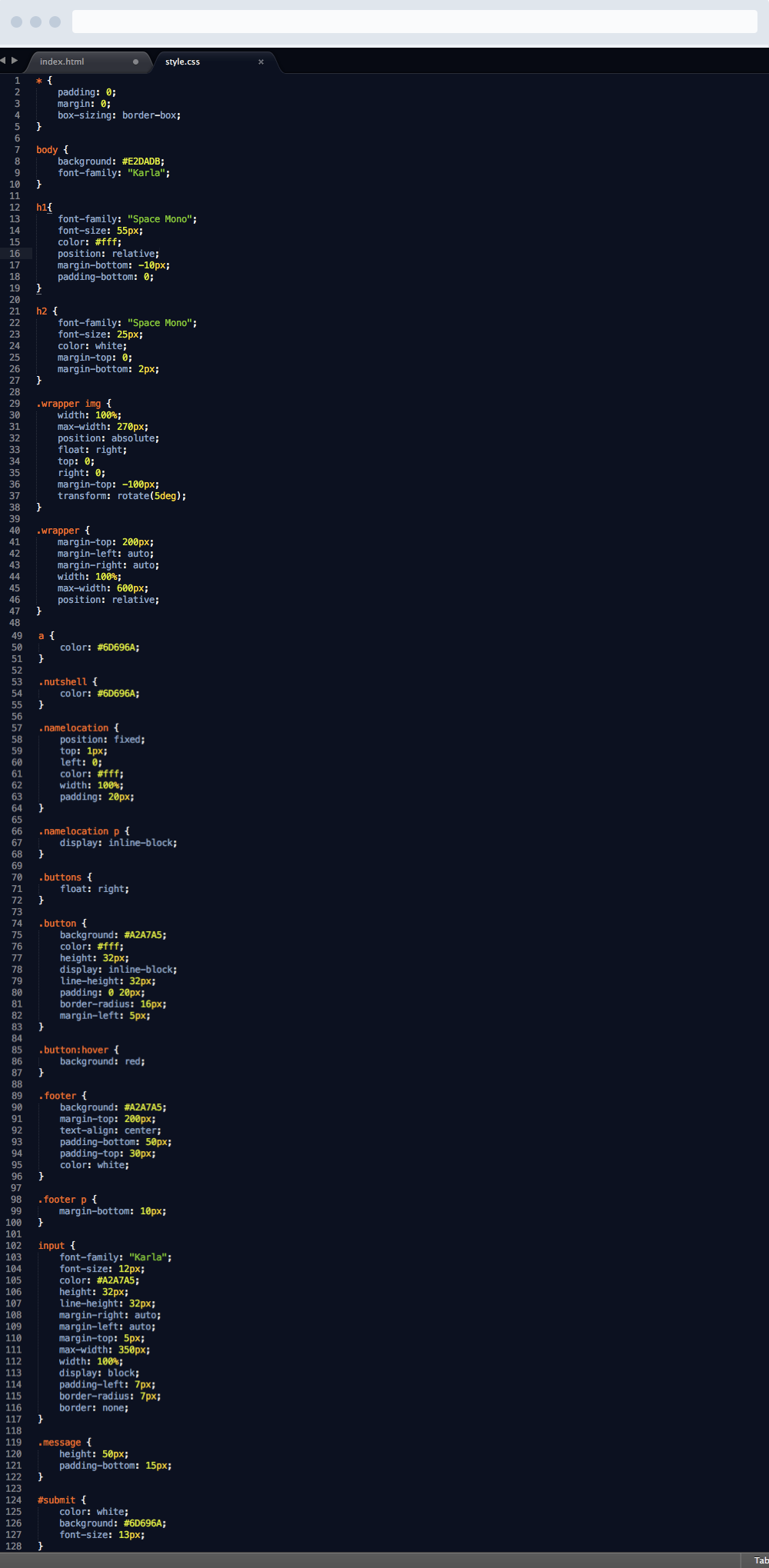
Last but not least, CSS:
Whilst I was making the shift from prototyping in Marvel to actually coding my website, there was one thing that has made my life so much simpler. Something that you probably noticed running through my CSS doc. Divs, Classes and Unique IDs, all of which act as fantastic organisation tools and make targeting specific parts of your website super easy.
There might be a few things in the code that you don't recognise but I'll run through as much as I can in this article - and save some of the bigger things for my next post.
Divs
div tags are an organisation tool that basically groups your code, so you can divide it into sections and divisions. It helps when grouping block elements. You'll see I used them throughout my HTML and also added classes to them including 'namelocation', 'wrapper' and 'footer'. Here's the run down on what adding a class or unique ID does for you and your code.
Unique IDs and Classes
When you’re styling with CSS, sometimes using the standard tag selectors we are familiar with aren’t as effective as we'd like. There will come a time when some of the copy you under the <p> tag may need to be styled differently to other copy under another <p> tag. This can be fixed this with IDs and Classes. Both are commonly used throughout code and is something used to thoroughly improve the readability of your code.
Unique IDs
Adding IDs will help you target certain HTML elements when you’re styling in CSS. IDs are unique and should be used only once to target specific elements which will have unique qualities, otherwise you’re defeating the point and may be better off using classes. Simply, add an ID as an attribute to an existing HTML tag and give a value of your choice enclosed in speech marks.
Here's an example from my code above:
<input id="submit" type="submit" value="BREAK ICE">
Here I've decided to add an ID to this button in my form because it's going to look a little different to the other input elements. I've given it the ID of 'submit', to keep things simple and easy to remember if I revisit it. Then to style that specific ID in CSS, you target it with a hashtag followed by the ID name, like so:
This CSS value above will change the background colour of the submit form button to the dark brown in my colour scheme, the font colour to white and the font size to 13px.
*Remember, Unique ID’s should not be used across multiple elements - you’ll find they’re inefficient for multiple use and should only be used for quick fixes.
Class
Classes can be used several times across HTML to apply specific styling to each one. Which is why the class attribute will become your new best friend. You’ll find that the names which people title their class tags actually reflect the type of content for their web page.
For example, let's take a look at the 'button' class from my code above. I added the same class to each of these elements, like so:
To style classes in CSS, they are selected by entering a fullstop and followed by the class name, like so:
The code above has styled the size of the elements boxes (remember the box model) and positioning on the page as well as colour.
There may be a time when you need to target an element within a class. To save yourself adding a unique ID, you can simply target you might sometimes you might need to set the same typeface for say one h1 and p but you want the font size different. To target specific elements, for example just p of the class article you select with
There is no limit to number of selectors you can have and you can select multiple classes at once.
My Thought Process
Think of the code as a whole, not just single components
The first stages of coding my website went surprisingly well, when it came to adding text I got things into the right page positioning that I wanted them to be and manoeuvred my way around pretty easily. Then when I showed my code to one of Marvel’s front-end developers, he pointed something out that made me realise I was thinking of each CSS value as a single component when I should be thinking of the website as a whole.
For example, I had been setting the font-family property to each selector, repeating the same line of code around five times...when I could have just added the body selector and set the font-family in there once. This is something that could be extremely helpful in the future if I needed to make changes to the font or whatever, I can just do it in one place rather than about 50.
How in the hell do I create a button?!
The first true questionI asked myself when working on this was actually, but how do I make a button? Should I be designing it in a tool like Photoshop or Sketch and adding them as images because it really can’t just be text with an adjusted background right?
Au contraire. That's exactly how you do it. Adjusting the trusty box that houses every element to look desirable and essentially button like is in fact correct. It’s actually quite a transferable thing to think that when something seems too simple that’s usually the way to do it. There were a few interesting thing that came up when I was creating the buttons which I’ll run through here which might also be useful to beginners.
Floating
Firstly, you’ll see that I’ve added some small detail to the top left of my home screen which is just my name and location. When I added the text to create the buttons on the right, I set a div class which holds the button's text and some classes called button. In the css style document, I pushed the div class to the right using the float property.
Once I did this and checked how it appeared on the screen, I found it was displaying on the right but wasn’t inline with the detail on the top left. Annoying. To get my head around fixing this I found it makes it easier to think of coding CSS as playing with lego. They’re all blocks that you’re just piling on top of each other, with secret codes to getting them to sit inline.
In this case, the .namelocation text is acting as a block and the same for the buttons I've added on the right. We can change this easily by setting the display to inline-block to each of their CSS values, forcing them to live in harmony and sit on the same line.
Box-Sizing: Crucial to styling
This property is actually really crucial to your styling document, giving it the value of border-box rather than it’s automatic, secret setting of content-box means you are resetting the format of the internal styling template of the browser.
This is very important stuff. If every browser has a different internal styling template you’ll never be starting from the same place which could mean your work will look different across them all.
To stop this happening add this to the top of your styling doc:
Getting responsive
By making our websites responsive we mean to make all the elements we include in our design to scale correctly across all devices. If we don't take this into account, if you've built a website tht looks perfect for the web, it's visual charm and usability may be at risk.
Whilst this is maybe something I could maybe avoid for now and revisit later, it’s something I want to try my best to include from the beginning. Especially due to the nature of internet consumption these days across all devices. In order to make a elements responsive they must be attributed with a width and max-width. I spoke about this briefly in my last post on the CSS box model.
The first thing to attribute to the element you want to make responsive is a width of 100%. By setting it to 100% you are ensuring that across all devices, the element will appear at it's full size across screens.
However, you'll notice when you set the width to 100% of the screen, it pushes the content of the element to the left of the screen. To stop this happening you need to add a max-width. By adding the max-width you're dictating the size of the element - whichever size you desire!
Mine reads like this:
So the div class of .wrapper positions the content within it 200px from the top of the screen and is centered by adding margin-left and margin-right to auto. The width is set to 100% to keep it responsive. The max-width to control how much space it takes up on the screen.
To test if your site is responsive simply drag your screen from the right to the left. As the browser size gets smaller then you'll see if your elements fall out of line.
Until next time...
To keep this digestable I'm going to round things up here. The main lesson from this past couple of weeks is that actually sitting down and making a proper go of it teaches you much more than sitting through lessons. By piecing together code from scratch you give yourself the opportunity to ask and answer questions which may not have risen from lessons.
There is so much more I could run through like input forms, transformations and negative margins - but I'll leave you with the suspense and keep you coming back.
Follow me on Twitter to keep up with my progress!