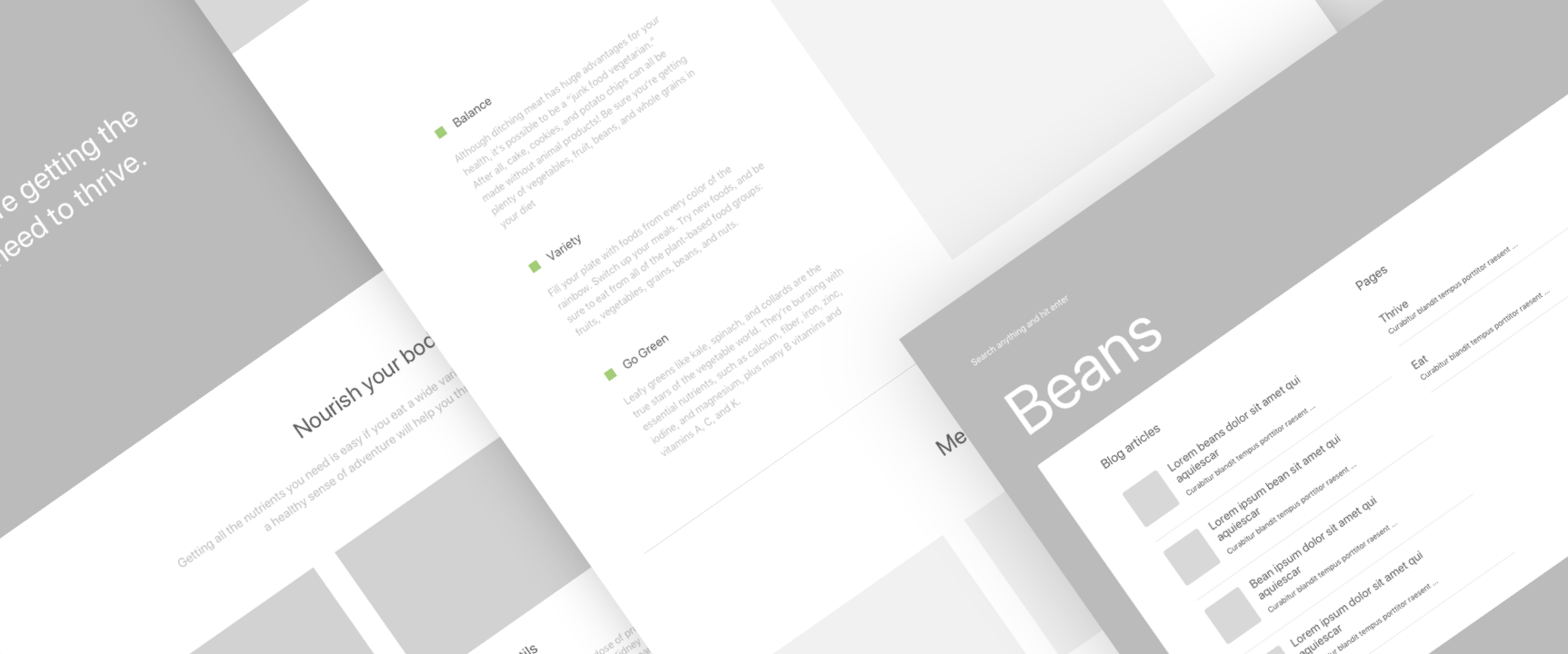
So much goes into building a website. There is a fairly standard design process which every designer should work through to achieve great results and minimise the risk of failure when starting a new project, including journey maps, site maps, user flows, personas, content, Lo-Fi and Hi-Fi Wireframes, UI audits.
However, it's not just about creating a good set of deliverables. The difficult part is being able to present them in a digestible way for the people on the receiving end. A great delivery not only makes all the difference to your client but also to the overall concept progression, giving a deeper understanding of your vision and how the project works collectively.
This is a short guide explaining how I built a delivery presentation deck to showcase Lo-Fi and Hi-Fi wireframes to clients back when I was working in a design agency.
- Wireframes with annotations to help explain the design and the user flow
Choose the simplest tool
There are many different tools for wireframing on the market now, including Marvel's offering, however, in our design process, we decided to create delivery templates using Sketch.
Sketch has a cool feature that lets you export separate pages into a single PDF file, and since it’s all vector-based, the document is always small and looks crisp in any resolution.
Wireframes can easily be imported into prototyping tools using several different file formats, however PDFs are super easy for offline viewing, especially when traveling as they are easy to archive and to keep track of.
In my agency days, we would normally embed the prototype link at the end of the presentation deck, giving our partners the opportunity to develop a deeper understanding of its flow and interactions.
- Exporting to PDF from Sketch
Create a consistent look and feel
“In a good presentation deck, each page feels like part of the same story.”
It’s important to define rules around how to use typography, colors and imagery across the whole presentation.
To make our wireframes for clients look visually consistent, I created an Internal UX Kit, based on a pre-built master kit. This not only allows you to make sure that the output produced by different designers in the team is aligned with your company's identity, but also gives you the possibility to quickly re-use components from a previous project when creating a new deck proposal.
Make it easy to read
Once completed, we'd then transfer the wireframes into the presentation document where we'd annotate the key points and functionality.
We used a great plugin for Sketch called Sketch-Notebook, an extension that lets you pull out key areas of interest, and document your thoughts into a clean side column. You can add and remove comments, easily swap the order around, and even customise the appearance to fit your own brand style. This really helped us speed up our wireframe presentation process, and is probably the key element that made our internal deck so successful. Check out the plugin.
- Sketch Plugin
Create a sitemap to show the user journey
User journeys are critical when designing a new website. It gives both clients and the project team a quick feel of how the website will work, what content and functionality are required to meet the user's needs, and what aspects of the website must be put in place to support the journey. It helps estimate the amount of work needed from the dev team and it's great to flag out potential mistakes that occurred during the planning phase.
I suggest you annotate only the key most important interactions for each page, to keep the presentation clean and understandable, it could put off non-design stakeholders reviewing your work. Leave the dirty work to a prototype.
There are tons of new user flow tools coming into the space which automate this process, instantly transforming prototypes into user journeys; giving a birds eye view of all screens and the user flow between them.
- A Sitemap showing the user flows between screens
Voilà!
Make sure your wireframe presentation files are as clean and well-organized as possible. Run a spell check, proofread and confirm that all pages are labeled clearly, in the correct order and have a logical flow before you distribute them to the partners! I’m not english, so this is definitely the most complicated part for me!
- The end wireframe presentation
Hope you enjoyed this post, now go showcase your clients' wireframes by making the best delivery deck you can!


