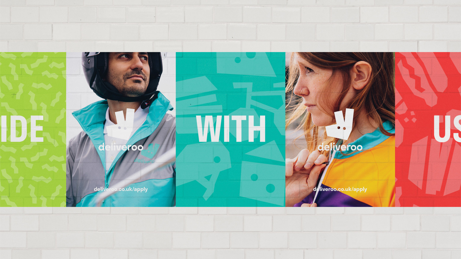
Deliveroo has been the talk of the town in design for the last couple of months. Their new visual identity sparked conversation and drove attention to the fast moving startup - which launched in 2013 and now has over 20,000 riders and operates in 12 different markets. Last month lead Deliveroo designers, Courtney McNeil and Simon Rohrbach, spoke to the design community at Design Club about the ins and outs of their design process, touching on their challenges and achievements from re-design to implementation.
We caught up with both Courtney and Simon to grab all the details for anyone who missed them at Design Club.
Deliveroo have built a well known and successful brand in a very short period of time - why did you decide on a new visual identity?
"From a design perspective, we were hitting the limit of what we could do with our brand."
Our company has grown rapidly over the past three years, expanding both internationally and within our existing markets. It quickly became apparent that the look and feel we had developed when we were a small startup no longer fulfilled the requirements of a quickly growing company operating in 12 different markets.
From a design perspective, we were hitting the limit of what we could do with our brand. For example, we wanted to invest in our rider kit and make it more vibrant, safe, fun and visible. We wanted to more effectively communicate through advertising campaigns. Our products needed a unified design language that was closely interlinked with the aesthetic of our brand.
"Our products needed a unified design language that was closely interlinked with the aesthetic of our brand."
It looks like there were tons of moving parts to the redesign, website, apps, outdoor marketing, rider kits, equipment - what was the biggest challenge?
Yeah, it certainly was a challenging but also fulfilling and exciting process.
One of our biggest challenges was dealing with the logistics of such a huge project. Having created enough new kit for 20,000 riders, it was essential that it reached our international 100 cities at the same time. In our case, the rollout of the rider kit determined the overall launch date of our new look, which had to be set many months in advance. Having physical components that require significant logistics efforts around the world determine a very immovable launch date is not something you’d commonly find in a startup these days, and centering all other efforts - product, marketing, internal communications - around this was a big challenge.
Equally, when you’re working on something for this long, internal communications become a hugely critical part of the project. We had to make sure we brought everyone on the journey along with us, but also kept the process lean and efficient.
Finally, given the length and scale of the project, we had to ensure that everyone was focused on the finish line and gave it their all over such a long period of time. It would not have been possible otherwise.
"We had to make sure we brought everyone on the journey with us, but also kept the process lean and efficient."
How long did it take from start to finish?
Our design team spearheaded the process internally in collaboration with DesignStudio and Brake over the course of a year.
Now that it's live, how are you measuring its success?
I think success is two-fold. There’s externally measured success, and internally measured success.
Externally, we’ve had a fantastic response from riders, restaurants and consumers alike, as well as many media publications. Our riders are now safer thanks to their new kit, and our brand is much more visible in cities around the world.
Internally, the new brand has given all our teams a reinforced sense of commitment and purpose, and given our design team new creative possibilities. We can now do things that were hard to achieve with our previous identity - because what we have today is built with all the lessons we’ve learned as a business over the last few years.
"The new brand has given all our teams a reinforced sense of commitment and purpose."
Are you going to miss anything about the project?
When you’re working on a new visual identity, for a very brief moment in time, you feel like you control all the variables that define how a company looks, speaks and thinks about the value it builds in the world. And for a long time, all this work is locked away in a room, and while you’re incredibly excited about it, you can’t show it to anyone until it’s time. This is an incredibly exciting feeling, and something we’ll miss for sure.
But most importantly, we loved working with the guys at Design Studio, they were the perfect partners for this project.
What's one piece of advice that you would give to anyone else that's about to transform their visual identity?
"Have strength & confidence to bring others on the journey, be unwavering & tenacious in your pursuit of the goal."
Make sure you fully think through the time investment and the implications of the project, and that everyone across the business is fully committed to the project. Let go of your natural biases and inclinations as a designer, and have faith that the process will bring you to a result that is better than what you ever could have imagined. Have the strength and confidence to bring others along on the journey, and be unwavering and tenacious in your pursuit of the goal.
What's next for the Deliveroo design team?
We’ll continue to invest heavily in our new look and evolving our products and marketing communications globally. We’re about 13 people in product design and research and about the same size in brand design and project management. At this stage, we’re very focused on continuing to expand the team in a sustainable manner and putting in place processes and frameworks to support this kind of growth.
Want to find out more about the Deliveroo Design team? Check out their website here: http://www.deliveroo.design/


