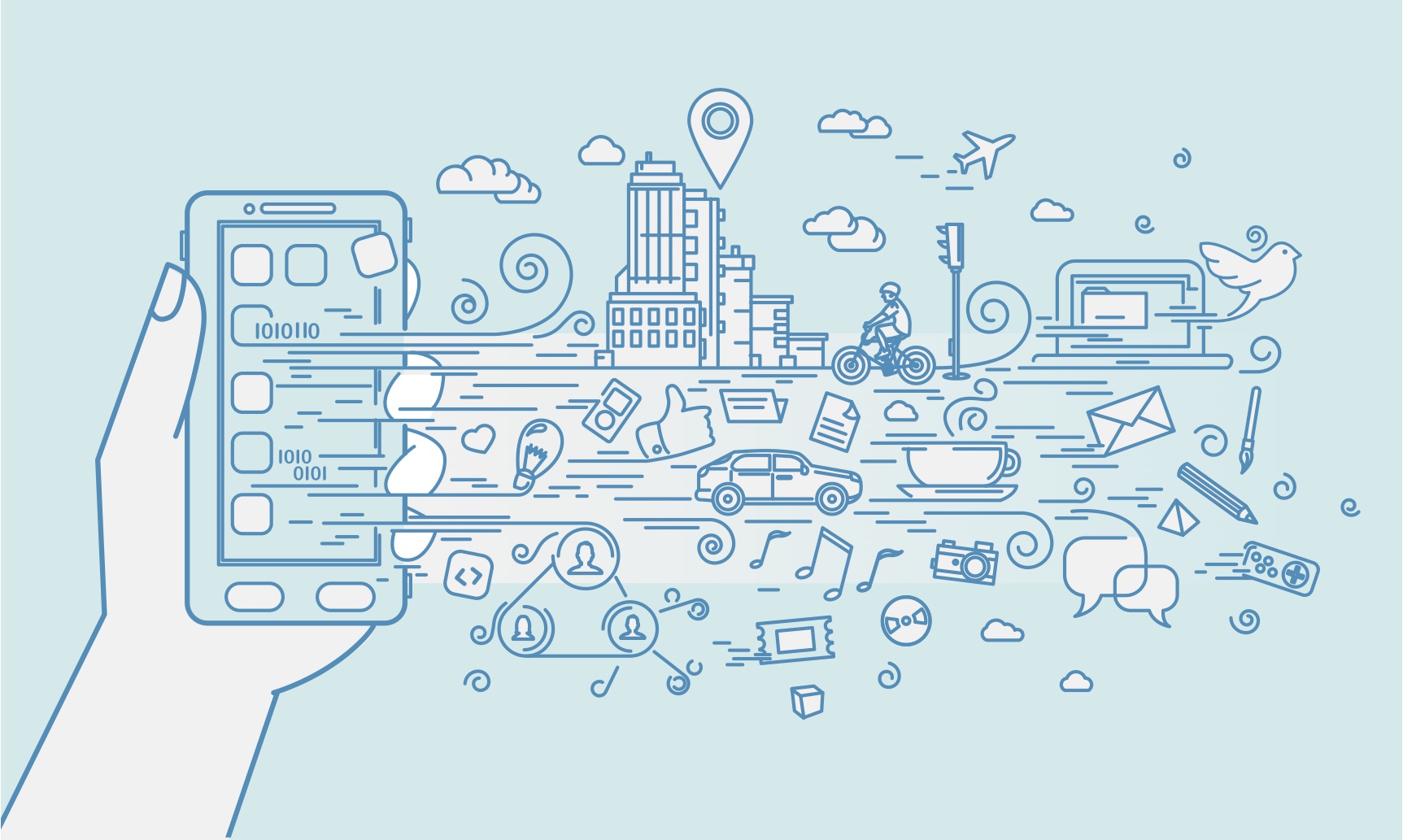
We are in an exciting age of design: Welcome to a new era in history where our bodies, heaters, cars, bedrooms, streets and well — just about everything is beginning to become an interface.
- Google’s Project Soli is developing a new interaction sensor using radar technology.
"Just about everything is beginning to become an interface."
This article will present a number of exciting technologies and various interfaces to interact with them, as well as take a historical perspective on interactions with man-made objects that have evolved with us to where we are. For simplicity’s sake, I like to group human interaction with the environment and technology into 4 ages:
- The age of tools
- The age of the machine
- The age of software
- The age of the self
The age of tools
We used primitive objects and symbols to communicate
Humans began communicating with symbolic representations carved into any surface. Hieroglyphics were one of the initial ways that humans started communicating and it was highly symbolic. This symbolism would later develop into art, writing, documentation and story-telling. We can even argue that we have come full circle and are using the symbols on our keyboards to communicate subtleties in communication beyond words. Even if they are silly.
The tools that we were using to communicate became more and more sophisticated, resulting in things still widely used today like pens.
The age of machines
When hardware was the interface
The industrial revolution placed greater emphasis on productivity, as well as the ability to produce objects at scale at low costs. Welcome to the age of the machine, where we built objects at scale to help our lives become simpler.
"Welcome to the age of the machine, where we built objects at scale to help our lives become simpler."
- Typewriters were one of the machines we learned to use to make us more productive.
One example of how we began to increase our productivity is seen in the creation of the typewriter, which was designed in 1868 by Christopher Latham Sholes. We begun tapping physical keys to make words, still using our hands, but with help from the typewriter as a replacement of the pen. It helped create a consistent and effective format that could be easily adopted as well as save us time.
The drawback, however, was that we needed to learn how to type. We were mass producing machines and the power shifted to them. Despite designing the hardware as the interface, we as humans had to adopt to learn how to use the machines. This is symbolic of a lot of the machines that were created at this time.
"Despite designing the hardware as the interface, we as humans had to adopt to learn how to use the machines."
The age of software
Learned skills from using hardware become metaphors to teach us how to use software
When software needed an interface, designers looked to adopted hardware and learned behaviour to make it easy for us to learn how to use the software. For example we looked back to the typewriter to learn how to type on a screen.
- The keyboard still looks like a typewriter and typing became a learned human skill that many of us cannot live without.
The typewriter was used to inspire the keyboard to make it easier for us to know what to do. We had already learned to type, so the next natural progression was to see this to begin interacting with screens.
Later we see this same transition in software, with our smartphone keypads looking like mini versions of the very same keyboards and typewriters. Adorable and useful. As we began to touch, we began to define a completely new way of interacting with out environment.
Touch is human-centric
On why touch worked
With the rise of the smartphone, we taught ourselves all kinds of funny gestures for the novelty and to be able to use it — and — of course because it was really cool to be able to all kinds of fun and even secret stuff with our hands. We learned the difference between a pinch and a tap and a long tap and invented more gestures than we can keep up with.
- Multi-touch as shown on a smartphone, where expanding and contracting the fingers allow the user to zoom in and out.
We started expanding and contracting as a way of zooming in and out. This behaviour became so natural that I have witnessed grown men try and zoom in on physical maps.
Touch works because it is intuitive. You see babies working tablet devices faster than their grandparents these days, simply because we are born to explore things with our fingers. It’s innate and reminds us of back where we started during the beginning of communication.
- Children playing with a tablet with speed and ease
Touch came with a price
And the user experience often suffered
We might have become like children in a candy shop. Wanting to touch everything in sight and along the way, we made up some pretty obscure gestures and made it nearly impossible to find stuff.
That’s because we hid stuff.
We hid a lot of the main user interface features. A major part of the problem was competition between Android and iOS, where initially iOS lead the way and significantly reduced their Human Interaction Guidelines. The simplicity looked beautiful, but we were just hiding the ugly or complicated stuff for later and often made interfaces more difficult to use. Android emulated a lot of the worst things Apple implemented and it really wasn’t really until Material Design was introduced that there were even consistencies in Android design at all. The myriad of device sizes didn’t exactly help either.
We also forgot about consistency.
A swipe on iOS can mean to read an email, delete an email, archive an email, or playfully connecting with my next Tinder match, depending on the app and the context. As designers, we cling to extensive onboarding sequences just to show users what to do.
Touch only works on big screens
Now we have new devices and they have such small screens that touch becomes difficult. Designers of these devices re-introduce hardware centric features humans struggle with.
Even if your fingers are finer and more dextrous than mine, I still smile at the thought of poking around on our wrists.
You cannot navigate such a complex things as the internet from a hardware centric feature such as the Digital Crown. It is a real-world spin-off from known watch adjusting behaviour, but it is time consuming as well as fiddly.
The age of the self
The old metaphor comes full circle — the next iteration
Now that the time has come, how do we design experiences and products in a world where any environment is interactive?
- The Apple Pencil writing on an iPad Pro. An example of human-centric behaviour with high technology.
The next iteration partly illustrates us coming full-circle, with the Apple Pencil being a piece of technology, both hard- and software which is helping us write again, similar to where we once started: a simple tool and a surface.
"…we are now getting to a point that technology is so advanced that we can “unlearn” how to use it"
It just so happens that this simple tool is a not so simple Apple Pencil and the surface happens to be a pretty advanced iPad Pro. Specifications aside, what is exciting here is that we are now getting to a point that technology is so advanced that we can “unlearn” how to use it.
The Apple Pencil is human centric because it takes 2 things that we are already familiar with: an actual pencil and an iPad, meaning that we don’t need to learn anything in order to be able to use it (unless we need a reminder of how to write with a pencil again).
How can we design products to facilitate innate behaviours, rather than design products that force us to learn new skills? How can we become more human centric in our design philosophy?
Moving beyond touch
Not only did small screens instigate designers and technologists to explore others ways of interacting with technology, new use cases and contexts inspired us to start thinking of different ways that we could use technology.
- Hey, Siri
Voice commands, for example, work great while driving or cooking, but may cause a couple of stares while asking Siri where the nearest erotic massage parlour is on the train commute home.
Voice is a way that we can interact with technology around us. It can be both passive and interactive. The great thing about voice is obviously that we don’t need any hands for that — however there are limitations such as context which mean that it is not always going to be the most intuitive. Voice recognition has also not really been good enough to be trusted until very recently, but now we are at a time that voice recognition is eerily good.
Like touching. But without touching
"The future of interaction design is limited only by our range of gestures."
Project Soli is a tiny radar that can turn basically any piece of hardware into an interactive device, controlled by delicate gestures. It’s from the Advanced Technologies and Projects (ATAP Lab) at Google and has helps make the world our interface.
- Gesture samples for Project Soli
Now that Project Soli is open for a select group of developers to work on, the future of interaction design is limited only by our range of gestures.
This post was originally published on Danielle's Medium profile.


