How my Sketch file started: a separate artboard for every type of Yammer thread. There were lots.
Reducing our design handoff from 30 mockups to just one

Yammer’s vertical rhythm grid, which evenly spaces all UI elements and text baselines.
I’ve recently begun working on a design revamp of Yammer’s Android app, beginning with conforming all Yammer conversations to a 4px vertical grid for better readability. Because a single misaligned pixel could throw off the grid, we began with the painstaking process of taking app screenshots and dragging each one on top of my original mockup for comparison. After many sessions designing and coding alongside Victor Alcazar and Ozzy Thebe, two very patient Yammer Android engineers, each individual chunk of a Yammer thread was looking perfect.

However, when we combined the chunks into an actual thread, the grid was thrown off. Once stacked on top of each other, the perfect chunks were not so perfect.

We soon figured out the problem: certain combinations required some extra margin in order to fit on the grid. Because a Yammer thread can have hundreds of permutations — some have documents or images attached, some have multiple types of metadata — we would need to define hundreds of special margin sizes. Even if it were possible to catalogue and special case each of those margins, it would seriously slow down the app.
I took the problem to our lead designer Manuel Muñoz-Solera to mull over. He had plenty of experience designing modular UI before —it’s a common and well-documented approach for CSS frameworks — but due to several years of fast product cycles and the resultant code and design debt baked into our mobile and web applications, we’d never had the chance to implement a modular approach at Yammer.
After dragging all our chunks around in a giant file and reworking a few of them, we came up with a simpler, more modular approach to our thread design, one that solved our margin problem.
Here’s what we did.
- We grouped each chunk of a Yammer thread the same way our developers were grouping them in the code. To help out our eyes, we assigned each one its own color. At this point we also started referring to the chunks as modules, because we fancy.
- We stopped defining margins between modules. Instead, all the spacing in the app would come from padding within the modules — specifically, top padding. Bottom padding would have worked, too; just not both. The key is to choose one of the two and stick with it. This kept things simpler when we did need to define top and bottom margins in some special cases.
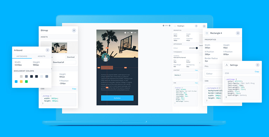
- We threw all of the individual modules into one super long artboard. It looks pretty weird, because this is not a conversation that would ever actually exist in Yammer. It’s okay, though. All we need it for is checking alignment on our grid and making sure every type of element is accounted for.
- When everything was laid out vertically, we still had three specific combinations that were throwing things off. This was okay with us — three was much easier to deal with than hundreds. Our engineers went to work defining special “if…” statements for each of them.


In the end, instead of having 30 different artboards for different types of Yammer conversations, we have just one master artboard. We can drag the modules around and re-stack them however we please, and when we turn our vertical grid lines on to check it, everything lines up. It’s perfect, it’s only one artboard, and it matches the code perfectly. Needless to say, our Android engineers were very pleased.
It’s super easy to drag modules into an actual mockup and know that everything will stay on-grid:

It’s been a long time since I had any epiphanies around the fairly boring process by which I hand over my designs, but this switched on the proverbial lightbulb over my head. Maybe you already approach your mobile designs in a modular way, in which case I salute you. We’re a design team with many collective years of experience among us, so the fact that we had never structured our work this way made me want to share my lightbulb moment with you.
We’re now working on “symbolizing” these modules using some of the new symbol functionality in Sketch to make an extensive library of pixel-perfect, scalable UI elements. Stay tuned for a demo, it’s pretty nifty.
This article was originally published on Cameron's Medium page.
