A good product is a lot about the problem that you pick & the ideas that you implement. But a well-sorted & deliberate Design handoff document and a process can play more than a handy role; ironing out quite a few wrinkles that can cause unnecessary escalations and ad-hoc duct-taping later during the execution phase.
"As designers, we are the guardians of execution and thus equally responsible for the air bubbles that might exist in the finished product. Thus before every release, it’s imperative for the designer to sign off the build. But it’s not always that Design Quality Check is given it’s due place in the process, and most product releases burdened by tight timelines end up bypassing this or at the most subset it under exercises like Dogfooding. The problem with bypassing Design Quality Check is that it looks like an easier trade-off to make instead of squeezing in those precious few hours before the release — More than the immediate quality loss what’s even more harmful is the legacy it carries onto the upcoming releases & sometimes it almost lingers throughout the lifecycle of the product, either as a function of team’s mindset or the actual workflow."
Having underscored the importance of a design quality check, there’s a responsibility that designers have too, which could lighten the burden of quality check & bug bashing later on, which is — how were the designs shared?
For the most part, it really does depend on how comprehensively were the designs published by the designer to the stakeholders. Designers, more often than not, want to see themselves as Thinkers but not so much as Executionists. It helps to learn a thing or two looking at the way Developers operate. The Version Control rigour, Namespacing of the files/modules, Documenting iterations or Commit messages or Patch notes etc. It would only help us designers get more productive & useful at our job.
"Designers, more often than not, want to see themselves as Thinkers but not so much as Executionists."
"With this premise, I’d like to share some thoughts on how designers can adopt a few techniques to ease our & our colleagues’ work in the execution phase with the help of a well rounded & thorough design handoff."
When a design is handed over to the developer, there’s multiple layers of information that needs to be conveyed. In addition to the Mockups and Specs+Assets, one must also share the Interactions, Copy, and a Checklist. All these cover different aspects of the design solution and need to be collated in one, simple, accessible document that sits on the cloud. You can call it the Design Handoff Document.
A Design Handoff Document is a throwaway artefact. It serves the goal to build something, and that’s it.
1) Mockups
There isn’t much to mention here. We all have been generating & sharing UI mocks comfortably since many years now. But I do have a couple of points to make :
- Naming your files : Let the file/screen name not possess any form of versioning. The name of the screen should simply describe it’s function. If you’re not yet using a version control solution for your designs, you probably should.
Plus, make sure you use consistent casing when naming your screens, whether it’s ‘camelCasing’ or ‘Sentence casing’ or ‘lower casing’ etc. - Have the necessary, archive the rest : At the time of handoff, you’d have collectively zero’ed on an option you’re going to build. So weed out all the older iterations & explorations. It also helps you write simpler filenames.
2) Interactions
- Make a flow : Putting the mockups together is only half the work done. You’d need to stitch the screens together based on the flow using Hotspots (or just make an Interactive Prototype). It helps the product manager understand how the user journey is panning out; and helps the developer plan her/his approach to code.
- Figure out the fidelity : Not every screen has to be fleshed out with high fidelity prototypes. Few screens could simply be static with explanatory comments, few could get away with platform-specific standard interaction patterns and few might require those custom prototypes. There’s no blanket rule for all the screens, so discuss with your developer & plan accordingly. Do not end up spend a ton of time prototyping a simple interaction pattern that already exists.
Whether you choose to communicate the interactions through an Interactive prototype or Comments marked up on each static screen — it’s upto you. But the idea is to have the interactions documented. There’s a tendency to leave this bit till the last minute when you hear designers say, “I will sit with the developer & hash it out”; but it’s not efficient.
3) Copy
- My advice is to list all the Copy in a 3-column table using any cloud tool of your team’s choice (Paper by Dropbox or Sheet by Google). There’s always a lot of Copy that cannot be shoe-horned in the UI mocks, so we’d need to record them somewhere else.
- For reference, I’ve drawn a brief template for our Copy table —
• First, specify the type of copy. This helps developers quickly parse through the list. The rows could be grouped by the name of the screens (Homepage, Cart, Checkout etc.)
• Second, specify the situation & context of the copy. (Eg. Whether the user is logged in or if it’s a repeat user. Or, if there’s an ephemeral event which’d influence a particular UX). Mentioning the context or the heuristic helps the developer understand when should the message appear/disappear.
• Lastly, the actual message.
More often than not, most of the product & design folks don’t spare enough brain cycles on Copywriting. Different team compositions would dictate if you’d need a specialist copywriter or not. But this post is not about whether the designer should write her/him own copy; nor is this another rant about how ‘copy is king’. I’m just saying you should have all the copy documented when you share the designs.
Plus, you’d anyway not want your developer to ‘fill in’ the copy for you in the final hour before the release. (‘cuz you are obviously not around ‘cuz you’ve already left for the day. Oh, designers.)
Specs & Assets
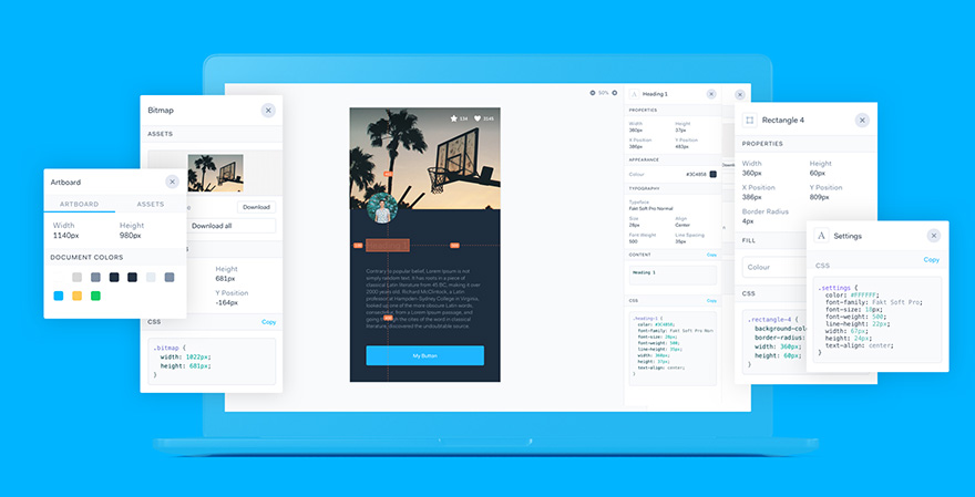
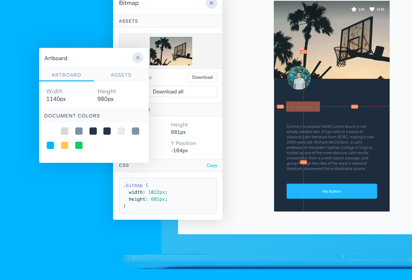
- Automate: Today, with the abundance of handoff tools available, a designer should not be allowed to waste any time redlining the designs with specs, measurements, and style guides. Let’s make use of these nifty tools and save our team’s time. It’s just a matter of properly organising layers & groups in your sketch fileand let the tools do the rest.Whenever you ought to define/refine your visual vocabulary — Give Lingo a spin, which helps you create a sharable style guide.
- Accountability: Automating the handoff process gives designers the authority to question the developer incase of deviation from the prescribed designs.
For example, raise a jira ticket against the responsible developer the moment you spot a discrepancy in the build. This way there’s organised accountability within a timeframe and no email escalations against the designer.
And oh..
- When sharing your Specs, don’t forget to communicate to the developer the Grid System you’re using in your designs. I use 8-point grid system considering almost all the screen-sizes in the market are divisible by 8. Here’s how you can start using it in your designs.
- If your designs involve a lot of state-changes for buttons or labels, then PaintCode is known to serve this need well. Plus, it translates the SVG paths & ColorData to generate Swift or ObjC classes, and you can simply share the swift/objC/java file with the developers. I’ve heard many developers appreciate PaintCode, although personally I haven’t used it.
5)Design Handoff Checklist
The most gut-wrenching part of any design execution exercise is the ‘missing designs’. There’s always an edge case or two missing from the designs shared, and this always gets escalated mostly during the last mile of design execution, with a sense of panic because of the looming deadlines. This leaves the designer reacting to the situation instead of responding with reasonable thought.
A practical solution to avoid all the last moment chaos, is —
- Maintain a plain-jane checklist of all the cases & features that need to be designed; created & managed by the designer on the project.
- The checklist will flag the status of the feature being picked up or not, and whether it’s completed or under works. All the completed rows should have the link to the corresponding design.
- If a certain feature is moved to the next version because of a certain dependency, then the corresponding team is marked along with a describing comment.
- Anything that does not exist on the checklist, is not accountable for implementation, and this understanding is established between product, design & engineering at the start of design solutioning. This way the checklist acts as a reference & single source of truth incase of a deadlock or confusion around whether or not the feature was agreed upon to build.
We designers do spare a lot of thought and care while designing for our users; and it would only be fair to extend similar empathy toward our teammates. So one should try to keep the Design Handoff Document as simple & consumable as possible; without design jargon & funky acronyms. I’m reminded of this popular programming quote that goes
"Always code as if the guy who ends up maintaining your code will be a violent psychopath who knows where you live."
This article was originally published on Bilal's Medium page.
Now in our case, the developer doesn’t skim but actually dissects your designs, going knees deep, implements them. Doesn’t he deserve the most empathy? Probably does.


