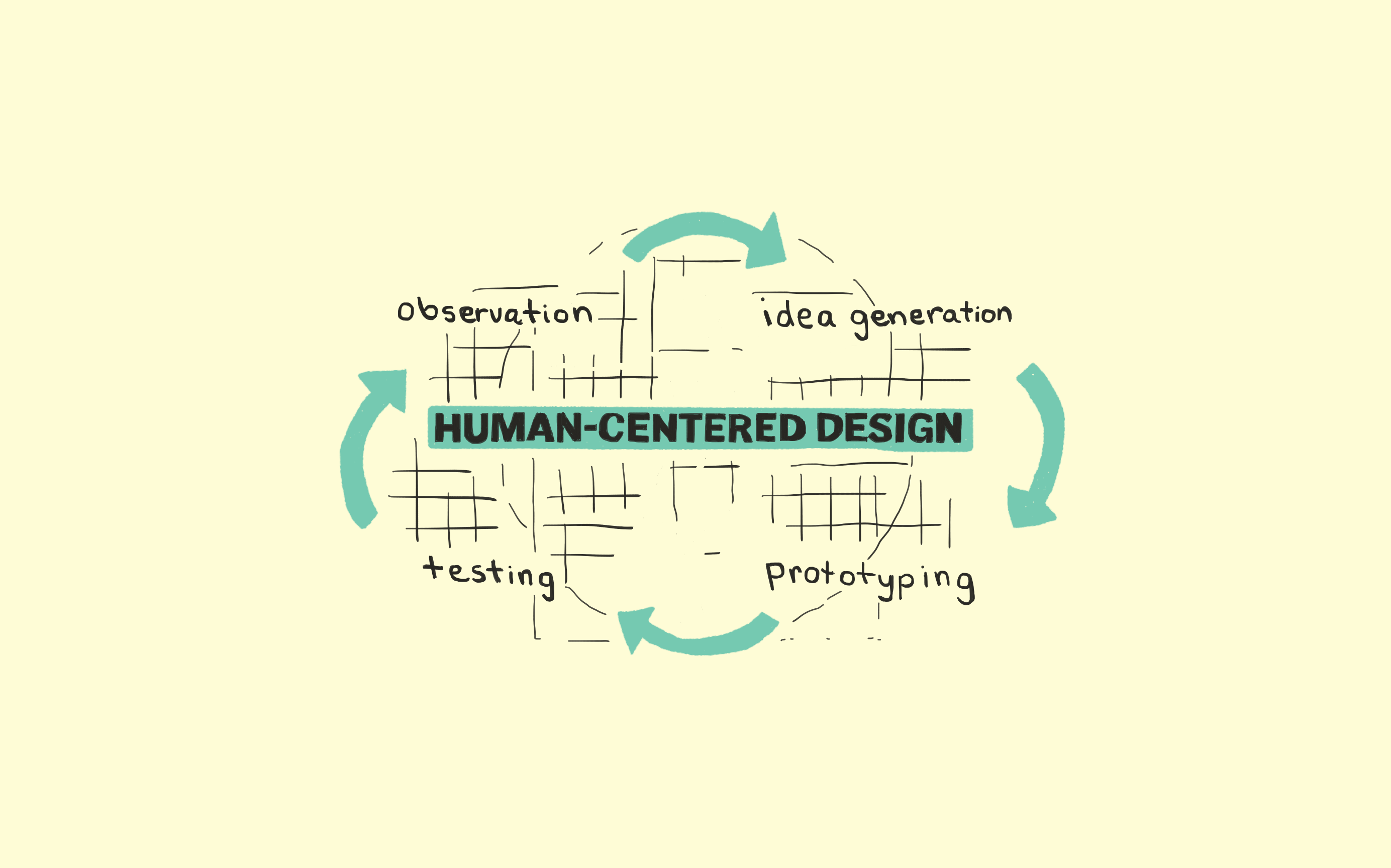

People are all getting familiar with the “Human-centered” design process. It has become a common term especially in companies where customers always come first. But I wonder where did it all start? Who started it? What was the reason behind it?
Doors. Confusing doors.
Confusing doors are everywhere.

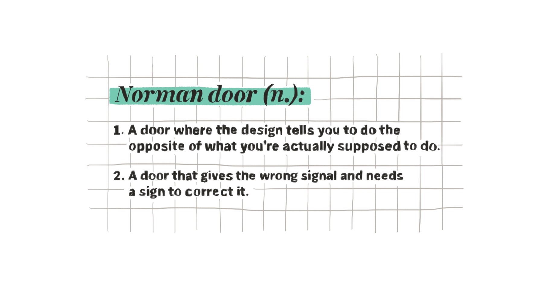
They are also known as, 'Norman Doors'. Why?
Don Norman is:

- a Professor of Psychology
- a Professor of Cognitive Science
- a Professor of Computer Science
- the Vice President of Advanced Technology at Apple
"It can be obvious if it’s designed right."
But for our purposes, we’ll describe him as someone who spent a year in England and got so frustrated with his inability to use what are supposedly simple systems like light switches, water taps and doors,

that he wrote a book, The Design of Everyday Things.

He is the ‘Norman’ of the 'Norman Doors'.
"Why do you have to have a sign that says ‘Push’ or ‘Pull’? Why not make it obvious?"
In an interview he was asked,
"If I continually get a door wrong, is it my fault?"
He answered,
"No. In fact, if you continually get it wrong or if other people continually get it wrong, it’s a good sign that it’s a really bad door."
Why does such a simple thing need an instruction manual?
Why do you have to have a sign that says ‘Push’ or ‘Pull’? Why not make it obvious?
It can be obvious if it’s designed right.
There are 2 basic principles of design: Discoverability and Feedback.
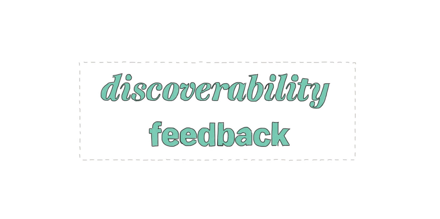
The ability to discover what operations one can do.
When I look at something, I should be able to discover what operations I can do. Discoverability, when it’s not there, you don’t know how to use something.
"When there’s no feedback you have no idea of what happened or why it happened."
A signal of what happened. When there’s no feedback you have no idea of what happened or why it happened.

What contributes to discoverability?
- Affordances — define what actions are possible.
- Signifiers — specify how people discover those possibilities. They are signs. Perceptible signals of what can be done.
- Constraints — limit the set of possible actions.
- Mapping — the relationship between the controls and the object to be controlled.
These principles can be used in App Design too to improve it’s usability. Let’s take for example a product page. We want our customers to buy the product.
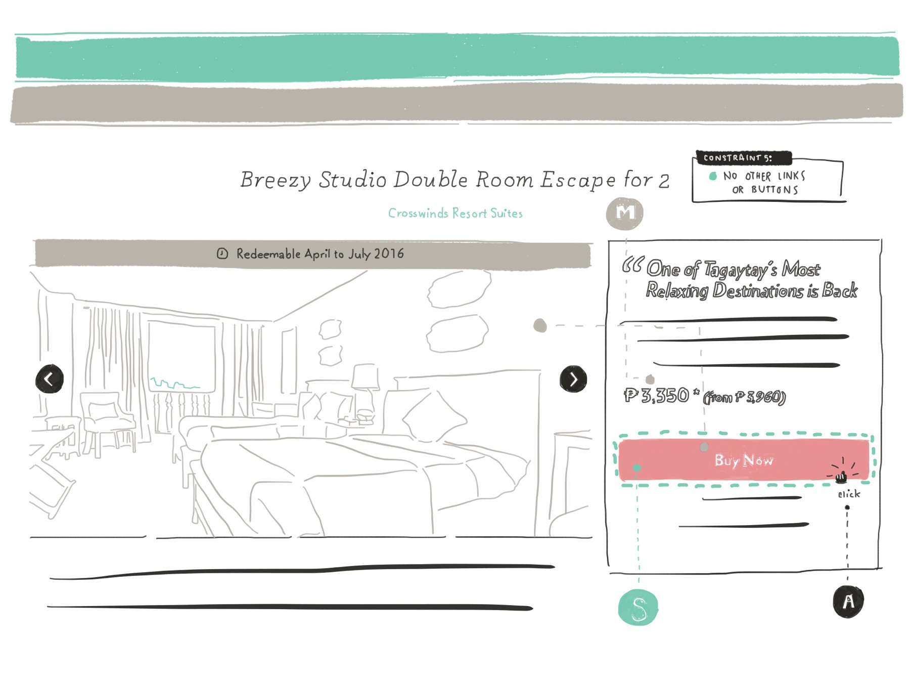
The 2 common affordances in any apps are click and scroll. And for this goal (buy), click is highly likely to be used than scroll. Scroll is more used for browse goal.
What element is the best signifier of the click action? A button. This is due to the fact that in real life, buttons are also clicked. A common or familiar action to everyone.
How can we make our customers focus more on clicking on the ‘Buy Now’ button. There are multiple ways. One of them is defining constraints or setting limits on the possible actions that customers can do on the page. For example, removing any other links or buttons to other pages.
"When you click a button, there should feedback."
Placing the button beside a photo and below the price indicates the mapping of the click action to the product being represented by the photo and price.
And finally, when you clicked on the button, there should be a feedback. Like a loading message, or an animated spinner to tell the customer that the action made was received by the system and is now being processed.
To end, let me share some words I heard about design from Joe Gebbia of Airbnb,
“Every time you see a duct tape in the world, that is a design opportunity. Why? Because that’s an indicator that something is broken. Something didn’t perform the way that it is designed to. And that there’s an opportunity to improve it.”?—
"Frustration is an opportunity to make the world a better place, so don’t hesitate to design a solution."

Frustration is an opportunity to make the world a better place, so don’t hesitate to design a solution.
This post was originally published on Ce’s Medium profile.

