13 ways to present forms and the future of data input
From complex ERP systems to Facebook, applications make meaning out of input. The form — in its many manifestations — provides a gateway for user submission. This article illustrates 13 different ways to present forms, and explores the future of data input.
Modal
Simple modals work well for forms with low complexity and limited inputs. Modals are usually easy to implement and have a straightforward user experience. However, complex interactions requiring additional modals, or popovers can cause user error. Also, modals prevent the user from interacting with other parts of the app until it is closed. Consider employing a separate page for longer forms, and inline editing for in-context entries.
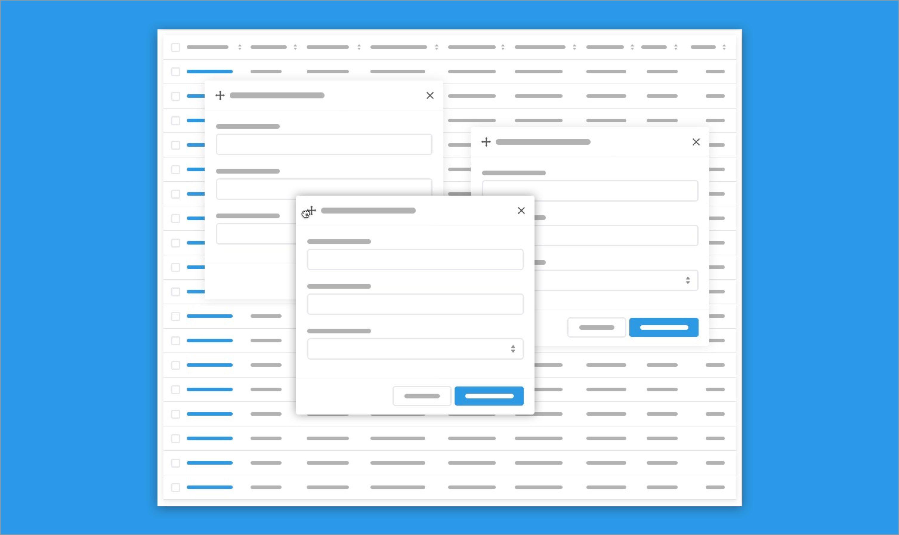
Multi-modal
Multi-modal forms (there is probably a better name for this) present itself as draggable panes, allowing the user to interact with many forms at once. The user can drag modals around the page allowing them to view the information beneath it. Multi-modals allow power users to address lots of information at the same time, instead of pulling up multiple views, browser tabs, etc. This presentation can be problematic for novice users because they can get lost and commit erroneous actions.
Slideout
Slideout forms present itself by sliding over a portion of a main view, or pushing content over to accommodate the form. Like the modal, this presentation is contextual, allowing the user to reference information from the main view. Slideouts usually allow for longer forms because it takes up the window height.
Popover
Popover forms are great for quick edits and entries. The popover is presented in-context to the related data so users don’t lose their place in the app.
Inline
Inline forms allow a user to make simple entries and edits directly where the data is presented without being redirected to another view. Inline forms can have an edit and read mode, or inputs can be edited and auto-saved as a user interacts with individual fields.
Editable Table
Like inline forms, editable tables allow the user to manipulate data directly where it is presented. It is great for the entry of tabular data like in the case of a spreadsheet or invoice line-items.
Takeover
Takeover modals enable a user to interact with a complex form, while having the ability to quickly go back to their previous view. Takeovers are great for entering system level data that doesn’t need a subsequent view.
Wizard
Wizards allow users to fill out sequential information step by step. Wizards are great for complex forms that users won’t engage with after completion. Wizards should be employed when a user needs to go through an unfamiliar process. Wizards are typically a poor user experience, and a bit patronizing, for high use forms.
Sectioned Form
Sectioned forms are great for the entry of complicated information. The user benefits from having the full context of the form, instead of a multi-page form like a wizard. The user is free to fill in information throughout the form instead of linearly, affording greater flexibility.
Although not a typical form, drag and drop editors allow users to pick from predefined inputs and drag it into a WYSIWYG presentation. By mimicking the physical world, the main interaction adds a level of fun to the input.
WYSIWYG
What you see is what you get editors are employed for text editors like Microsoft Word, email creators like MailChimp, website publishers like SquareSpace, etc. WYSIWYG editors allow a user to create rich content without knowledge of HTML, CSS, and JS.
Fill in the blanks
Sometimes usability best practices can be neglected for aesthetics and fun interactions without creating a poor user experience for reasons I wrote about in an article on the aesthetic usability effect. Fill in the blank forms present input in a sentence or paragraph, allowing the user to complete statements with their data.
Conversational user interfaces and the future
Conversational user interfaces (CUI) typically consist of a “bot” responding to freeform voice or text inputs. The bot then answers or provides further form controls to address the request. Machine learning has been employed to better interpret input and tailor responses.
There is a lot of hype around conversational user interfaces. Many designers think CUI is the future of web forms. WeChat’s success has provided credibility to the exuberance. However, as Yunnuo Cheng and Jakob Nielsen point out, the benefits of WeChat’s integrated service offerings come more from its familiar and convenient graphical user interface instead of its conversational user interface.
CUI suffers from many usability issues including: lack of discoverability, and an arbitrary completion path. CUI homogeneity isn’t the future of form design, but it is the future for many chat apps that have found a niche around this way of collecting input.
I am looking forward to designs that blend CUI with rich graphical interfaces. Mini embedded applications can be presented based on user input, which can lead to larger applications, perhaps independent of the chat box. Or maybe CUI is used when a user is lost in an application. For more insight, Tomaž Štolfa has a great article on the future of CUI.
Many forms will become obsolete as data entry becomes standardized, OCR capabilities increase, and software automates manual processes. However, a user interface will always be needed. I hope these different form presentations help you build better apps.


