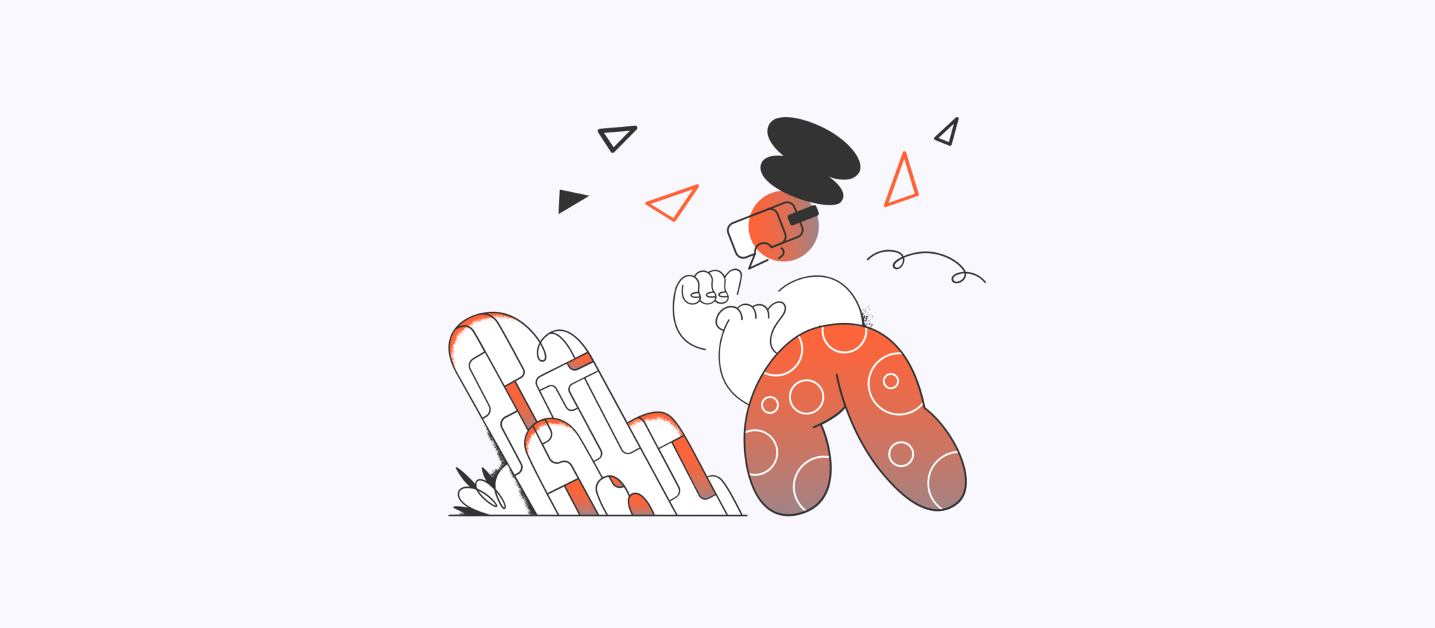
The VR age is rapidly approaching.
When the world’s largest tech companies (Google, Facebook, Microsoft, Apple) are investing billions into VR development technologies, you know something big is on the horizon. Experts say that this VR revolution will be bigger than the advent of the mobile phone, and the first company to design a consumer virtual reality product that is adopted by the masses will win big. Really big.
So why should designers care?
Designers should care because the market that has provided them with reliable work over the past few decades and is about to shift towards a new paradigm of immersive 3D content. Sound, touch, depth, and emotion will all be integral to the VR experience, making even the most novel 2D screen experiences feel boring and dated.
*Note: Realizing there is a lot of overlap between virtual reality, augmented reality, and mixed reality (VR/AR/MR), I’ve decided just to use the term ‘VR’ in this article for the sake of simplicity. I will explore AR/MR in more detail in a future article.
Getting Started with Virtual Reality Design
I wrote this article to help people get oriented with the processes, tools, and principles when creating VR experiences. Let’s dive in!
The Best Way to Learn about VR design…Is in VR
In VR you’re not just an observer, but you’re a participant in the story with an option to influence its outcome. Pretty cool, right? So before you even start thinking about designing for VR, it’s critical to experience it first hand and really understand how it works.
Google Cardboard is a great entry point for newbies, as it is affordable ($15) and works with any smart phone. For people who want the best quality experience and are willing to pay for it, Oculus Rift or HTC Vive are the best options. The Oculus and Vive both have natural hand controllers, which let’s you interact with your virtual spaces. The Tilt Brush and Google Earth VR apps are great interactive experiences to try first.
"We’re finally going to be free of the 2D monitor. It’s been a window into virtual reality that we’ve all looked into for 30–40 years." — Brendan Iribe
Think Beyond the Rectangle
After you have an idea of what VR feels like, it’s time to think about what kind of experience you want to design. We’ve all grown so used to designing for rectangles because every viewing device is a rectangle. When you’re in immersive 360 space, your environment is boundless.
Do you want to create a first person game? Maybe an educational VR app? An interactive movie? Whatever it is, start simple and think about what you need to start an MVP.
Sketch Ideas
Getting started designing your VR experience isn’t too different than the process for designing applications or a web or mobile product. You will need user personas, conceptual flows, wireframes, a VR prototype and an interaction model.
As you ideate on design ideas, consider some of these fundamental questions:
- How do people get started?
- What affordances are provided to guide people without overwhelming them?
- Do you want to err on the side of providing too much guidance or create a minimalist environment that doesn’t overload the user with too many choices?
Don’t expect people to know what to do and where to go. Slow and progressive familiarization, visual clues, and guidance from the software should all be used to help the user.
Don’t Reinvent UI Patterns
VR apps with intuitive user interfaces — similar to what people use on their wearables, phones, tablets and computers — are what will make VR accessible to the masses. Novel interactions are fun to come up with, but it increases user’s learning curve.
Similar to designing 2D interfaces, VR designers should use size, contrast and color to denote hierarchy. In VR, size is based on the distance between the user and a piece of content, so it’s important to understand the scale of content and appropriate viewing distance. For example, knowing how large to design your type is tricky, but fortunately there are many precedents in the real world. The same considerations made for print design (billboards, posters, books) are helpful when designing content for VR.
Consider how you interact with a touchscreen monitor today. There are a number of patterns that we have all grown to understand such as swiping, pinching to zoom, and long tapping to bring up more options. These are all considerations that should be made in VR as well. I’m confident that as more designers come into the VR field, there will be more minds to create and vet new UI patterns, helping the industry to move forward.
Tools
Pencil and Paper
Before getting into any software, it’s crucial to get your ideas out on paper. It’s fast, cheap, and helps you express ideas that may take hours in software. This is especially important because moving from sketches to hi-fidelity can cost much more in 3D than in 2D.
Software
Some designers start with tools they already know like Sketch, others use it as an opportunity to learn new tools. It really depends on what engine you are going to use to build your app. If you are building a 3D game, you’ll want to use Unity or Unreal Engine. Cinema 4D and Maya are also widely used, but mostly for complex animations and renderings.
Frameworks
There are three major frameworks to choose from when designing for VR: Mozilla A-Frame, Daydream VR, and Unity VR/Unreal SDK.
- Mozilla A-Frame is for Web VR and can be used platforms such as Google Cardboard, Samsung Gear, and Oculus Rift.
- Daydream VR is for midrange VR and works with mobile phones only.
- Unity VR/Unreal SDK are for high end headsets including Oculus Rift, HTC Vive, and HoloLens (AR).
Experience Principles
When you’re designing for VR, you’re designing for the capabilities of people as much as you’re designing for the capabilities of the system. So it’s essential that you understand your users and the issues that may come up while they experience VR.
"Virtual reality is the ultimate empathy machine. These experiences are more than documentaries. They’re opportunities to walk a mile in someone else’s shoes." -Chris Milk
Physiological Comfort
Designing an experience that is comfortable for people is the most important consideration (and a difficult one). If you’ve ever used a VR headset for more than 20 minutes, you’ve likely experienced some sort of fatigue or nausea. VR can confuse your brain because your body is stationary but you’re viewing an environment that is moving. Providing a fixed reference point, such as a horizon line or a dashboard that stays with you as you move, helps ease nausea. If there is much movement in your app— accelerating, zooming, jumping— it must be controlled by the users or they will become sick.
Environmental Comfort
Just like in the physical world, people can easily get uncomfortable in small, large, or high spaces (claustrophobia/agoraphobia/vertigo), so it’s important to understand scale as a VR designer. If you design a space that’s too big, users may get lost. If a space is too small, users may get claustrophobic.
There are many ways to guide people through your virtual environment. Non-spatial methods including audio and light can be especially useful. Audio can be used for spatial positioning and light can be used to reveal a path to follow. The gaming industry has used these techniques for years to help guide people through their journeys.
Ergonomics
When first designing for VR it’s exciting to think about creating futuristic interfaces like we’ve seen from Hollywood blockbusters like Iron Man or Minority Report, but the reality is those UIs would be exhausting if used for more than a few minutes. The following diagrams help to illustrate the comfortable range of motion zones:
We’ve all been affected by some sort of “text neck” syndrome at some point (the soreness felt from looking down at our smart phones for extended periods). Depending on how far you lean over, poor posture can create up to 60 pounds of pressure on your spine. This can lead to permanent nerve damage in your spine and neck.
As VR is adopted by a wider audience, it will be essential to establish healthy habits and movement standards. Instead of trying to adapt ourselves to fit the limited interactions supported by our existing technologies, our interactions with VR platforms will need to be as natural and intuitive as possible. This “natural computing” paradigm — that is, interactions that no longer have to adapt to the limited form factors of the computer (keyboard, mouse, touchscreen) — will allow us to interact with the digital world in the same way we interact with the physical world.
"Instead of trying to adapt ourselves to fit the limited interactions supported by our existing technologies, our interactions with VR platforms will need to be as natural and intuitive as possible."
Input Methods
When you’re wearing a VR headset, you can’t see what is in your hands. Unlike gaming controllers that we’ve grown accustomed to (Playstation, Xbox, Wii), VR hand controllers have to be suitable for “blind mode” use.
Every platform has different methods to engage with the VR environment. For example, Google Cardboard has only one button, Oculus and HTC Vive both have two hand controllers which provide six degrees of freedom. The controllers enhance the VR experience by allowing users to pick things up and physically engage with the others.
Sound
While sound is often annoying when using the web or mobile apps, it is a integral part of VR development. Consider the phenomenon of synesthesia, where stimulation of one sense leads to the automatic triggering of another sense. For example, you smell something and get the illusion of taste. This also works with sound. Since tactile feedback is still lacking in VR, sound is a great way to provide feedback when users touch objects.
3D Sound — aka Holophonic sound — is still in its infancy, but will be transformative in how we experience VR. We are all used to stereophonic sound, which provides sound coming from two channels (left/right), but holophonic sound allows us to tell if sound is coming from above, below, or behind us. Think of when you are outside and hear an airplane. You intuitively look up, right? Having this sound experience in VR is what will make it truly immersive.
VR Design Guidelines
In closing, I recommend checking out a few resources that will give you a broader understanding of how to design for VR. Google VR Guidelines, Oculus VR Best Practices, and the UX of VR are the best places to start. After reading through these resources, you’ll easily be ahead of the crowd.
Further reading:
- Design Practices in Virtual Reality
- Design Beyond a Screen: A Primer for VR, AR and the Multiverse
- Stop Talking and Start Sketching: A Guide to Paper Prototyping
- A Crash Course in UI Design
- Mixed Reality User Flows: A New Kind of Template
Think, Explore, Create
What’s exciting about designing for VR right now is there are very few established conventions and very few experts — it’s a completely open field! If you start designing for VR now, you could be the expert in one year. If you already have experience in gaming or architecture, you already have an head start. This industry shift from 2D to 3D is not only a great opportunity to rethink paradigms of human-computer interaction, but be involved in the creation of a entirely new field.
Just like the process of coming into any new field, it’s essential to be constantly reflecting on the new opportunities in this industry. There are infinite opportunities to innovate, improve, and create brand new experiences in this space. So think big, be critical, and break out of your 2D thought process!
This article was originally published on Blake's Medium page.


