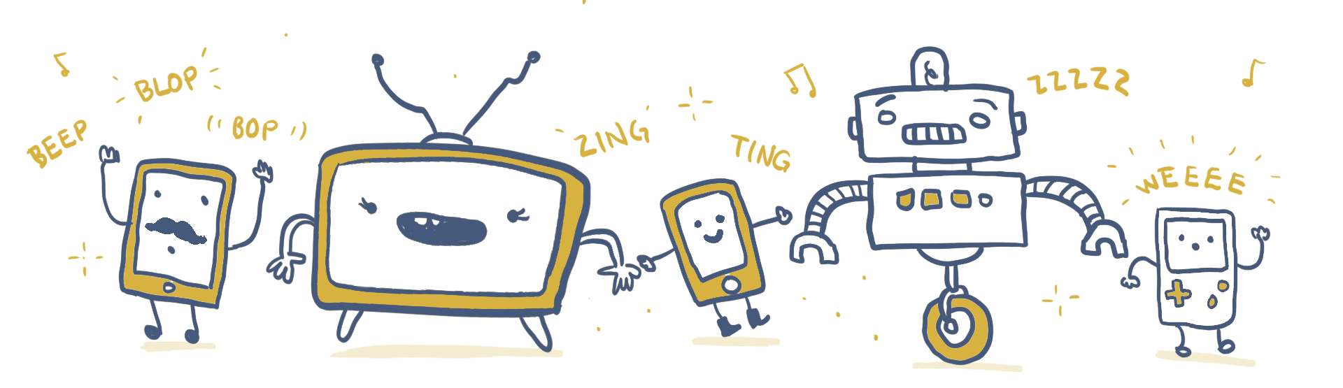
We leverage the sounds of our morning alarm or the distinct beep of an unlocked car to communicate with our technology. Yet there’s an assumption that user interfaces communicate mostly through a screen, overlooking the power of sonic language.
"Although hearing is one of our primary senses, most interfaces today are primarily visual."
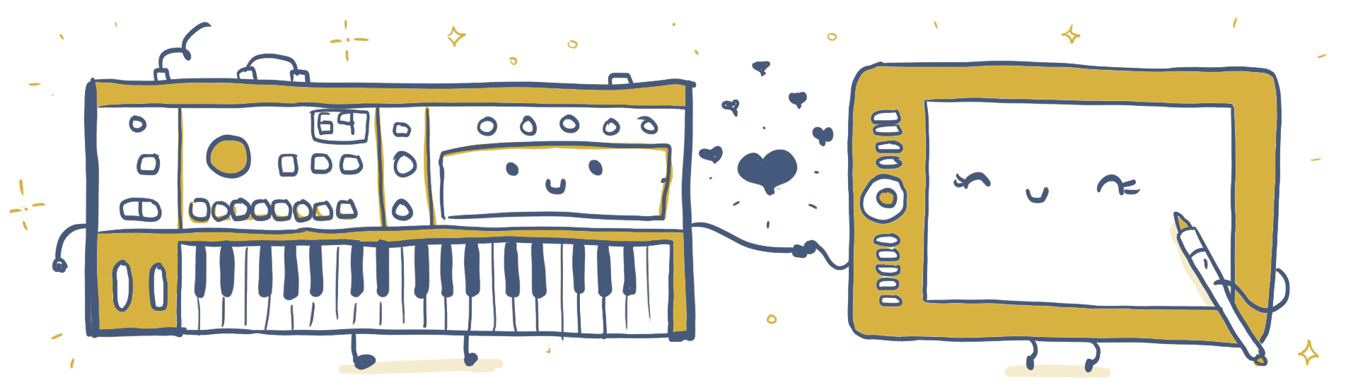
I've been a designer for 16 years and I compose music as a hobby. These two skill sets have helped me reinforce the idea that user interfaces are meant to incorporate at least sound and vision. In my current job as a UX Designer at Udemy, my team has been working on a revamp of our learning experience. In a brainstorm session, the concept of incorporating sound in the interstitial screens of a course was surfaced. Excited, I started playing around with some synths and midi samples to create auditory feedback on lecture progress and completion. We experimented with different instruments, chords, and tempo. The challenge was to use audio to meaningfully illustrate progress while representing our values. What sound represents us? We ended up with some short and subtle motifs using a marimba and a harp in A Major.
This experience left me wondering… what if instead of using beeps and zings as auditory feedback on interfaces, we applied harmonies, notes, or chord progressions as symbolic sounds? What if we chose an instrument or set of instruments that speak to our brand and reflect the voice of our product? What if music was used in such a way that the user intuitively understood its underlying message?
"What if music was used in such a way that the user intuitively understood its underlying message?"
Although hearing is one of our primary senses, most interfaces today are primarily visual. Sound feedback can enhance user interactions, yet there is a reliance almost entirely on how things appear on the screen. Auditory feedback aids the user by enabling them to look away from the device to complete multiple tasks. This feedback is also helpful by demonstrating that an action has been registered, is in progress, or has been completed without the use of a screen. Designing with audio is not easy, though. There are many aspects to consider if you want to keep your experience pleasant, meaningful, and practical.
"Auditory feedback aids the user by enabling them to look away from the device to complete multiple tasks."
I enjoyed the experience so much that I decided to compile a collection of musical sounds that others could implement in their productions. I ended up making over 200 audio samples of harmonies, sequences, SFX, speech, and chord progressions on 8 different instruments.
You can download the full pack here. But if you want to know a bit more about my background, my recommendations on how to design musical interfaces, and my process for creating these sounds, then keep on reading!
If a tree falls in a forest, do I get a sound notification?
Before talking about music, let’s start with how we interpret and eventually develop meaning behind sound. Non-speech audio contains rich information that helps us understand our environment, a process that has become part of our everyday experience. Just by listening, we can determine when the batter hits the ball, when the velcro is detached, or when the teapot is ready. We’ve been using audio as a feedback mechanism in devices such as TVs, microwaves, cars, toys, and mobile phones. Auditory interfaces can function as useful and pleasant complements (or even substitutes with the rise of wearables) for visual interfaces.
When designing with audio, it is important to define the specific meaning of each sound at an early stage in the process. A sound that communicates important information should be significantly different from one that serves as a complement to the visuals. Since sound is fundamentally different from vision, it can carry information that the latter cannot. Sound reinforces the first three principles of interaction design: visibility (affordances or signifiers), feedback, and consistency in a unique way.
Auditory designs can be used to display patterns, changes in time, calls to action, notifications, or warnings. The possibilities are limitless, but that doesn't mean every interaction needs to include sound. Audio should enhance the experience, not interfere or distract. So users don’t get annoyed by repetitive sounds, it’s best practice to apply short and simple sounds that are informative by their form alone. That way the audio contains a meaning built into itself.
Design and music are so in tune
While design is my primary passion, music has always had a special place in my heart. My musical background is not the most traditional, yet it’s pretty cliché: I started (horribly) playing the guitar with a punk band as a teenager, then transitioned to synth-punk with midis and DAWs, and then worked my way into nu-disco with synths and arpeggiators (James Murphy would shake his head). After “wooing” listeners with música sabrosa in a cumbia band, I decided to explore the “lost art” of DJing (Mexican weddings are my specialty).
Throughout all my years as a designer and an amateur composer, I have discovered that the mapping of these creative processes is not so different. When composing a song, writing a comic, or designing an experience, your objective is to tell a story. You follow a basic structure: exposition, rising action, climax, falling action, and resolution. It’s all about taking your audience on a ride.
The similarities don't stop in the structure. The dimensions of sound (pitch, timbre, duration, loudness, direction) are analogous to the elements of design (shape, color, size, texture, direction). And the principles of both music and design (composition, form, rhythm, texture, harmony, similarity/contrast) share similarities too.
Why am I telling you this? Because I think that the sound and visuals of any interface should be homogeneous. For example, when designing a warning module, we might use a red color and an alert icon since these are familiar visual cues that the user would recognize as something dangerous or risky. Similarly, we could use an alert sound that is high pitched, loud, and has an unusual timbre. Visuals and audio on an interface should be related in an analogous or complementary way.
Blackberry compares visual language of a graphical UI with sounds on their Earconography:
An icon of an envelope can be different colors, have a stamp on it (or not), or be tilted 25 degrees, but as long as it still looks like an envelope, users will know what it represents. Same story for sounds.
Finding the right sound is such a treble
"Audio should enhance the experience, not interfere or distract."
Choosing the right sound for you depends on the intention and feel of your product or service. On a fundamental level you can use speech sounds or earcons (the auditory version of icons) in your UI. Apps like Facebook, Tivo, iPhone, and Skype use earcons to create a relationship with their system. When using earcons, an instrument or set of instruments can represent a brand or establish the personality of a product. Should the sound be metallic or woodsy? Synthetic or natural? Big or small? Complex or simple? Asking these questions can help define the material and type (wind, percussion, or string) of an instrument and set a theme.
The variations of sound have no limit. You can play with its many dimensions and yield completely different results with each combination. Additionally, the auditory dimensions affect each other such that loudness can influence pitch, pitch can change loudness, and other dimensions such as timbre and duration can influence each other as well. It can get a bit difficult going into all the technical details, and hiring a sound engineer might not be on everyone’s budget. So, I would recommend quick experimentation and trusting your gut when choosing a sound that’s right for your project (or you can just hire a kid in a punk band).
Ideally, musical UIs should be partly iconic and partly metaphorical, meaning that they carry everyday sound attributes but also some abstract meaning like size, material, speed, or weight. I like to make the comparison of flat versus skeuomorphic design on sound. For example, in the instance of closing a dialog in an app, instead of applying the literal sound of a closing door you could use a sound that changes in timbre, speed, and force and mimics a synthesized version of the closing door.
A pitch on musical interfaces
Regardless of musical education or background, most people seem to have some basic musical understanding. Playing with different attributes such as rhythm, harmony, instrumentation, melody, and tempo, can help define meaning and intention of each sound.
A couple of apps that use music amazingly in their interactions are Monument Valley and o k a y ?. It’s no coincidence that they're both games. Game designers have explored the use of music on interfaces for a long time, and I think product designers can learn a lot from them. Using chords can add depth to an interface in which tones of different pitches are played continually. Harmonic motion, emerging from melodic movement, can give the sense of progression, success, or errors. Other events like completion, departure (sending, uploading), or returning (receiving, downloading) can be represented by modulating from a dominant key to a tonic key back and forth.
Musical messages can also be associated with feelings. In Western music culture, major scales are associated with happy feelings (e.g. most pop music) and minor scales sound sad or melancholic (e.g. “Love will tear us apart” — Joy Division, “New York I love you, but you’re bringing me down” — LCD Soundsystem). Choosing a music scale can help determine the mood of your product.
"Choosing a music scale can help determine the mood of your product."
The pack I created uses the D major scale. I made different sequences, progressions, and chords that can be used together in harmony. I plan to post an update as I continue to expand the pack with other scales in the future.
How to use the pack in just a minuet
The pack was created recording some analog and digital synths in Ableton Live. It has eight instruments (bell, guitar, harp, marimba, piano, whistle, flute, woodblock), a couple of SFX (R2D2 and X-Files), and some speech sounds (both female and male).
Each instrument has between 20 and 40 sounds. When used together, they can represent a sequence of steps, success states, errors, notifications, alerts, and other simple interactions. I also included some subtle embellishment chords in case you want to add new life and a bit of spice to your product.
https://soundcloud.com/pablo-stanley/ui-harmonies-pack-1-sample
The folder structure is pretty simple: “Root / Instrument / file”. Filenames are: “instrument-concept-note-number.extension”. I recommend using the sounds of a single instrument for different interactions. But if you want to go crazy, combine two instruments and see what you get.
Leaving on a high note
Music can affect how we interact with visual interfaces. It helps the user dive deeper into a story and engage emotionally. If carefully designed, musical interfaces can enhance an experience and personalize a product but if used the wrong way they can distract or annoy (remember all the early 00's flash sites & obnoxious personal blogs?). Audio is incredibly personal, we have to make sure to walk on the right side of this fine line when communicating with our users.
I hope the pack I created can help you design richer experiences and inspire you to create amazing products. I’d love to hear your stories about incorporating sound in your UI and see what types of interaction orchestras we can implement across the web.
You can download UI-Harmonies-v1 here.
This post was originally published on Pablo's Medium Profile.

