Let your user show you the path
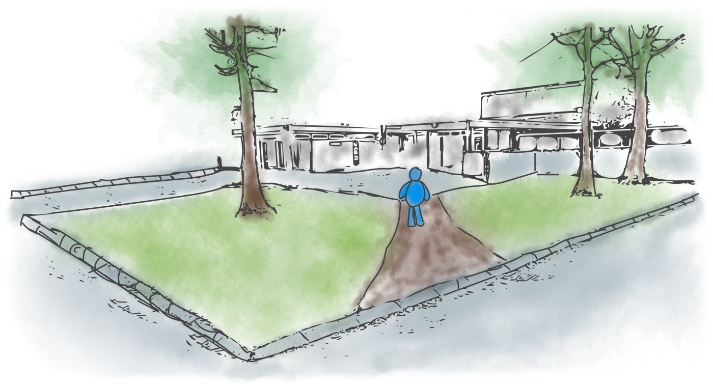
"Once upon a time, there was a genius architect. After completing a new building, he decided to leave the courtyard and other grassy areas around the building without sidewalks. The idea was to let people use the building for a year and let their use form trails in the grass. Then lay the sidewalks on top of those paths."
This story illustrates a great way to find out how people actually behave. Desire lines are a consequence of usage of the shortest route to a destination. They are evidence of how much traffic a “path” receives. After that, the desire lines can be used as a blueprint for the design. So simple, beautiful and efficient!
"Desire lines can be used as a blueprint for the design."
The principle behind desire lines allows users to show their needs via their behavior. This is the most efficient way to know what your users really want. Observing natural behavior is a much more accurate indicator of user needs than talking to users and trying to figure out the needs from interviews.
"Letting user behavior dictate the UX of your product is the essence of user-centered design. Forming that deep understanding of the user behavior will guide your design in better direction."
It is important to note that observing the behavior should happen without the user knowing she is observed. It must be non-invasive. You need to play the role of a ninja stalker for the sake of designing better UX. Once the user feels/knows that somebody is observing the behavior changes and it won’t reflect the reality that well.
Desire lines are an unbiased and statistical measure of how people use things. The perfect blueprint for your design.
If not desire lines then what?
How many times have you seen trails in the grass that break off of a paved walkway? I am guilty of making some of these, everyday I go to work.
How many times have you seen users navigate around the interface and never click the button that was supposed to lead them to the same page? I have, many times during my user testing, due to inappropriate placement, layout, copy text or hierarchy.
The problem with not observing the desire lines is that you end up doing designer-centered design. Designers try to design how space should be used by putting in sidewalks, buttons and etc. Yet, people simply refuse to follow the designed path.
"Avoid becoming the designer who thinks that knows what people need. All too often designers know nothing. We have much to learn."
Instead, become the designer who understands the people’s needs. Using the power of desire lines is a good way to get started.
How to use desire lines in your digital design
In a sense observing desire lines in the real physical world is easier than the digital one. You need to wait patiently for people to use things and then analyse the collected “data”. Unfortunately, this approach is more expensive and slow than the digital one.
Using desire lines in your digital product design is much faster and can be cheaper. Heatmaps, cookie tracking and in general any analytical tools that are gathering tracking data can be used to discover patterns and desire lines.
Use tools such as: Amplitude, Google Analytics, MixPannel and Hotjar to gather and analyze that data. Find out what users are doing when they interact with your product.
Further, understand WHY they do it. It will require a bit more effort to arrange user interviews but it will pay off.
"Be one of the great designers, who puts the extra hours to understand the users needs."
A few final words
The power of desire lines is not unlimited. It is great universal design principle that can show you what people do when they want to achieve a particular goal. However, desire lines don’t show you why people do what they do. You will need to dig deeper and try to discover the pattern by talking to your users.
Next time when you decide to take a shortcut and cross the grass, think of this principle. :)
This article was originally published on Anton's Medium page.


