This will be the first post of series of articles I will be writing on design principles. The idea is to share my perspective on timeless design principles that can be applicable across many mediums and contexts. It is aimed mainly at new designers and designers like me who tend to forget this stuff, and need a refresher.
I have to admit the headline is a bit misleading for the sake of being more interesting. Please forgive me! :)
Lets get started with the two design principles: Feature creep and KISS.
The danger of feature creep
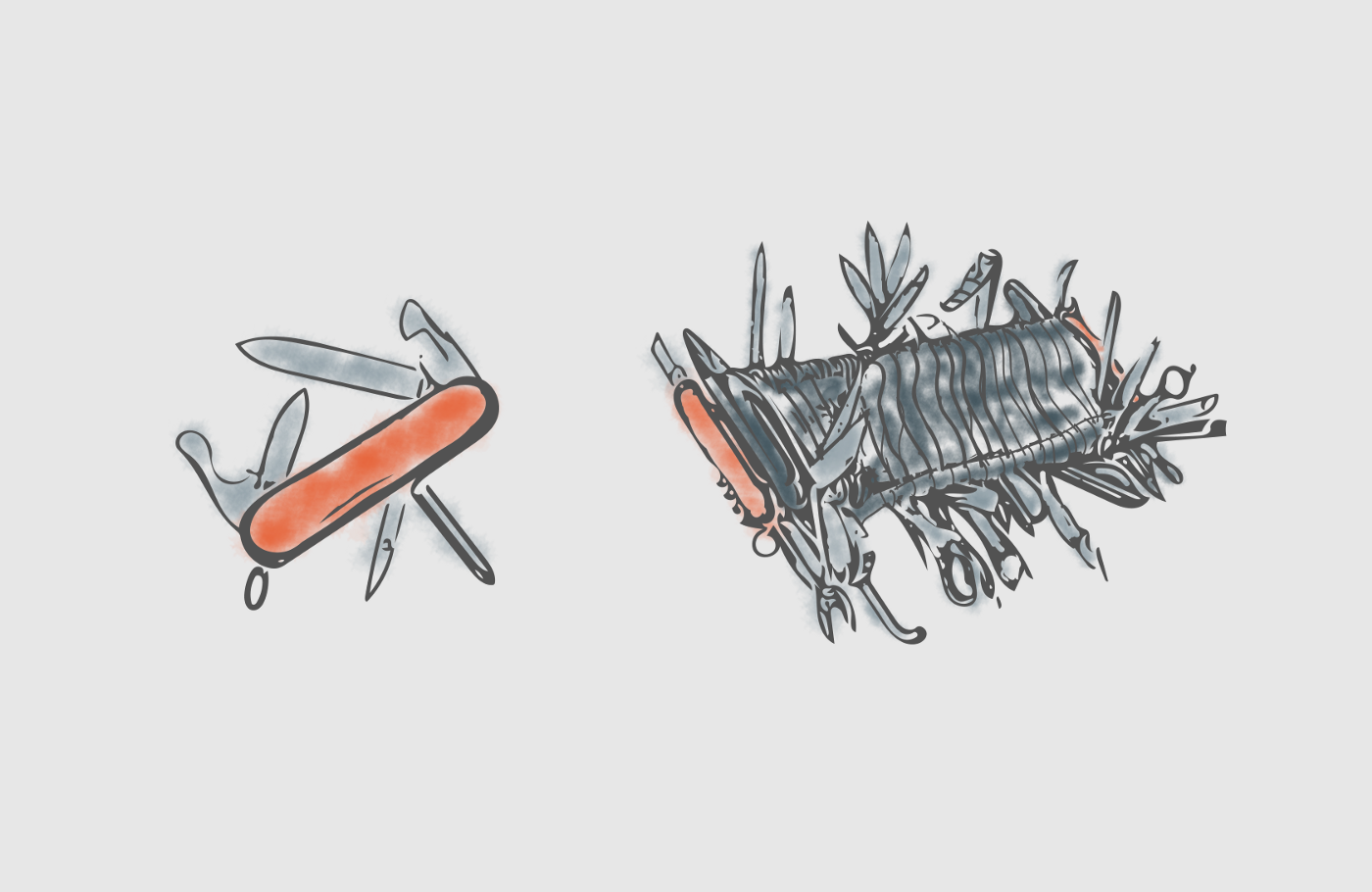
Most of the time continuous addition of new product features beyond the original scope usually results in cost and schedule overruns. If that happens, you’ve let the feature creep sneak on you!
Sometimes features are easy to add especially in software/web development. You can think of feature creep as cancer for software applications. It accumulates too many features that end up crippling or even sometimes killing the end product.
Feature creep appears when stakeholders start thinking they know what’s best for the user. Yes! That’s without actually communicating with the user.
If anything, just remember. More is not better! Except sometimes.
Continuously adding features will add unnecessary complexity. Unnecessary complexity will add unnecessary costs (money and time).
"Continuously adding features will add unnecessary complexity. Unnecessary complexity will add unnecessary costs."
How to deal with the feature creep?
Watch out for small features that can easily sneak in and stay. Feature creep is a mean ninja! It is hard to detect, it blends so well with the environment and can hurt your product real bad.
When adding features, always test them with real users. Features must be linked to customers needs. Educate everyone around you about the feature creep.
Read below about the KISS principle to keep the feature creep at bay.
Traditional explanation of KISS
The acronym KISS stands for Keep It Simple Stupid. Other variations are often used like Keep It Short & Simple, Keep It Stupid Simple and Keep It Simple Silly. The original phrasing of the principle Keep It Simple Stupid was popularized by Kelly Johnson.
"Johnson designed aircraft for war which meant planes had to perform reliably and they had to be easy to fix in stressful field conditions. One of the principles he employed to do this was KISS."
Simplicity should be a key goal in design. Simplicity means minimal amount of parts with minimal interactions between those parts.
Fewer parts and interactions results in faster and cheaper way to build. Performance will be more reliable and will be easier to troubleshoot and maintain.
The paradox in simplicity
Innovative designs are rarely simple! The process of iteration and prototyping is messy. Designs end up with inessential elements and interactions as they are developed. That’s the feature creep mentioned in the first part of the article.
"The KISS principle becomes most useful once a design nears a working prototype. Iterations must become subtractive. Designer’s focus needs to become narrower. Everything that has no significant purpose and does not solve the user’s needs, has to be either removed or redesigned in a way that it will be available when it’s needed."
When you arrive at that stage of your design, ask yourself: what can be removed without hurting performance? Keep user testing your designs. Keep removing and simplifying. Apply KISS until you can’t simplify any further.
Simplifying is great as long as it doesn't hurt the performance and objective of the tool/product you’re designing.
Simple is born from complex
Imagine a standard pencil. It is a simple tool that enables you to leave your mark in this world. Everything in the pencil has its purpose and role and supports the needs of the user in the particular context.
So what is the complex part?
Just imagine, the process behind making that pencil and the design decisions that went into it. The way to assemble the wood and include the graphite mixture and the shape of the body so it doesn’t roll off from the desk. Everything has its purpose and ultimately supports the user’s goal. Beautiful and simple! But reaching that result was not simple at all!
Here is a short video of how pencils are made, if you are curious:
O.K. , enough pencils!
Great UX design applies the same KISS principle. The end product needs to be simple and go through all the complexity! Clear your design so that everything in the product has a purpose and works toward satisfying the user’s needs.
Final thoughts
No matter how much design experience you have, Feature creep and KISS principles are universal and will serve you well in the future. When you iterate your designs look in both directions. Think of what to add and what to subtract.
Always design to solve a problem for the user and improve things. Keep in mind, simple often is complex. :)
Remember the next feature you add could well be the feature that kills the product. Make sure you test it with your users. Keep your designs well balanced so you can achieve optimal level of functionality, cost and maintainability.
Thanks for your time!
This article was originally published on Anton's Medium page.


