
It is essential for our designs to show well-organized information, so the user can understand easily what is shown. It is a key to providing good UX.
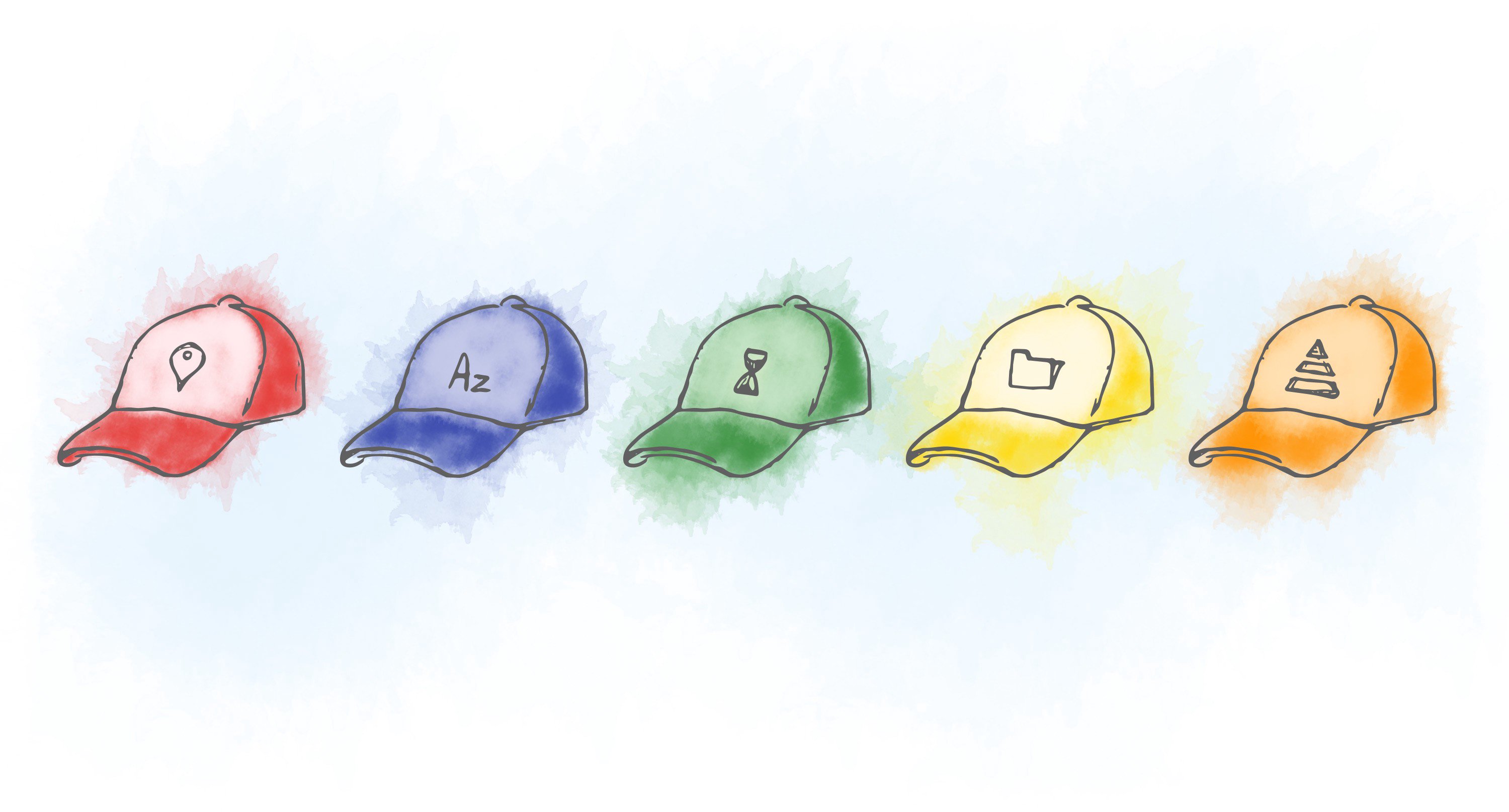
Among many ways of showing data, one has stood the test of time and proves to be efficient even today. It is called “Five Hat Racks”.
The concept of the "Five Hat Racks” was originally developed by Richard Saul Wurman in his book Information Anxiety. Later he wrote the book “ Information Architect”, where he redefines the “Five Hat Racks” concept to form the LATCH principle.
“Information may be infinite, however…The organization of information is finite as it can only be organized by LATCH: Location, Alphabet, Time, Category, or Hierarchy.” — Wurman, 1996
The idea is that there are five ways to organize all information. In the end it’s about answering the user’s question in a clear way. Avoid organizing information just for the sake of making pretty graphs that don’t contain answers!
“I’ve tried a thousand times to find other ways to organize, but I always end up using one of these five.” — Wurman, 1996
Let’s take a look at the 5 ways of organizing information.
Location
Organizing information by its location. It can be physical or conceptual (spatial) location. We humans have evolved to organize location this way in our daily lives. From using maps for navigating and war strategies to placing our ingredients in the kitchen.
Location organizing is important when the information has multiple different sources and locales.
For example, when designing a particular service we should consider the location of different goods and how they will be distributed. Designing Supermarket’s shelves is a good example of organizing information in physical location.

Pokemon go is a good example of app that organizes information by location
In the digital world organizing by location plays an important role, too. Triggering specific UI interactions and notification based on locations for example. Think of GPS and any apps that help with orientation and finding direction. Reminders and other features that prompt you to act based on physical location.
Also, with the rise of VR/AR technologies, organizing information based on location is becoming very important aspect of Information Architecture.
When to use it?
Use it when the relative position of the information you want to present is important. When giving directions or to prioritize what is the most relevant thing to be in reach.
In combination with the “Time” organizing of information we can show the needed answers to the users in the most convenient way.
Alphabet
As the name suggests, ordering information alphabetically is great way to provide random access to data. It is one of the best ways to organize information when the amount of data is big.
For example, the word dictionary or the big phone book be it digital or physical.

Source / Yao Liu
We all have used them and know that as long as the user is familiar with the alphabet this method of organizing the data is efficient.
When to use it?
When the information is referential in nature (Dictionaries, encyclopedias, book indexes etc.). When efficient nonlinear access to specific items is required. It is also a good fall back when the information can’t be sorted with another method.
Time
This type of organizing information is probably the most used one by humans. We like thinking about and putting events in linear fashion. Time is great way of categorizing events that have happened over fixed time duration.
Examples: Calendar and meeting schedules, email inbox, project plans, the enjoyable Facebook timeline, order lists in e-commerce platforms, messaging apps and many more.

Weather app by Javi Pérez
Organizing by time allows for changes to be easily observed and comparisons to be made. It’s the best way to document history since we humans perceive time in a linear way.
When to use it?
When presenting and/or comparing events over fixed time duration. When you want to communicate a time-based sequence (step-by-step procedures). Organize the information by time when you need to give instruction or when you need to document events in chronological order.
Category
When the information needs to be sorted by similarity or relatedness, using category is the best way to organize it. We could argue that our brains work in similar way, we like grouping similar things together.
This method of organizing information is used across the physical and digital world. From shopping goods and industries to categories on Pinterest and hashtags on Twitter.

Choose category by Paul Flavius Nechita
Grouping things together into categories makes it easier for the users to find the general type of information as long as they know what they are looking for. It is a great method when combined with the Alphabet one.
When to use it?
This method works well to organizing items of similar importance. If we have an indication that people will naturally seek out information by category. We can use information organized by categories to suggest complimenting features/products to increase discoverability.
We should keep in mind that people don’t always group things the same way! Especially true when the properties of the information are overlapping several categories. For example, if we take my Bluetooth speaker, which is water resistant and can be used in the shower. What category should it go in? Bathroom accessories or Audio?
Make sure to user test the terms that define the categories and if they make sense for your users.
Another potential problem with organizing information into categories is the size. The bigger the information the more likely it is that there will be sub-categories or sub-sub-sub-categories. Having this will make finding the information a pain in the butt.
Make sure not to create too many sub-categories if the only way of finding the information is by clicking on each individual category and sub-category.
Hierarchy or Continuum
When the information can be organized by comparing things across a common measure. If the information needs to be organized by magnitude.
For example: Small to large, Lowest to highest, Happy to unhappy etc. Star ratings on services and products, score tables, efficiency, sizes and more.

Tee Size by Dann Petty
When to use it?
Use the Hierarchy (Continuum) way of organizing information when there is a shared measurement that you can use to compare things. You can emphasize the information by visually manipulating the sizes or colors of how the information is shown.
Wearing the 5 hats
Using more than one hat at a time is the best way to organize the information you want to use to answer the user’s questions. Mixing categories with alphabetically ordered items. Using Time and Location to organize memorable events. You can use all 5 hats, if needed, to give flexibility of how the information is served.
Allowing multiple ways to view the data is something many users expect to have in today's digital world. To do that we need to wear the 5 hats and use them the best way we can.
Final thoughts
Remember, the most important thing is to organize the information in a way that the user will easily access and understand. Use the data to answer the questions the user has.
By allowing the user to see the information in a way that is relevant to their goals you will create more usable products.
The article is inspired by the book “Universal Design principles” by William Lidwell.
This post was originally published on Anton's Medium profile.