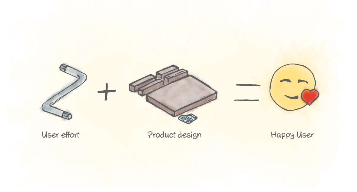
The IKEA effect is a cognitive bias that can influence the outcome and perceived value of products to a large degree. People tend to place high value on products they have partially created. Hence, the name IKEA effect. It is derived from the Swedish furniture retailer, famous for products that require being assembled by its customers.
Products designed by IKEA and LEGO are great examples of this psychological effect. Designers must have the IKEA effect in mind when designing solutions and use it when appropriate.
A bit about the IKEA effect
The more the need for customization and co-production are present in your target audience, the more the IKEA effect is relevant for you as a designer. The effect can help you instil feelings of competence in the user when the task is completed successfully.
"The IKEA effect will create a stronger bond between the user and the product. The effort that users will put into completing the product to its final state will transform into love for that product. The subjective value will be higher in comparison to a product that hasn’t cost any effort."
For example, participants in one study constructed their own origami cranes. The participants valued them roughly five times more than another group of participants who didn’t contribute to building them.
"The IKEA effect will create stronger bond between the user and the product."
"It is important to point out that the IKEA effect is not about putting the effort in, be it a little or a lot, it is more about the completion of the task. The IKEA effect is present when the user can enjoy the completed task and the product. If the product is disassembled soon after the assembling the effect is lost."
Another example which points out that it is also about hitting the sweet spot comes from the period of 1920–40, when American food manufacturers wanted to reduce the time and effort required to make a cake. They simplified the process so much that the cooks only needed to add water and bake the cake. Unfortunately, the sales of the cake mix quickly stalled.
The manufacturers reached a psychologist named Ernest Dichter. Ernest found out that the reason for falling sales was the level of effort required from the buyers. Making the cakes was too easy! It was so easy that people didn’t get any satisfaction from baking the cake. People felt as if they were still buying pre-made cakes from a store. The solution was to get the egg out of the dry mixture and allow people to add it themselves. Doing this made the sales go up again.
"People had the need to be emotionally invested and get rewards from the process of making the cake and not just the end result."
"The journey is as important as the destination."
Making things too easy is not necessarily providing a better experience for the user. It is all about hitting the sweet spot where the user can enjoy breaking the egg, getting a bit dirty, feeling in control and eating the cake in the end.
IKEA effect in your design
"The act of creating something with ones own hands increases the perceived value to the creator. As Designers we are familiar with that feeling."
Let’s look at some ideas of how to utilize this in our designs so users can see bigger value in the products we make.
People are willing to pay more for products they create than equivalent pre-assembled products. The general rule is the higher the contribution the higher the valuation is. Yet, if the effort required is too big or the contribution too small, people probably won't complete the task. The IKEA effect is possible only when the user actually completes the task.
"To hit the sweet spot create products where effort is low but the perceived contribution is high."
To hit the sweet spot we need to aim to create a product where the level of effort is low but the perceived contribution is high. This way the IKEA effect can be achieved.
"Whenever possible let users have control over customization of the product and service. Design it to be as easy to execute as breaking an egg and to have a high perceived contribution as cooking the whole cake."
When you let the users feel in control and put a bit of effort into getting what they need from your product/service, they will form a stronger bond with the product/service.
Digital designers for example can use sample data and editable templates to achieve the IKEA effect. Make the first experience with your app feel dynamic and alive to the users. Prompt them to edit the templates and interact with the product.
For example, leading them through the process of setting up their profile to completion. Executing a simple task successfully such as sending their first email or setting up a widget on their website.
"Simple actions which require low effort but make the user feel they've contributed a lot, will lower the fear of dealing with a new product. If done properly and continuously for a period of time it even can lead to forming loyalty to a brand and product."
You might even gain a few ambassadors saying things like, “It was so easy to setup and start using it! You should give it a try.” Or in the case of IKEA furniture “I saved some money on it and now it looks so good, even better than the fancy expensive furniture in the other shop.”
Final thoughts
Sometimes saving the users a bit of labor can deprive them of that dash of happiness they'd experience if they were to make some small contribution. This should make you think about whether you should decrease the user effort to zero or close to zero.
"We should engage users in design and increase their sense of product ownership and brand loyalty."
To make use of this effect we should engage users in design and increase their sense of product ownership and brand loyalty. This way our designs will be loved more.
Thanks for taking the time to read this post!The article is inspired by the book “Universal Design principles” by William Lidwell.
This article was originally published on Anton's Medium page.


