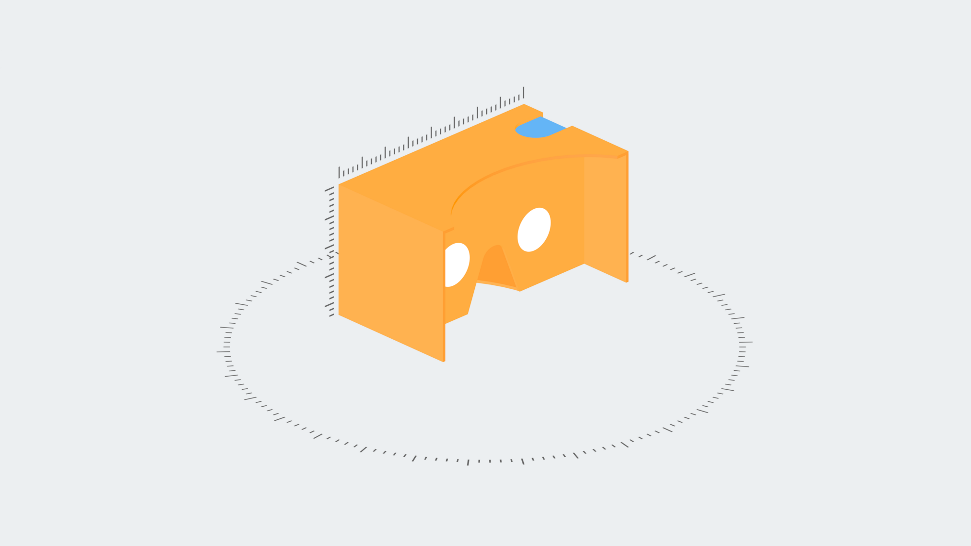
The technology of virtual reality (VR) has been gaining traction, however there is an absence of methods and best practices when designing for it. In my bachelor’s project I am focusing on the user interface (UI) and user experience (UX) opportunities and problems created by the technology of virtual reality.
Historically digital interfaces, have been crafted to suit the hardware requirements of 2D screens. Designers have been fitting content and navigation inside the frames of displays, translating our real world experiences to icons and other UI elements (Bill Moggridge, 2007). Bloating the virtual environment with 2D elements ruins the immersion that VR offers. Designing for VR should not mean transferring 2D practices to 3D, but finding a new paradigm.
"Designing for VR should not mean transferring 2D practices to 3D, but finding a new paradigm."
The foundation of my research is based on the literature exploring human perception and environment, such as The Ecological Approach to Visual Perception by James J. Gibson, Inquiry by Design by John Zeisel or The Poetics of Space by Gaston Bachelard. Although the core literature of environmental psychology was written in the 70’s, the knowledge is entirely applicable to virtual reality.
Designers should expand their expertise to different fields, such as psychology, architecture, sound design, lighting design and physics, in order to be able to create fully controlled experiences, guiding users in VR by shaping the virtual environment in such way.
In my project I am designing and developing a single VR experience, proposing solutions to these problems within a neutral virtual environment in the form of use cases (in a similar manner to Google in their Cardboard Design Lab app).
The following use cases cover only a portion of the wide variety of new interactions and solutions VR offers. The simultaneously emerging technology of mixed reality (MR) will also open up new possibilities. Although there are overlaps in terms of UI and UX design between VR and MR, each of these technologies demand fresh approaches from designers.
The future of this medium depends on the content created for it. Most of the current VR experiences are bare simulations of real life, but after the dust settles from the boom of the new technology, content will adapt to the specifications of the medium. This upcoming phase will again require new design solutions, but for now we need to focus on creating firm foundations to build upon.
"The future of this medium depends on the content created for it."
Design solutions for VR
Role of the ground
“When a pilot is in the clouds there is nothing to see outside the plane, and it can be very disorienting. When the pilot comes out of the clouds and sees the ground and sky meeting at the horizon, the pilot can orient” (James J. Gibson, 2015, p. 19). Users can find themselves in such situation in poorly designed VR experiences, causing inevitable motion sickness. The ground to horizon relationship is as important in VR as in our physical reality.

Atmosphere
Atmospheric (aerial) perspective can help users to understand the scale of the virtual environment, therefore making the experience more natural. The concept of this phenomenon is simple: “The farther away an object is, the more air and particles we have to look trough, making objects that are farther away look less sharp and bluer than close objects” (E. Bruce Goldstein, 2013, p. 230). This gradual fading of the landscape is a clear cue for depth and distance.

Masaccio using atmospheric perspective in order to create the illusion of depth.
Terrain features
James J. Gibson in his book The Ecological Approach to Visual Perception (p. 62) breaks down terrain features into 8 main categories.
- Ground is rarely an open environment. It is usually cluttered. Open environments allow locomotion to any direction over the ground, whereas a cluttered environment allows locomotion only at openings.
- A path affords pedestrian motion from one place to another, between other terrain features.
- An obstacle is an animal-sized object that affords collision.
- A barrier is a specific kind of obstacle that is usually blocking vision as well as movement.
- A water margin prevents pedestrian locomotion.
- A brink, the edge of a cliff. The limit of approach. It is danger zone, pedestrian animals avoid these places.
- A step is a layout of adjacent steps which afford both descent or ascent.
- A slope may or may not afford pedestrian locomotion dependent on the angle and texture of the ground.

Terrain features: opening, path, obstacle, barrier, water margin, brink, step and slope.
Using these features in a controlled manner, as the building blocks when designing the virtual environment, will result in (natural) VR experiences guided by human intuition.
Introducing the user to the environment via soundscapes
In virtual reality changing the environment entirely is effortless, although for the user these sudden and overwhelming changes can cause sickness and confusion. A gentle introduction to the new environment can be achieved by fading-in the ambient soundscape of the place at first, then the image. This allows to build a mental image of the environment via sound, lowering the shock factor.
La Jetée (1962) is almost entirely constructed of still photos, however the soundscapes used in the movie allow the viewers to build a strong mental image of the space.
Guiding the user with objects
Navigating the user via a certain path in a cluttered environment can be difficult without using conventional wayfinding UI elements. The usage of these elements could break the immersion of the experience. However subtle changes in the environment, such as growing flowers at the openings of a field in order to draw the users attention to the correct path, could still maintain the genuineness of the place. These hints should be contextual (the flowers would not work in a Martian landscape).

Red flowers in Firewatch guiding the player towards the correct direction.
Contextual reticle
In non-tracked VR (e.g. Gear VR, Google Cardboard), reticles are used in order to show the user the specific point where they gaze. It helps to orient in space by showing the centre of focus. It is also used for movement and interacting with objects. These specific tasks demand different reactions from the reticle.
- Idle state — the idle state reticle should be as minimal as possible, giving only a hint where the centre is.
- Movement —the reticle should be activated when the user looks at any place that is approachable. When doing so, the reticle should transform into a larger pointer, highlighting the selectable area with a circle projected over it from the user’s perspective.

Difference between idle state and movement reticles.
- Interacting with objects — when the user turns his/her attention to an interactive object the reticle should react accordingly.

Transition between idle state and interactive reticles.
- Reticle colouring — the reticle should adapt its colour to the brightness level of its background, by switching between light and dark modes in order to stay visible in all lighting conditions.
- Objects as reticle — replacing the reticle with specific 3D items can be an easy cue for the interaction (e.g. a key as the reticle whilst opening a lock).

3D item replacing reticle for a specific interaction.
Interactive objects
If not all objects are interactive, users should be hinted which objects they can interact with. The contextual reticle can be a help in this case, but in some cases, in order to avoid confusion, the interactive objects should change, too. This could be a minor change in the shading of the object or even a subtle sound describing its behaviour whilst looking at it (e.g. subtile click in case of light switches).

Interactive object activated on look.
Conclusion
Virtual reality is emerging as a new medium with the potential of having as strong an impact as radio or television did in the past century. We have the opportunity to build the foundations of interface, experience and interaction design specific for this medium without taking already existing solutions for granted.
References for the article can be found on the original post.
This post was originally published on Jonathan's Medium profile.


