Bringing education into the digital realm — How the Design Museum uses Marvel to make their workshops engaging, interactive and fun
- 216+
design students
joined their app design workshop since the beginning of 2017/2018
- 20
students per session
The Design Museum has small sized classes to provide students with a tailored experience
- 5
minutes or less
is the time it takes to introduce Marvel to the kids and get them started with their project
Industry: Education
Location: UK
Key Feature: iOS app, Design Tool & Prototyping
“Young people don't often think about the apps they use — digital products are a part of everyday life these days. We want our students to understand how the whole app is put together and that it's not just this one ever-changing screen but lots of different screens that all have their function, and work together. It should be seamless to use, to the point where users shouldn’t have to think about how it's working. And this is the thing about good design, it's often something you don't notice.”
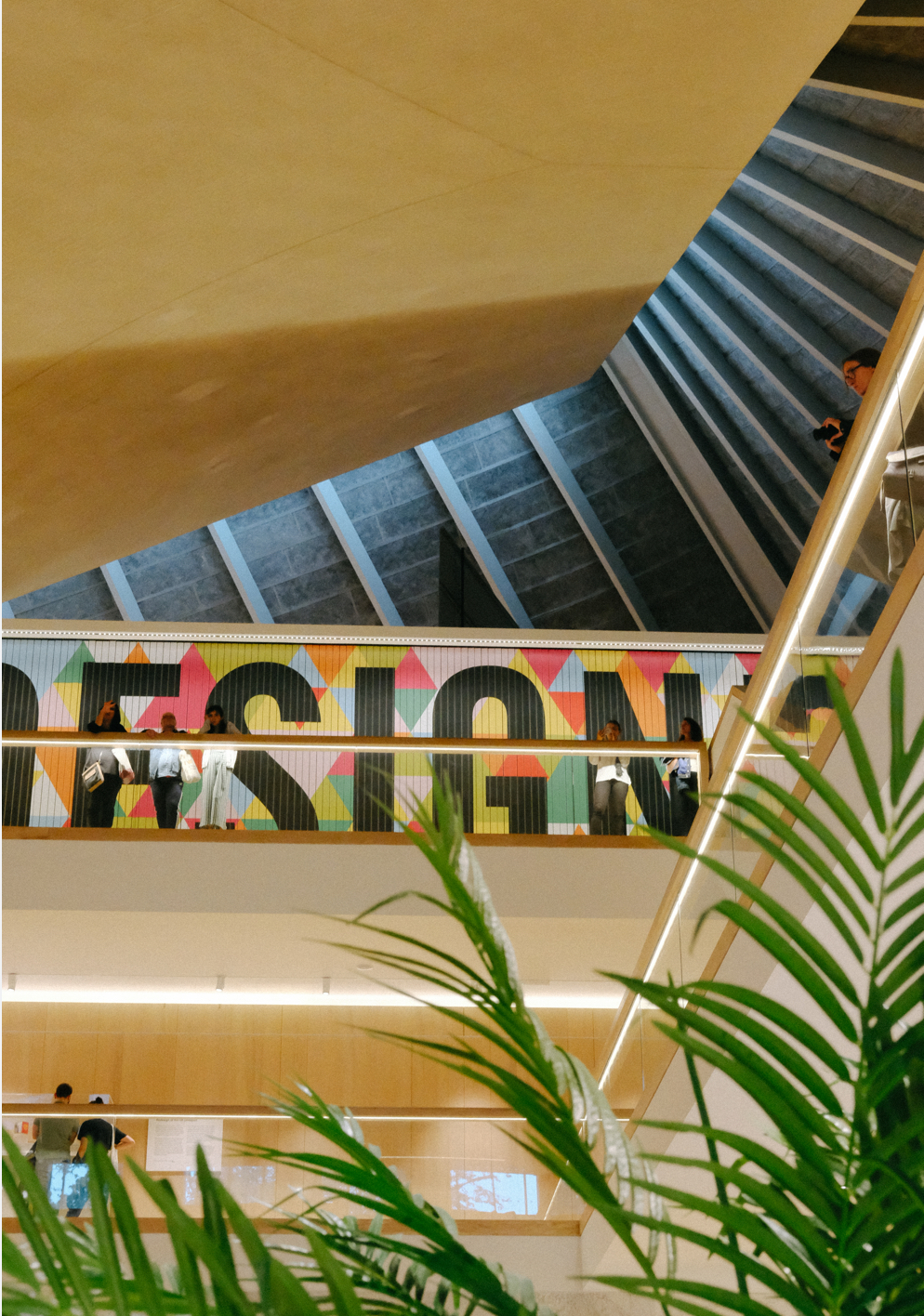
At the Design Museum in London, where they host a number of inspired exhibitions showcasing every form of modern design they're also creating playful approaches to education - using a haptic, constructivist approach to exploring design.
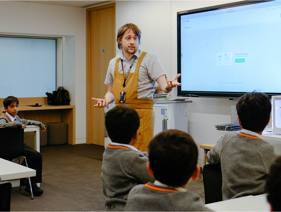
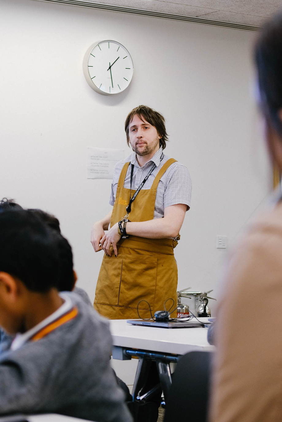
David Houston, their Schools Learning Producer, manages all things education; from programming workshops, ensuring the right staff are onboard, right through to overseeing creation of resources and managing their online learning site. We caught up with David, as he taught students from Buckingham Prep School, to find out more about their digital design workshops, which cover App Design, 3D Printing and Graphic Design.
“Digital is now a really core part of design and is being adopted into schools curriculum's nationally, so we felt compelled to implement a digital offer as well. We worked with a freelance content developer who helped us identify these three workshops topics which are important in the digital realm”.
In the App Design workshops which run one week per term at the Design Museum, Marvel plays a crucial part in the student's learning process. David tells us, “Marvel is an off-the-shelf solution that allows students to work together to realise their ideas and gives them the ability to rapidly prototype.”
“Marvel is an off-the-shelf solution that allows students to work together to realise their ideas and gives them the ability to rapidly prototype.”
Implementing Marvel in the classroom
The students, ranging from KS2 and up, get a short introduction to App Design from the teacher, where they'll also ask them what they understand of it. This helps them to gauge where the room is and what support they may need when they're creating.
Once the students have been grouped into teams, they're given a clear design challenge to solve, for example, creating a social media platform for elderly users who don't have much experience with technology. “There have been some great responses to this scenario,” David tells us. “One group came up with idea that their app would automatically recognise the user's face as their password and their reasoning was that it eliminates the necessity to remember or even understand how to enter a password.”
When it comes to introducing Marvel to the class, David tells us it couldn't be easier. “It takes under five minutes to explain how to use the product, it's really more a few pointers than a tutorial. That's the thing about Marvel, it's very simple to pick up, easy for the students to go and create with and they see very quick results.”
“It's very intuitive, the students really get on well with it and understand what is going on. The more they can see it has a quick outcome, the more they are encouraged to go and do something which is more elaborate and more involved.”
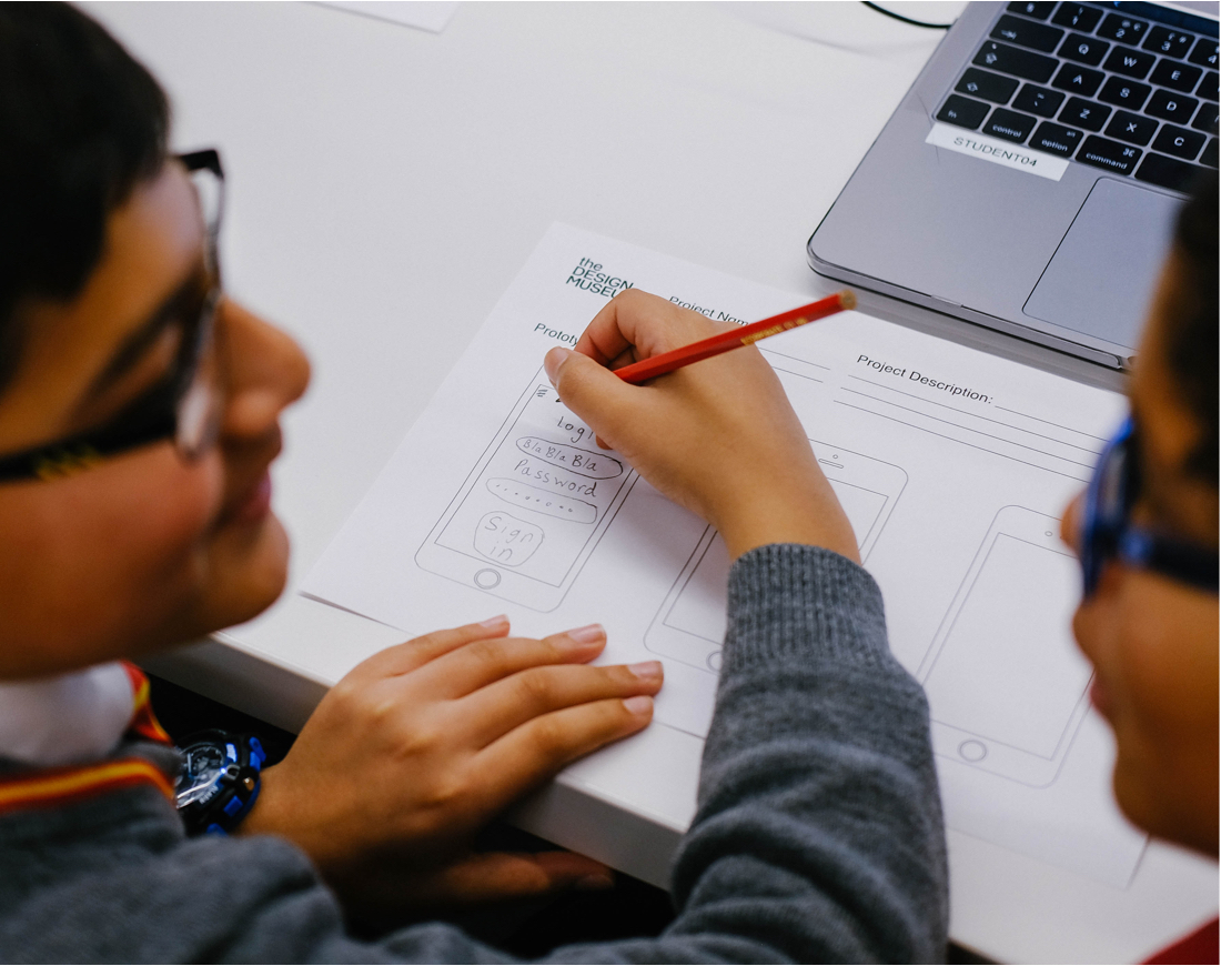
Previously, the students used the Marvel iOS app on iPads to prototype their solutions. They'd be given pen and paper to sketch their up their ideas and then take pictures with the Marvel app, where they could add hotspots to the image and make it interactive. “That way they could make something analogue which they could convert to digital.”
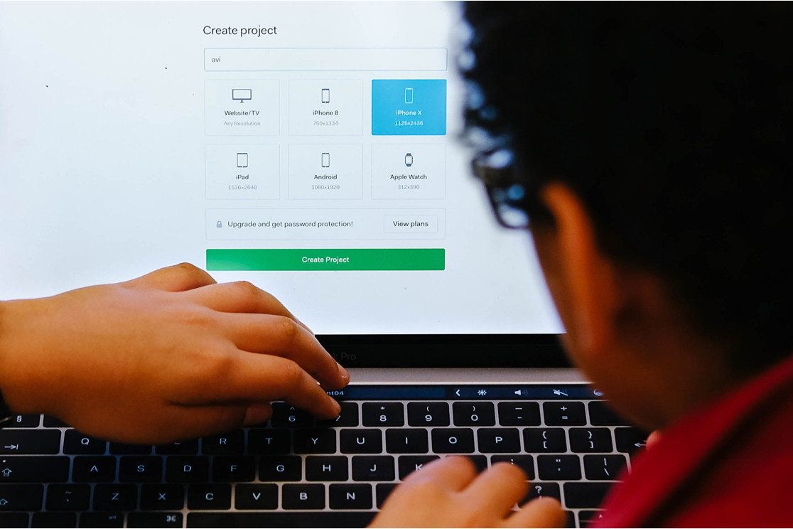
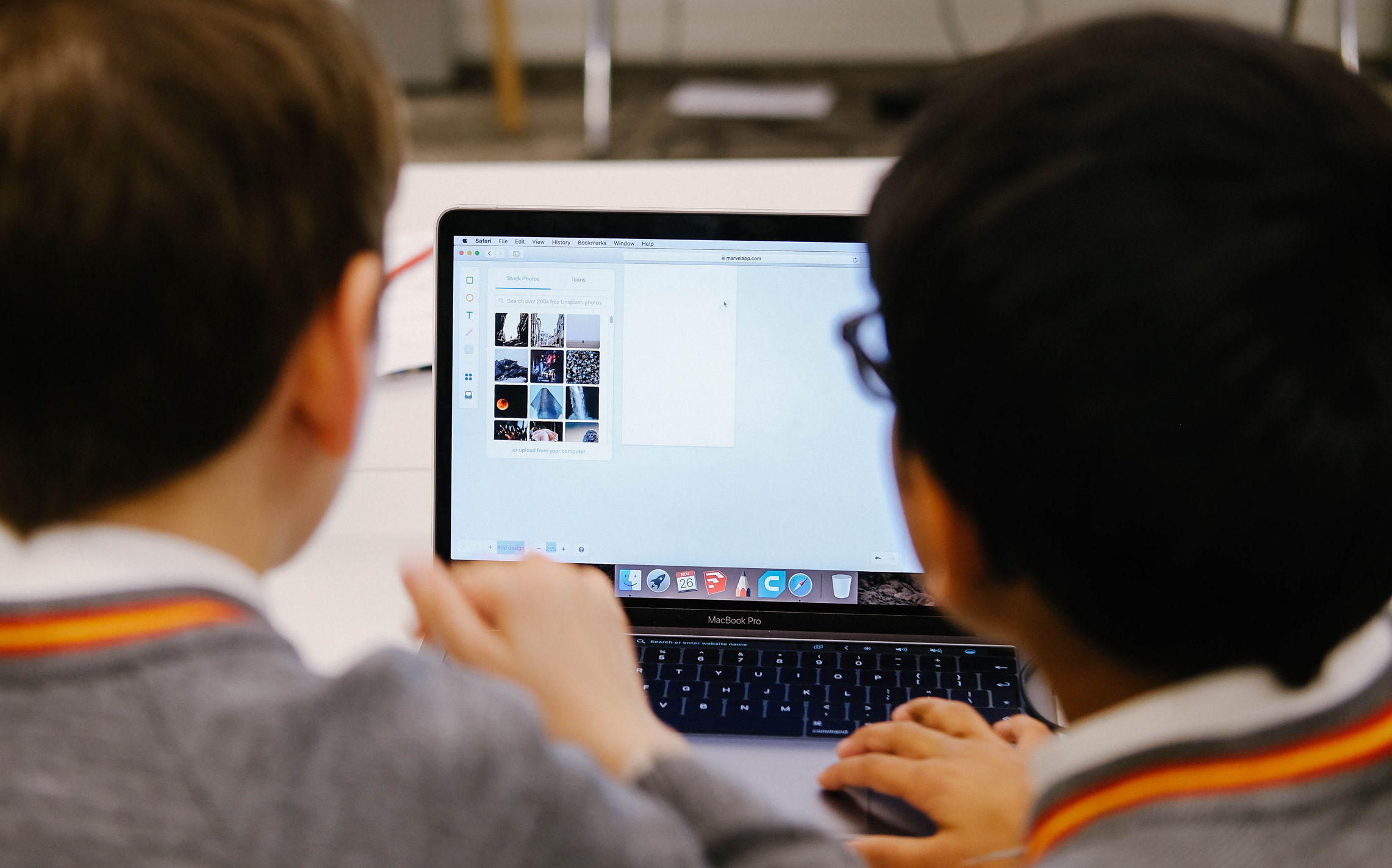
Now, the workshops have adopted using the desktop version, as this enables the students to utilise the additional design features within Marvel's design tool. David explains, “It also means students can design more freely and can pull images from the internet to work into their designs.”
David believes it's important the students are still sketching their ideas initially, as then when they move onto using Marvel it allows for stages of iteration. “They can make mistakes on paper, but when they come to doing it digitally they have a strong idea of what they want to do and how they want to change things — and not just trying to digitise this rough idea.”
“Working on the desktop version means they can add images and assets from external sources, whilst also allowing them to visualise an idea, take something that's analogue and convert it into digital.”
How does Marvel work for the Students and The Design Museum
With Marvel, the Design Museum found a flexible plan that meets their needs as an educational organisation. One account houses a number of pseudo-users which can be accessed on the laptops they provide in class, so new students have access right away without having to sign up.
“What's great is we can utilise our central Marvel account as the hub for each new student's project in every class we run.”
“As an educational service, our student's data is our biggest priority, and we want to avoid using tools which need personal details to be entered on our computers. It's also great for the teachers, they can see what's being created in their Marvel dashboard as it happens.”
The students use the design tool to create basic app wireframes and UI, where they can either choose from a library of templates or create their own shapes. Once the wireframe is complete, they can move forward to the prototyping stage where they add hotspots and transitions to each screen - making their screens interactive and showcasing the true flow.
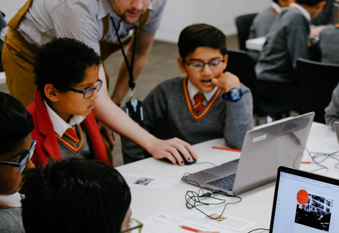
Marvel enables the students to work collaboratively on the design and prototyping stages. “We want them to partake in critical thinking within their teams — about their designs but also their peers' designs as well. So we would always promote them to work in a group of two, maybe three at most.”
When it comes to why the Design Museum chose Marvel for their workshops, David said, “The sessions are an hour-and-a-half long, and within that time we're asking students to understand the concepts, create a prototype and reach the finish line of what they're doing. We want them to feel that they've got something that functions in some way, at the end of the session. And Marvel was the only tool that really produced an outcome that really fitted those asks.”
